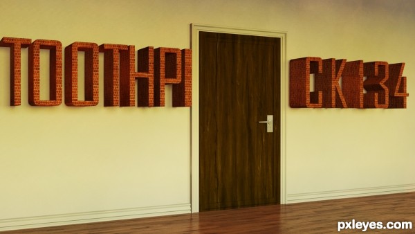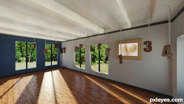
Hi people this is my second entry in this contest and I hope you like it :)
Rendered in Mental Ray
Render Time: 11min 50sec
Program: 3DS Max (5 years and 3416 days ago)

I hope you like it! This is sort of my first ever interior scene so please give me feed back! :) (5 years and 3421 days ago)
Nice job - I may have to enter in another one now :}
Thanks Secretsather! I think your entry is pretty good too! 
Excellent! Great idea and well presented 
Thanks layerstack  appreciate it
what program did you use? this is splendid! i'd love a program like this to help me with my blueprinting or decorating my own house...back to your logo, i think its FANTASTIC!
Thank you so much for this comment CrystalClear !  I used 3ds max to model and rendered in mental ray... Nothing too special that I used... For the lights I used the daylight system and the light that comes through the window is the mr Sky Portal. For the settings I didn't use final gather but just GI (global illumination)Then just played around in the exposure control while changing the settings to get different results. Finally the materials are all mental ray's arch&design. It will take allot of testing until you adjust the exact settings needed for image to look quite realistic. Thanks
you're welcome..you are quite skilled at room making! lol did u ever use your talent to figure out the right paint color for your living room? that would be a great use!
Thank you I'm glad you like it  It's my first ever architecture scene so I'm still learning
This looks nice actually, I esp. like the floor & the light on it.
Very nice rendering. Looks great
Thenkas for the support greymval and nasirkhank  It's appreciated
Cool idea! I like this one better than the bricks.
Thanks for the thought pingenvy  I agree with you

Great entry author...love the idea and execution...well done
Thank you erathion! 

Howdie stranger!
If you want to rate this picture or participate in this contest, just:
LOGIN HERE or REGISTER FOR FREE
Good job i think i would have gone with a different material for the text because pick134 seem blurry and hard to make out.Maybe a change in camera angle/lighting might help. I'm no pro (look at my entries!!) just giving my thoughts
  Keep up the good work
  GL
GL
Thanks! I was thinking about changing the whole material, and I think you've just convinced me I'll update the entry asap
  Thanks!
Changed the Material on the letters. Hope it improved ;D
looks lovely at hi-res
Thank you jamespaul!
Howdie stranger!
If you want to rate this picture or participate in this contest, just:
LOGIN HERE or REGISTER FOR FREE