(5 years and 3343 days ago)
1 Source:
Photography and photoshop contests
We are a community of people with
a passion for photography, graphics and art in general.
Every day new photoshop
and photography contests are posted to compete in. We also have one weekly drawing contest
and one weekly 3D contest!
Participation is 100% free!
Just
register and get
started!
Good luck!
© 2015 Pxleyes.com. All rights reserved.

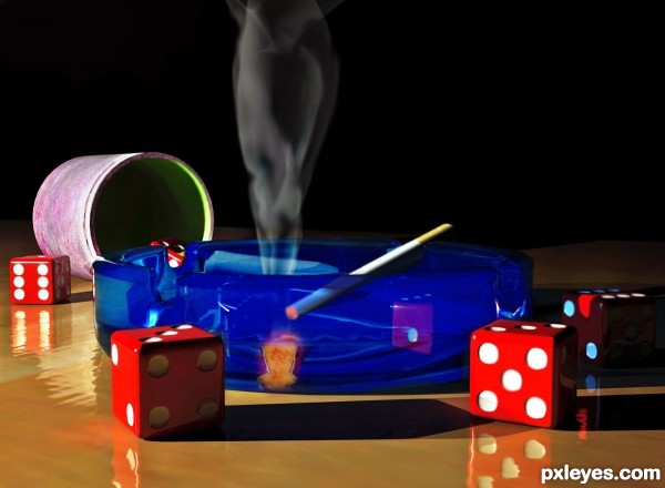
Too dark. The beautiful effort on the ashtray is lost with the black background, and you don't have enough light reflection on the glass in comparison to the rest of the image..
Also the cigarette is way too thin, even as a "slim 110."
agree with mossy..try making the picture brighter with a touch of contrast..and im really lovin' those gorgeous red dice!!
nice entry ,the dice are loooking very real the shadow is also very good done
If it gets any brighter then it will be pushing the on theme limits...(emerging from the "DARKNESS" thanks for the commentary, I think my cigarette is fine.
wow, very nice work! Love that cobalt glass, and great reflections in it. I think the cigarette looks fine, too, author. Good smoke, amazing how you do that in 3D and not ps!
If the "cigarette is fine," then your dice are are about 1 1/2" in diameter...Look at the size of the dice BEHIND the ashtray, and you will see why the cigarette is too thin. The glowing tip would fit into the pip impressions on the dice...
MossyB....check my SBS step #4. You can see the scale of all objects in this scene, perhaps it is an optical illusion created in the side view of the "glass" ash tray.
No argument that 3d isn't easy, but that's no excuse when things are out of proportion, nor is it an excuse against having things pointed out.
Pretty rude to say "Shut up," missy...Nice behavior from a mod. VERY encouraging to members who comment.
I’m going to jump in here and add my 2 cents, I can see what mossyB saying from looking at just the render alone and I see no harm in constructive criticism. From what I can see I would say that the scale of the objects is indeed correct looking at step 4.There are many things to take in to consideration Reflections and Refractions /Indirect bouncing of light/ Absorption Distance / reflective index of each item in the scene /camera angle the list goes on.
Continued:
Which brings be to the point for future reference. Author looking at your render the Depth of Field is incorrect. The dice are soft when they should be sharp and the ashtray and last dice at the back are sharp when they should be soft (unless this was intentional)
Reason for this is Focal Distance of the camera has over shot (did you use auto focus?) you will find in most 3d applications this will happen. I always manual adjust mine.
If you take a look at step 4 you will see the bottom edge of the triangle is on the very last dice this is where your focus point is. The two parallel lines should be way back at the front of the ashtray. I have not used 3D Max since version 4 but am pretty sure you can manual adjust the camera.....
Warlock ,thanks for the input. Finally someone with some good solid technical advice. I will remember the focal distance in the future.
Fantastic work author...all elements great fit with each other but the dices are simply amazing...well done
Congrats.....Keep up all the good work!!
Congrats! Nice work
Howdie stranger!
If you want to rate this picture or participate in this contest, just:
LOGIN HERE or REGISTER FOR FREE