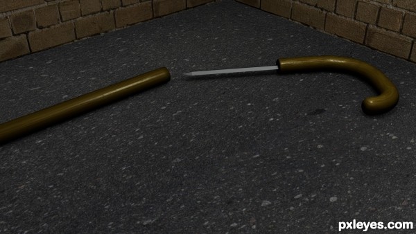
Walking stick with hidden knife.
All made in Blender 3D. (5 years and 3128 days ago)
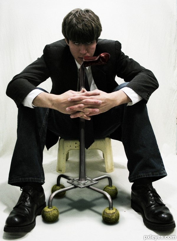
maya and MR playing with fur and MR please view HR as it is a bit dark. (5 years and 3128 days ago)
Credit to Wookiestock for the sourced sitting boy
Howdie stranger!
If you want to rate this picture or participate in this contest, just:
LOGIN HERE or REGISTER FOR FREE
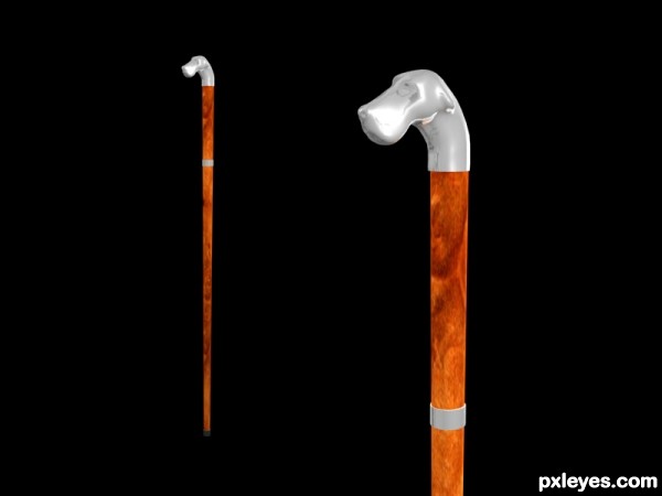
Modelled and textured in 3ds Max.
The wood texture is the burloak.jpeg that ships with the 3ds Max 2008 tutorials. (5 years and 3130 days ago)
The hound head is a bit too matte and flat finished, but the stick itself if beautifully textured and colored! You should make the hound head less gray, matching it more to the stick.
You're right MossyB. I just changed the head texture with some chrome. Thanx.
first of all you should add an SBS for the entry
great effort with this one but I suggest to add an HDRI map for the reflection and replace the black bgackground , and finally I suggest that you focus on one of the sticks and add a blur effect (depth of field DOF) for the other one ....
GL Author ...
I think you're right. But I don't know if I have the time anymore. Thank you Bitmap.
Looks much better with a bit of reflection on the hound's head. Good job!
Thank you MossyB.
Howdie stranger!
If you want to rate this picture or participate in this contest, just:
LOGIN HERE or REGISTER FOR FREE
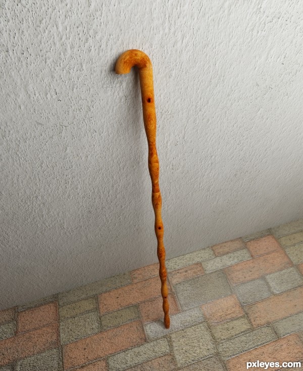
All made in 3dsmax.. (5 years and 3134 days ago)
Nice work, but the crooked floor would have the walking stick falling over onto the ground very quickly...Straighten it out, and you will have a beautiful render, because the textures and colors you have used are very complimentary to the interesting shape of the walking stick, it's just the wonky angle that is hurting this entry.
nice work.....
Thank u for ur advice & comments MossyB..
Thank u Sanju...
Great materials ..
nice overall ... GL Author
Thks Bitmap...
Howdie stranger!
If you want to rate this picture or participate in this contest, just:
LOGIN HERE or REGISTER FOR FREE
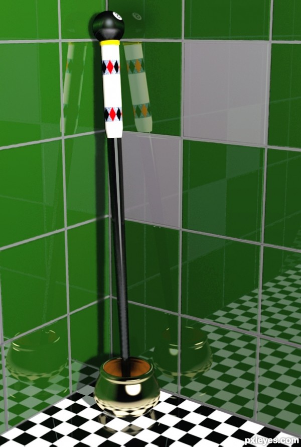
(5 years and 3136 days ago)
Nice render, just a thing: try to make joints between wall tiles without reflection (tile adhesive don't reflex) Good luck!
You are so right enblanco, thanks for the spot. Made a correction.
The light reflections on the base showing on the tiles do not correspond with the direct light source reflection on the base itself (it's all a bit too bright, as well). The walking stick itself shows NO light reflections or refractions, which is odd, considering that the black lacquer of the stick, and most likely the "8 ball" on top would show something, and not just be flat, matte black...
Lovely render, just needs a little tweaking.
Nice, but I would adjust the uvw map of the floor so that the tiles on the right are not cut in half.
Thats better! 
That is either some new or very clean tile, the reflections look so real! Very nice work, author, I like that you made the diamond design in photoshop. Clever stick for a hustler. 
Great improvement, wonderful results!
Howdie stranger!
If you want to rate this picture or participate in this contest, just:
LOGIN HERE or REGISTER FOR FREE
Great render - It tells a story, and makes you wonder why it is abandoned on the street, unsheathed...Looks like it didn't help the owner when he tried to use it...You should add a bit of blood onto the street or the blade. Nice work!
I would brighten it up just a tad, but otherwise it's great!
MossyB: Glad you like! BTW, I had the same idea.
Mimibeth: I agree for that, thanks!
Howdie stranger!
If you want to rate this picture or participate in this contest, just:
LOGIN HERE or REGISTER FOR FREE