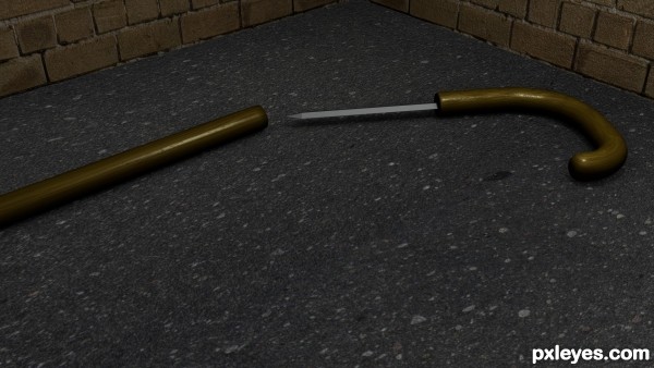
Walking stick with hidden knife.
All made in Blender 3D. (5 years and 3108 days ago)
(5 years and 3123 days ago)
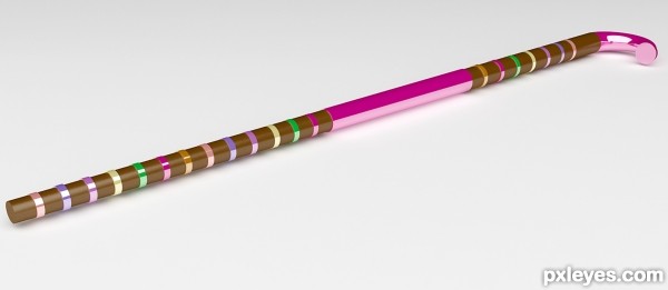
Very nice walking stick and yes, suitable for cute girl  Well done
Very cool  Reminds me of that candy thing you eat at Christmas :P GJ
thx guys, i just wanted it to look deliciously attractive 
Nice color variation .....
the render should have been better than this ... but it's OK now
Any way cool work and nicely done
GL Author
pretty!!
thank u all, and ill try to work on my rendering skills
very simple render.. and very grandly done.. excellent
COOL...really cool..
Howdie stranger!
If you want to rate this picture or participate in this contest, just:
LOGIN HERE or REGISTER FOR FREE
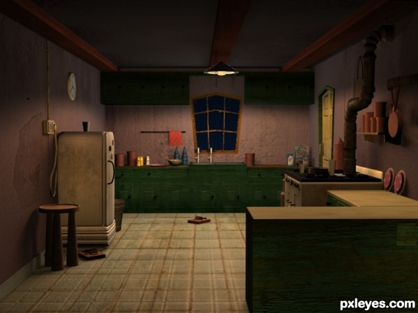
I made it and i used only standard lighting... I didnt use Mental Ray or Vray render engine... I used scanline render engine (Default of 3ds max)....
I hope you all like it... (5 years and 3565 days ago)
Nicely done. It looks really good.
you done good
Howdie stranger!
If you want to rate this picture or participate in this contest, just:
LOGIN HERE or REGISTER FOR FREE
(5 years and 3636 days ago)
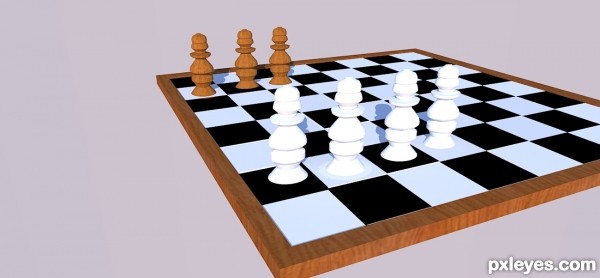
The pawns are not symmetrical....In the black side...the first pawn is fat and the others are thinner.....Nice try though...
thanks for comment.I have resized the first pawn.
Nice job. Give Govindrathod a golden medal for his comment!
good and simple 
awesome =)
nice, good luck to you. I haven't tried too much with 3d but it looks to be difficult to get dimensions just right.
Howdie stranger!
If you want to rate this picture or participate in this contest, just:
LOGIN HERE or REGISTER FOR FREE
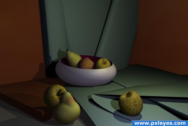
No meshes used simple primitives and the colour and texture editor for apples and pear skins.
Bryce prog used. (5 years and 3798 days ago)
nice work
Beautiful! Looks almost real.
gud work
I really like the dimmer lighting here...good color choice too. 
NICE
This looks really cool, but there's something about the shadows of the apple that's bugging me. Why would the shadows be different colors? One's kind of bluish while the other is greenish. Seems like different light intensity would change shade, not tint. And, if I imagine where one of the light sources is, the bluish one seems just a tiny bit big. I dunno. I could easily be wrong. It's still a cool picture. Good job!
Beautiful!
nice mood of light..gud work
nice choice of elements in this work. fruit and paper look great.
very nice 
Howdie stranger!
If you want to rate this picture or participate in this contest, just:
LOGIN HERE or REGISTER FOR FREE
Great render - It tells a story, and makes you wonder why it is abandoned on the street, unsheathed...Looks like it didn't help the owner when he tried to use it...You should add a bit of blood onto the street or the blade. Nice work!
I would brighten it up just a tad, but otherwise it's great!
MossyB: Glad you like! BTW, I had the same idea.
Mimibeth: I agree for that, thanks!
Howdie stranger!
If you want to rate this picture or participate in this contest, just:
LOGIN HERE or REGISTER FOR FREE