A bold attack is half the battle?
(All models and textures self made, no post processing) (5 years and 3850 days ago)

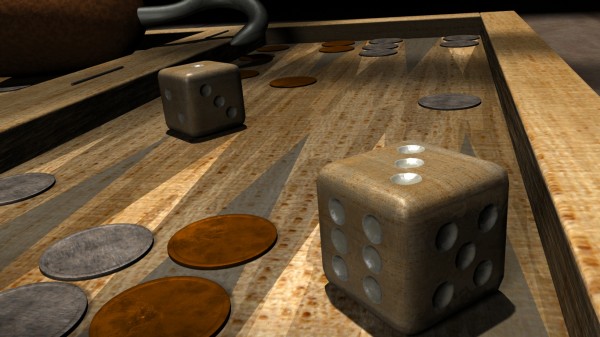
Mid 1600 entertainment below deck. Pirates loved playing back gammon...(?)
Since realism was supposed to be the key in this contest I had to cut the specularity and reflections.
2 image sources from CGTextures used for coloring (see below), the rest was made by me. (5 years and 3849 days ago)

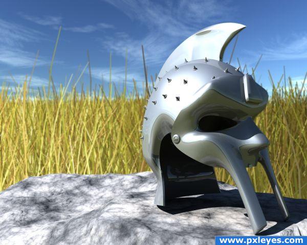
A tribute to the Mark Anthony helmet entry by *** :)
I wanted to make something looking like the helmet/mask in the movie Gladiator, (Ridley Scott 2000). I didn't find any blueprints or good pics for reference, so i improvised my own version. The helmet part is spline patched togheter and the mask is sub patched. No Photoshop post processing.
Edit: Added spikes as details to the helmet and modified the grass. (5 years and 3923 days ago)

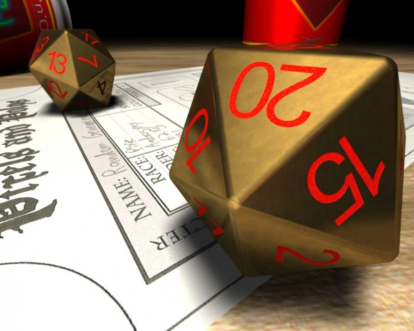
There's a lots of strange dices out there, especially in the world of classic role playing (pen and paper style). So I thought, why did we limit ourselves to the traditional D6?
Every object is self modeled/textured. I used a image from CGTextures for the basic coloring layer of the background table though (see SBS). It all took about 6 hours to render, so I had to cut some effects (such as heavy depth of field and global illumination, high AA/Low AS). (5 years and 3838 days ago)
go to dka120's profile
Wow! Love the use of light.
Very nice render. And SBS is detailed except the most important thing, what program did you used ? So, we are at least two who read it.

Thanks for the feedback billyboy.

The 3D-software used is of course no secret. I didn't reveal it simply because I'm the only one on this site using it (so far?). I'm not sure how to interpret the rule of anonymity. I think I'll have to wait for some mod guidance on that one.
But if you vote - revealing my user name - you can see it in my portfolio (earlier entries).
Amazing light work.
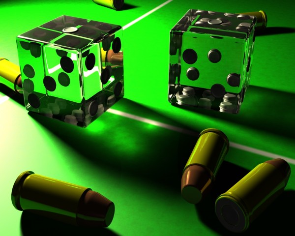
I'm loving the lighting effect the dice creates on the surface of the board. Although not really necessary, a little bit more work — like textures (scratches and or reflections) — on the bullets, and little depth of field would help sell the overall piece! Great job!
Coltranized, thanks, but more reflections would have made it unrealistic (take a look around). I agree about dust and scratch though. It has small amounts, but I had to cut down on many things to get a reasonable rendering time with the caustic effect.
nice caustics!
beautiful job
Congrats for your first place, Dka!
Howdie stranger!
If you want to rate this picture or participate in this contest, just:
LOGIN HERE or REGISTER FOR FREE