(5 years and 3198 days ago)
go to pingenvy's profile
Photography and photoshop contests
We are a community of people with
a passion for photography, graphics and art in general.
Every day new photoshop
and photography contests are posted to compete in. We also have one weekly drawing contest
and one weekly 3D contest!
Participation is 100% free!
Just
register and get
started!
Good luck!
© 2015 Pxleyes.com. All rights reserved.


You need to crop the people out
Thank you ibmaxed. I should read more carefully!!

edit...just switched pics
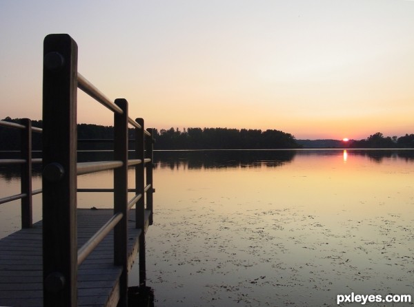
beautiful image, but you may want to straighten the horizon.
Thank both of you. Friiskiwi, the horizon is now flat as a pancake.
Thanks, I do like straight horizons.
Howdie stranger!
If you want to rate this picture or participate in this contest, just:
LOGIN HERE or REGISTER FOR FREE