(5 years and 3164 days ago)
it's beautiful, buti like it more in in color great work
here i used only the source, difference clouds and radial blur, it wasn't easy to choose the color, so i made it b/w (5 years and 3163 days ago)
it's beautiful, buti like it more in in color great work
thank you, what if i post one more entry in color)))
nice one!
thank you!!!
attack of the Psycho Sperm.. lol.. talk about a deadly evolution LOL.. good luck author
Fun idea. I, too, find the Step 4 color stage to have more compelling potential. More contrast to the 'hairy things' in this black & white version would add drama IMO.
Beautiful work!
Beautiful work author...Reminds me on some kind of virus or bacteria...best of luck
thanks a lot!
In a microscopic point of view this one is swimmingly catch my eye. lol! This is great work author. Good luck!
thank you so much!!!
nice work.............
super work author.. GL
Great work and very nice in color too
Congrats!!
Congrats
Congrats nicely done
Excellent job! Congrats!
Howdie stranger!
If you want to rate this picture or participate in this contest, just:
LOGIN HERE or REGISTER FOR FREE
(5 years and 3161 days ago)
beautiful
thank you!
Amazing, perfect!!! :o
thank you!
Very nice work author...Great job with the mood...Best of luck
many thanks!!!!
Nice image, i like the coloring.
thanks!
great job!
Beautiful work author!
great job author..nice color..
thank you!
Very COOL!
very lovely.... love this.
Beautiful work author GL
Congrats!!
Congrats on your 2nd place...
congrats
Howdie stranger!
If you want to rate this picture or participate in this contest, just:
LOGIN HERE or REGISTER FOR FREE
NO EXTERNAL SOURCES USED (5 years and 3154 days ago)
I would make the flower bigger so it hides the hand ( which is difficult to render corectly) and also to take the eyes away from the other possible mistakes ( lack of pelvis, neverending butt).
Nice crop & colors.
butts differ!
True!
Butts may differ, but NONE of them have the leg going up into the crease as you've rendered it...The left "cheek" is larger and hangs lower than the deformed right one with the poor right leg caught in the middle.
as the other leg is not completely vertical, i think that's exactly how a but should look like in that position, congratulations author! niceeeeeee work, good luck!
thanks for the comments!
I think what we're finding distracting is the "ending" line of the right cheek should be more horizontal than vertical. It would softly underline the cheek, completing its roundness. As positioned, it does appear the front / right leg is tucked between two cheeks instead of attached to one of them. What a nice idea, though.
I don't care how the butt should look like... I think this butt is one of its kind... hehe... I loved its... Best of luck...
oh, many thanks, nilknarfsoive!!!
Nice piece of work author......GL
Great entry...Top favorite too!
thank you, guys!
super work author... GL!!
thanks!
Great work! I really like the idea.
thank you!
wow, good luck!!
many thanks!!!
good luck!!
Thank you!
Nice Buns! (very well created author, very Picasso!)
thanks
Congrats Androla!
Congrats, nice work
Congrats!!
Congrats for 1st!!
congrats, I knew this will win
Congrats ... was there ever any doubt
thank you everybody!!!!!!!!!!!!
Howdie stranger!
If you want to rate this picture or participate in this contest, just:
LOGIN HERE or REGISTER FOR FREE
(5 years and 2781 days ago)
goose bump image you had too much fun with this, and it shows LOL
Little Red Riding Hood: what big eyes you have! very funny
Creepy cool, love this! Very nice lip and eye color contrasting with desaturated remainder.
Howdie stranger!
If you want to rate this picture or participate in this contest, just:
LOGIN HERE or REGISTER FOR FREE
go to Androla's profile
Photography and photoshop contests
We are a community of people with
a passion for photography, graphics and art in general.
Every day new photoshop
and photography contests are posted to compete in. We also have one weekly drawing contest
and one weekly 3D contest!
Participation is 100% free!
Just
register and get
started!
Good luck!
© 2015 Pxleyes.com. All rights reserved.
Very well done...nice idea
thanks!
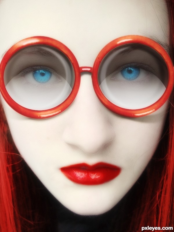
i like the effect very much, bravo , you can clean up a little the face the hair and rotate very little the face (has a small angle on right) overall I see this more like design , advertising ...is good!
edit: and the lips need adjustments on the shape
thank you for advice! i didn't change the lips, but cleaned the skin
well, i've changed the lips a bit
how is this related to the coffee cup?
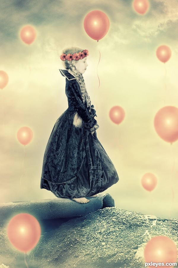
awesome Idea, great use of the source
thank you!
very cool image and smart usage of the source image...best of luck author
many thanks!!!
thanks!
WOW
Nice entry and cool one! Surely a high rate from me. GL!
Nice one ....GL
Question: Since the red rims of the glasses share the same light source (light reflections in same position), how come the lenses reflect light sources and create shadows from two different directions (like one is a flip of the other, instead of a duplication)?
By the way, I love the highly "polished" look of the model - great job with the glamor.
Congrats!!
Congrats
Congrats...
Howdie stranger!
If you want to rate this picture or participate in this contest, just:
LOGIN HERE or REGISTER FOR FREE