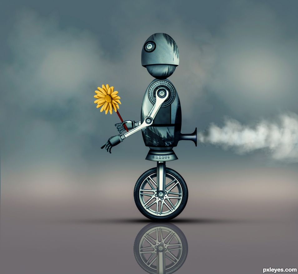
This was made with the Source Image only. Check out the SBS to see how it was made. (5 years and 689 days ago)
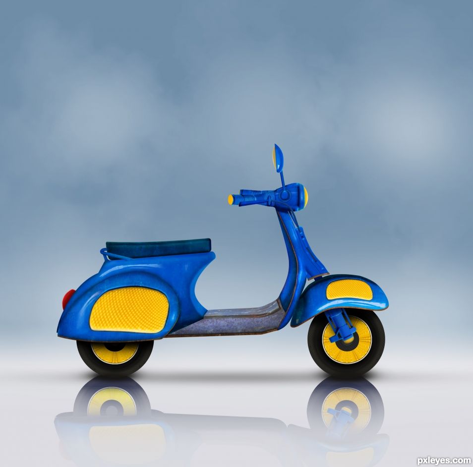
All source except for a texture. See SBS. Background was just Color Fill layers and Brushing. (5 years and 778 days ago)
Superb.
TY. Sometimes these things come together.
Excellent work.
Thanks my Angel. 
Lovely, though my butt's to big! 
My scooter company is working on a larger model about this big. https://media-cdn.tripadvisor.com/media/photo-s/07/ad/ef/29/the-giant-scooter.jpg
so perfect !
TY lolu.
I read your SBS and to a newbie this is really educational. How do you cut out the pieces so precisely? ..Do you use the pen tool? I have to tell you that after viewing KILL, and BANG and explosions and more explosions and fire..... to have come upon your little scooter, peaceful in blue, nice reflections, cool blue to calm the heat of BANG BANG BANG was simply a joy for my eyes. This, to me, is top notch work. I love it.
The source pieces were easy to cut out with the Pen Tool (with a 1px feather) since there was a lot of curves and straight lines. After some of the pieces, such as the rear fender and under the seat, were Warped and Puppet Warped into shape I did have to Pen them out one more time to get perfect lines and curves.
Thank you for that...I''m going to research out the pen tool because I rarely use it.
I rarely use it too. I wish we could change the color of the outline that it makes as well as the color of the nodes. They get hard to see because they are grey.
Just that.... very good... congratulations...
TY George. It came together pretty easily. I should make a video tutorial on how it was made.
Can you do that? Make a tutorial? Where can we watch it....let me know PHULEEZE?
Congrats Brother B!
Congratulations. A well deserved win.
Howdie stranger!
If you want to rate this picture or participate in this contest, just:
LOGIN HERE or REGISTER FOR FREE
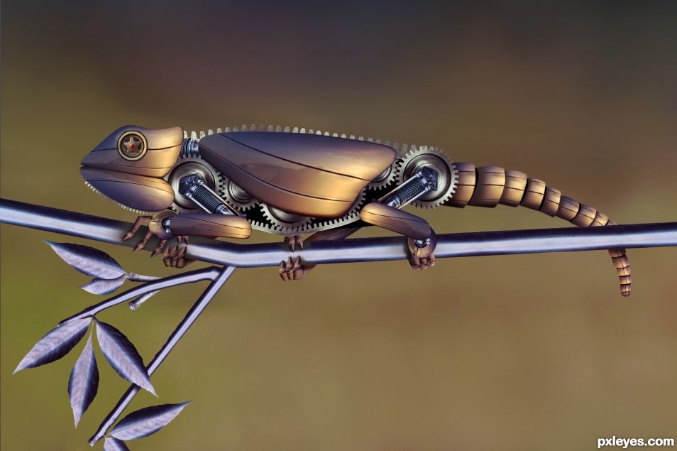
SBS included.
Robotic Chameleon made mainly with a scooter, motorcycle, and gears. Leaves for texture only. (5 years and 710 days ago)
Slick! 
Thank you. It all came together nicely. 
Great work.
Thank you skyangel
I will try NOT TO GUSH. From the shadowing aspects, to the realism/yet surreal to the colour palette of warm glow on the chameleon the the steel branches this truly rocks. I thank you also for your SBS which is a lesson (for me) and a valuable tool to learn from. Thank you for being on this site.
Thanks Still. It all melded together somehow. With the steel branches it turned out nice. Glad you like it.
Fantastic work ! Good luck author !
Thanks lolu.
Congrats on the win and the high score.
Thnx lchappell. I appreciate it.
Congratulations. Excellent work as always.
Mooohalo...
Howdie stranger!
If you want to rate this picture or participate in this contest, just:
LOGIN HERE or REGISTER FOR FREE
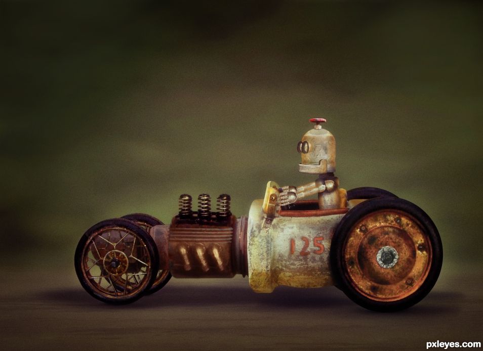
All source except for the wheels, seat, engine springs and exhaust. Even the Robot was created entirely from source. See SBS (5 years and 725 days ago)
Great, love his face! 
Thanks CM. Simple but effective. 
Sigh, I have just spent the last 10 minutes reading and thinking about your SBS, simply mind-boggling and the end result is just incredible. I have recently been educated by a master chop and photoshop manipulator on some of the finer things to look for when reviewing work on this side of pxyleyes. Your shadows are realistic, your blending is splendid your SBS is educational and dear author, you get high points from me. THANK YOU for being here.
A question: How do you make your work look like it is NOT PASTED ON. When I do PS my stuff looks pasted on. Thanks
That is a very difficult question. This Chop had some difficulties but also had some good things going for it. The main problem was the car external source was underexposed, and had lot of lost detail. Due to loss of detail, I probably could not "lighten" the car parts to match the source pipes, so I decided to darken the "source" pipes to match the car parts. You can see this in the engine block, the heat-fin thingy, and the front end part in steps 7, 8, and 9. Color Match worked good as a start (which took a bit of finagling) and then some lighting/color adjustments to dial it in.
Cutting things out properly is vital too. I generally use a 1px feather when cutting things out but sometimes that is greater or even much much much greater. The enemy is a "hard edged cut out" that looks like a cut out. If the 1px feather doesn't look good you can always re-mask and re-feather it as you already have your "base-line" cut out. Also cleaning the edges from **ANY** fringing, to me, is key. Even something minor like these "yuckies" on this spring should be taken out IMO https://image.ibb.co/dn0nr8/springs.gif. This is rather easy to do. Clip a layer on top of the springs. Sometimes I use Multiply, Hard Light, Overlay, but this time I kept it at a Normal Layer. Then just clone in some matching color from the springs to cover the yuckies and it will lessen that "cut out look".
Also when blending something in, remember that you do not always have to use a 100% brush while masking. A lot of the time it's best to use a lower opacity soft brush (22%-44% in my opinion but u can go higher or lower if needed) and just keep brushing from the outside to the inside which will create sort of a feathered mask. It takes time, but your blend can come out WAY better. Don't forget you can change the hardness of your brush so sometimes a harder brush will do better, but this is not usual.
Get used to your Pen Tool when cutting something out and make sure you can set your mouse/tablet to a lower DPI to make it move slower when using a Lasso or even while painting/masking. Use Smart Objects when you can, and also use Clipping Mask layer adjustments. You shuold almost NEVER work destructively.
Beyond that the brightness and color should matching, which is a whole 'nother ball game. Sometimes you may even have a bright/dark "spot" on something that needs to be taken care of, so that will have to be masked (generally with soft feather)and adjusted accordingly.
Proper shadowing or lightening of areas is also vital. A lot of the times you should use several layers when making a shadow. Make a darker one on top (this one will generally be smaller in size), and get lighter and lighter towards the bottom layers (these I generally make larger and lager). You want to do it this way because if you put the lighter shadow layers on top of the darker one, it may make the dark shadow layer TOO dark. You can change your brush shape with F5, so a lot of the times it's best to use an "oval" brush when doing this.
I'm probably missing a million things, but these are the ones that popped into my head while sitting here. Watch YouTube videos. Besides looking at other's work, it's one of the best ways to learn. Hope this helps.
"Hope this helps."
Hey, do bears fart in the forest?
YOU BETTER BELIEVE THIS HELPS. Thank you so much. I have faved this and will have it in my files to refer to, thank you again for your talent and generous heart.
Great work.
Thanks SA. It all fit together nicely. I had two final versions and basically after a coin toss, I decided on this one. The other one didn't have that "old fashioned" look but it was definitely awesome too. Sometimes nothing is good enough, but this time I had two to choose from. Not a usual situation.
You could have put both in the contest if they look different enough. You are allowed more than one in a contest.
Congratulations BWR. A well deserved win.
Mahalo seestah. My score surprised me. Didn't expect that high.
Congratulations BWR. It was the winner all along mate. 
It all came together pretty easily actually. Once I found that source car, it was destiny. 
TY BTW.
Congrats on this well deserved win! 
CONGRATS FOR FIRST PLACE
Howdie stranger!
If you want to rate this picture or participate in this contest, just:
LOGIN HERE or REGISTER FOR FREE
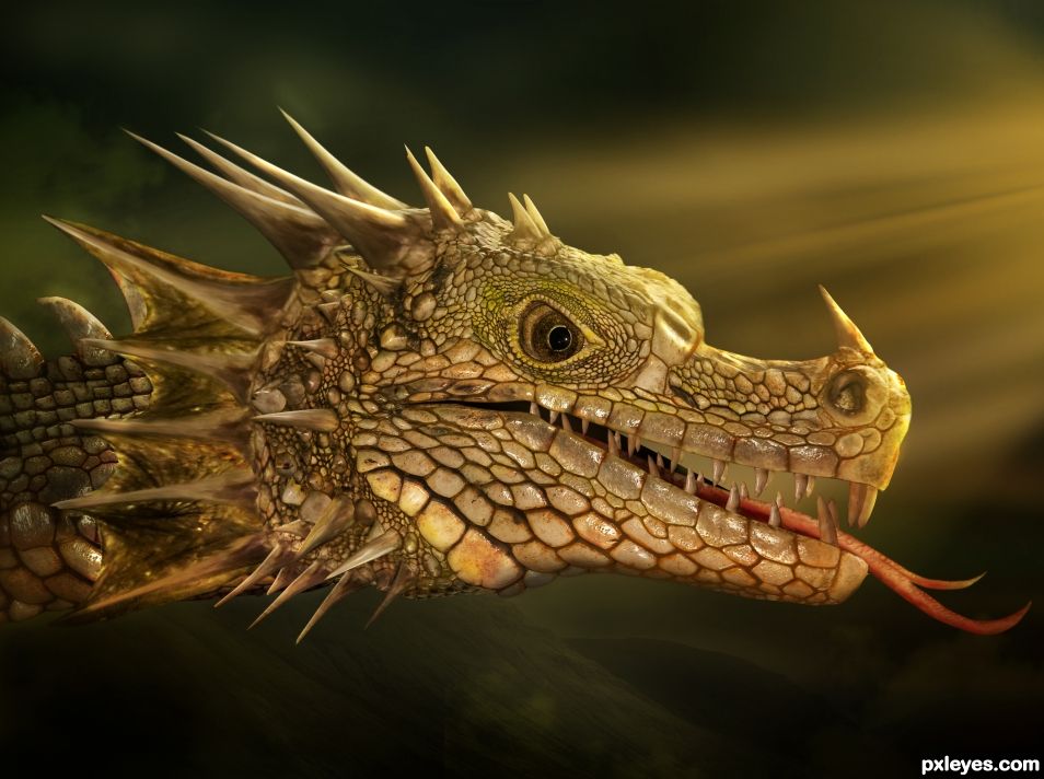
Please view SBS.
Dragon made from an iguana. Head-wing is from a bat. Teeth are from a crocodile. Tongue is from a cow. (5 years and 912 days ago)
Nice work, well done!
rturnbow. I need a vacation after making that one. 
I meant "thanks rturnbow".
Please add the source for the tongue.
Take your pick..
https://media.giphy.com/media/12N7qJJSez3Ggw/giphy.gif
https://media.giphy.com/media/VFZDuY0nePXry/giphy.gif
(added it to the sources BTW)
LOL... thanks.
A very.... good job.... WOW!
Thanks Sir George.
Congrats BWR, fabulous work 
Mahalo MM. WTH do you have to make to hit 70 points? I have yet to hit 70.
Congrats, really well done!
Congrats BW 
Howdie stranger!
If you want to rate this picture or participate in this contest, just:
LOGIN HERE or REGISTER FOR FREE
go to BWR's profile
Photography and photoshop contests
We are a community of people with
a passion for photography, graphics and art in general.
Every day new photoshop
and photography contests are posted to compete in. We also have one weekly drawing contest
and one weekly 3D contest!
Participation is 100% free!
Just
register and get
started!
Good luck!
© 2015 Pxleyes.com. All rights reserved.

Brilliant.
Thanks SkyAngel. There wasn't a lot to work with.
Nice, clean and fun. Gem is the sbs. At your level the only thing i can mention IMHO, is the reflection. I feel there should be a perspective simulated as it is projected on a plane, and in that you would see a subtle depth blur approaching the viewer. Fantastic!
Thank you and I couldn't agree more. Problem was that there were hundreds or maybe a thousand layers. I was working with mainly smart objects too. So all that stuff really was lagging my computer. At the end even a rotation was taking 10 minutes and a save was over 45 minutes. The reflection was the last thing I worked on and it was a huge pain in the butt. I pretty much could not do it any better due to the lag.
I was so afraid to flatten/rasterize the Smart Objects in case I wanted to change something, but at this point with everything done that won't be an issue. I can just open it (while waiting 20 minutes), rasterize what I can, and wait 10 minutes each time until the lag subsides. Then I can do as you say. I was hoping to get away with it but your Eagle Eyes dialed right into that error.
I probably need to learn how to manage those Smart Objects and stuff.
Your over complicating it. ZOOM in on the part if the image you want to be reflected and screenshot it. Paste that back into the original. A reflection is never expected to have the same clarity as the original focal subject.
use the principle of "green screen" as a background to make selection extraction easier and you have ONE clear simple jpg to play with.
Once you see the spacial illusion it creates your smile ear to ear!
Well I tried. I researched reflections extensively for hours. Watched many Youtube videos, read many tutorials, and Google Imaged till my eyes bled. It seems when the subject is level with the ground/water, the reflection is basically a "mirror" of the actual subject. As for the shape of the reflection, there may be some slight Skewing or maybe some types of light/medium distortions caused by complex light sources, but none of it appeared drastic or changed the overall shape of the reflection. Yes the reflecting surface may cause various types of "ripples", especially water, as well as Hue/Sat/Contrast etc changes, but I am saying that the overall shape of the reflection is consistently VERY similar to the subject's. It seems you basically take the subject, flip vertically... Voila!, instant reflection.
In my searches and tutorials I am not seeing any Perspective changes where the reflection appears to be coming "at us" in the way a shadow would act. I made some gifs and one jpg here so you can see what I am saying. https://imgur.com/a/QHr7qi5
Also here is a Google image search for "bicycle reflections" and "mountain reflections". The results were the same no matter what I searched for on Google. As a not, severe blacklisting from sunsets seemed to make the most difference in the shape of the reflections.
www.goo.gl/1oVo1r
www.goo.gl/sKR4bk
So, I am pretty stuck as to what to do. I think I may gradually mask it, blur it some, maybe turn down the contrast, de-saturate or otherwise mess with the color, and call it a day.
For my final thoughts, the reflections seem to be going "downwards" rather than "at us" like a shadow would. Perhaps one of our Photographers or other Photoshoppers can chime in, or maybe you can show me some Chops or images that replicate your idea. That would be way cool.
This upload was an education. What I liked most about it aside from the technical excellence was the humour....the fart propelling this handsome brute forward! LOVED IT and top marks. Very inspirational as always.
Mahalo seestah.
Congrats BW
Mahalo Z. Started off making an oval for the the body and went from there.
Congrats for first place BWR !
Mooohalo lolu.
CONGRATULATIONS on first place.
TY seestah.
Good on you for number two ! Congratulations.
oooooops I goofed. sorry.
Haha.
Howdie stranger!
If you want to rate this picture or participate in this contest, just:
LOGIN HERE or REGISTER FOR FREE