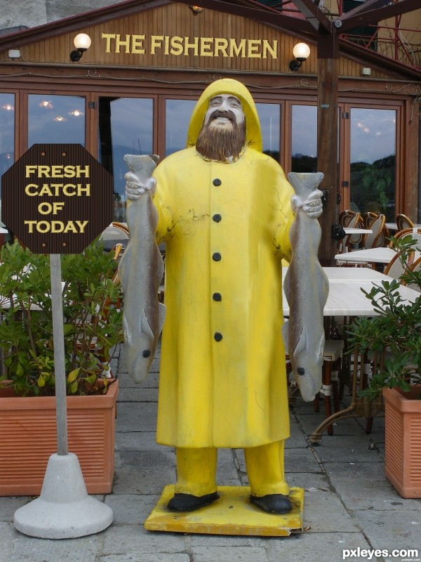
(5 years and 2953 days ago)
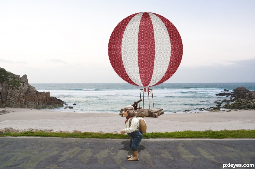
Stranded on a beach (5 years and 2558 days ago)
| No comments yet... Be the first! |
Howdie stranger!
If you want to rate this picture or participate in this contest, just:
LOGIN HERE or REGISTER FOR FREE
(5 years and 2555 days ago)
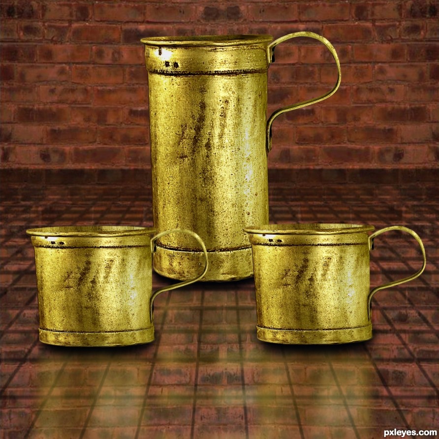
Not bad, try some shadows.
Thanks CMYK46 :0 I have some on bottom ...Do I need more?
I don't see them, and you've created conflicting light sources by flipping the cup at right. The light on the others is from the left.
Thanks I'll get on it. 
The perspective is off. The cups in the foreground would be much rounder top and bottom and you would see into the cups at the tops since they are below eye level.
Thanks spaceranger I will take care of. 
You always have to think..."where is my light source?" even when collecting stock photos to use. I have turned down fantastic stock photos simple because the light source did not match with the piece I was working on. If you don't think where your shadows are CMYK46 will be the first to let you know! lol isn't that right Bob? :P
He does know what he is talking about.
you know what would be nice...is if you,
duplicated the cups
flipped vertically
Gaussian blur about 40%
drop opacity to 30%.
then you would have a nice reflective surface coming from your tiled counter.  look sharp!
cool! now take the farthest cup reflection, and erase gradually. getting heavier with the eraser as you get closer to it. This one in the back would be less prominent then the others. Also gently erase the reflection where the bottoms meet the existing cup. I would say about same distance as your shadow.
Thanks I took care of and Thanks for the help. 
Thanks! 
Your corners are still too sharp on the 'cups' using the ellipse will create the correct shape, also the dark line at the top of the cup would also have a slight curve - following spacerangers advice regarding eye levels. Lastly take some time to clone out the repeating patterns you have on all the cups. (make the two front different to the one at the back)
Thanks 
Took care of.
You've done a great job improving your entry! Listening to helpful advice from these good members will make you a better artist. No matter what the outcome of the contest you should be proud of what you've done and your willingness to accept advice has earned you my respect.
Thanks! I have always appreciated the advise I've got from those in here who have helped me through the years on here. There has been good times and bad. I can say I have learn from members on here and they all know who they are.Yea I haven't done anything in here for a while but trying to fit time in for it.  And Keep Learning!
Howdie stranger!
If you want to rate this picture or participate in this contest, just:
LOGIN HERE or REGISTER FOR FREE
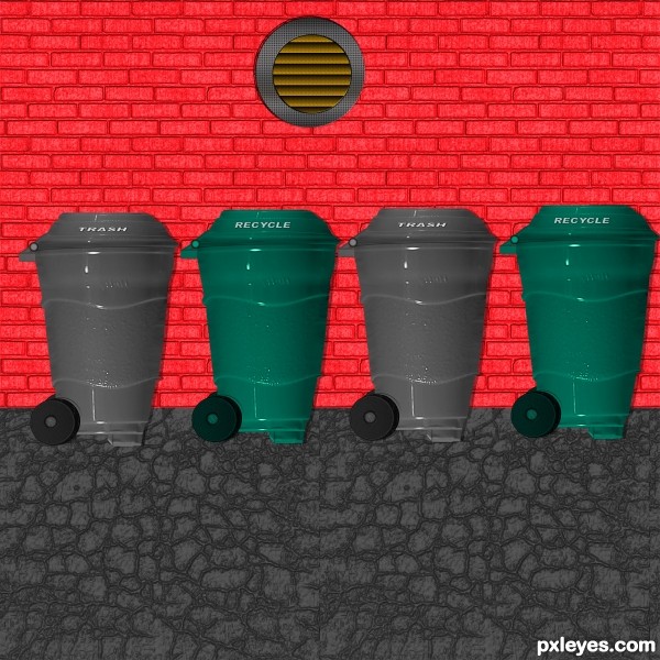
Please Note I have a texture effect tool that I have loaded with textures to add to what ever I want. Brick done with texture tool and the ground cover not from a source. (5 years and 3047 days ago)
Might make more sense to have a grungy surface, rather than a shiny reflective one, don'tcha think? 
Thanks CMYK 46 Hows this I made an old cracked black top look by taking a gray and adding a crack texture to look like crack filler using my texture tool. 
It's better, but think about your light sources. The light on the gray bins is opposite the light on the green ones.
CMYK46 Again Thank You I switch around 
I think that is very creative. Yes, it would look nice a little dirty, but with the refelctive surface it reminds me more about the cups.
Not sure what effect your going for, but I would like to see the ground transformed with the perspective tool. The cracks should look smaller the further they get from your eye. Good Luck!
Yep gotta agree with everyone above. Nice thinking with the source image. I like that you think a bit outside the box. Chalty has a good point about the perspective. 
Good use of the source...... good luck author.
Howdie stranger!
If you want to rate this picture or participate in this contest, just:
LOGIN HERE or REGISTER FOR FREE
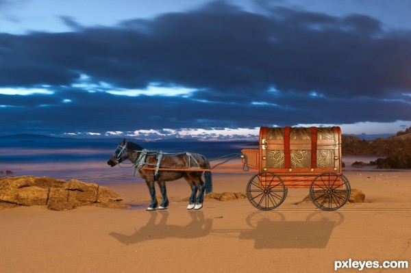
Spec Thanks to cindy4752 for use of this picture found on flickr photo sharing.com and on cindy47452's photostream
Spec Thanks to mqtrf. for use of his picture found in member stock on pxleyes.com (5 years and 3324 days ago)
Something Missing here ahhh the horse nice idea 
the horse look good now 
the reflection would be improved it you used some perspective transform on it to bring the bottom forward -- maybe a different background as well
Wsco I got your horse yea I worked on it all afternoon Thanks
Alan2641.... I just got your comment I did a redo but it was before I saw your comment What do you think of this 
sure it was the old west and not the dark ages :p lol
it is good work, pity there is no background or even ground.
Thanks Keiley22 I took out the black backround and reflection Do you like it now.....lol
i think shadows needs some blur well done
nice idea, shadow is not ok...see the light source. still it's a good entry. BL
weso Thanks there was a 3% gaussain blur added to it
Thanks gopankarichal I'll check it
looks much better with a background author  well done
Ok Thanks guys for help I just did again and added more blur and lightened up the shadow and Thanks Keiley22 again
Howdie stranger!
If you want to rate this picture or participate in this contest, just:
LOGIN HERE or REGISTER FOR FREE
go to Chuck's profile
Photography and photoshop contests
We are a community of people with
a passion for photography, graphics and art in general.
Every day new photoshop
and photography contests are posted to compete in. We also have one weekly drawing contest
and one weekly 3D contest!
Participation is 100% free!
Just
register and get
started!
Good luck!
© 2015 Pxleyes.com. All rights reserved.

Doubled the catch! the 2nd arm junction is very well made. GL
Thank You I also added a second lamp and sign and changed name on rest.Thank you I've been away from doing entries for a while doing other things Thanks for comment.
since the original photo is mine, and the Genoese are known for their greed, you did it to show that we are generous? two arms cost more bravo
bravo
LOL Thank You!
lol, I like this one =)
Thank You!
Howdie stranger!
If you want to rate this picture or participate in this contest, just:
LOGIN HERE or REGISTER FOR FREE