(5 years and 3164 days ago)
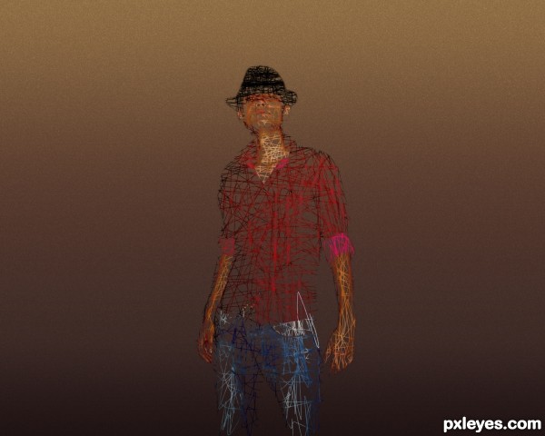
I want to know what others thinks about that, it would be better with a background? (5 years and 3157 days ago)
this is hardly a sketch, and you should link the tutorial! IMHO
It's a very interesting effect, but it's not a sketch as the contest describes...At best, it is a layer mask scribble, so is Off Topic for this contest.
The background is okay, since the body would be your main focal point, but the scribble itself is unimpressive, since there is no direction or emphasis with the technique, just an "any direction" bunch of marks.
I was thinking about the effect obtained if you put a piece of paper over a coin, and "scrible" over it with a pencil...but in my picture, i kept the colors  ...
...
outa the box.. I like it  good luck author (Looks like Freddy)
Thanks Drivenslush, finnaly, someone who appreciate, not criticize.
I like the effect as well.. I got what your concept was, I played with that concept a lot when I was a kid... let mods decide about it being on theme or not.. but your effect, I'm definitely going to try for my FB profile pic.. 
This is cool, good luck Author 
Thanks iquraishi and cabldawg71 !! 
I like the effect too but it's not a sketch because the face is too visible as a photography. Good luck author.
Thanks a lot...now i can wait for mod to remove my work... it's a sketch, a new type of sketch, invented by ME!
Howdie stranger!
If you want to rate this picture or participate in this contest, just:
LOGIN HERE or REGISTER FOR FREE
(5 years and 3171 days ago)
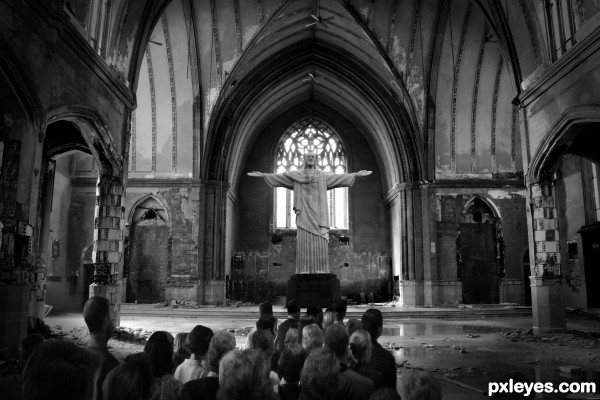
What's the source for the people?
I forgot to add the people source 
This is it:
http://www.google.ro/imgres?q=people+in+church+service&hl=ro&gbv=2&tbm=isch&tbnid=luPkAmTH-iftAM:&imgrefurl=http://www.turbophoto.com/Free-Stock-Images/People.htm&docid=ju6ItyKgYGBFmM&w=2560&h=1920&ei=cVdETpOJMMPDswbr9b36Bw&zoom=1&iact=hc&vpx=185&vpy=97&dur=495&hovh=129&hovw=172&tx=173&ty=118&page=1&tbnh=129&tbnw=172&start=0&ndsp=30&ved=1t:429,r:0,s:0&biw=1280&bih=853
believable scene 
Thanks aheman!
The most artistic one of them all .
why are the people in the ground? atleast that is what it looks like. If they aren't in the ground they are very very small and squished.
No they aren't, to me ,the proportion between people and support poles, seems ok...
Howdie stranger!
If you want to rate this picture or participate in this contest, just:
LOGIN HERE or REGISTER FOR FREE
I will post a SBS soon... (5 years and 3151 days ago)
Needs SBS. Very confusing.
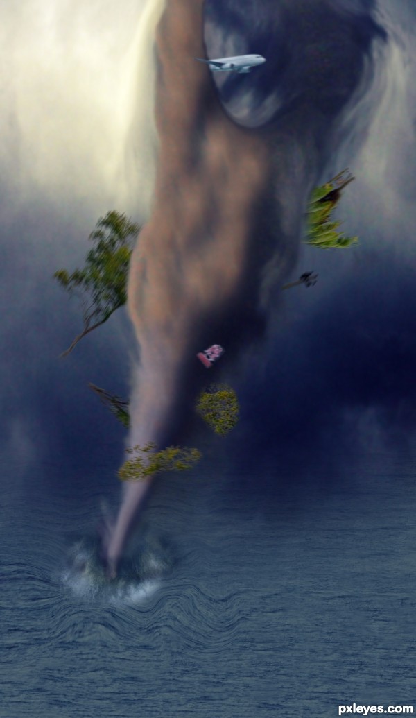
The tornado has no "funnel cloud" shape or movement, and the water waves are very fake looking.
Mossy...i think the tornado no need to be so realistical... but i will try to make the waves look better..
can i say something ?
no ?
I'll say it anyway
entry posted 3 days ago and no sbs Yet
Trees in the middle of the sea !!! OK OK
and yes it needs to be realistic because the plane and trees are realistic
A tornado in the sea is called Typhoon i guess lol
good luck
Yes yes... you're right..i had no time to post it, and i forgot.. so forgive me....
And now i can't edit it..
Good luck author
Wow! Scary!
Howdie stranger!
If you want to rate this picture or participate in this contest, just:
LOGIN HERE or REGISTER FOR FREE

(5 years and 3163 days ago)
simple but effective.. good luck author, I love neon 
Thank you Drivenslush 
Very creative and modern...Love it!
Thank you 
Howdie stranger!
If you want to rate this picture or participate in this contest, just:
LOGIN HERE or REGISTER FOR FREE
go to Darkrider92's profile
Photography and photoshop contests
We are a community of people with
a passion for photography, graphics and art in general.
Every day new photoshop
and photography contests are posted to compete in. We also have one weekly drawing contest
and one weekly 3D contest!
Participation is 100% free!
Just
register and get
started!
Good luck!
© 2015 Pxleyes.com. All rights reserved.

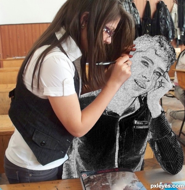
Just lighten the edge where the girl's arm is in front of the boy. Fun image!
Thanks for suggestion, it's better now?
ggrreeeaaattt idea
Try a small soft round eraser brush or a soft brush to mask along the edges of her hands where they rest on the sketch part. Cool idea a little tweak on the masking will do it right.
Good fix, great concept!
Thanks for the tip @lchappell, i will try.
very nice take on this contest -- well done like the effect.
This is very creative, author, and you got a perfect photo to use.
Thank you Pearlie
!
Author I see a major difference. Looking better, glad I had something useful to say for you. Welcome to PXL BTW.
Thank you Ichappell, is nice to be here, around nice and talented peoples. I'm sure i have many great things to learn!
Splendid my good boy .
Splendid my good boy .
Howdie stranger!
If you want to rate this picture or participate in this contest, just:
LOGIN HERE or REGISTER FOR FREE