(5 years and 3142 days ago)

First to submit!!!!!
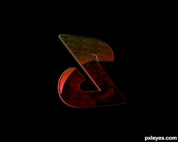
I love this contest. It shows how users are ABLE to interpret other users tutorials. This is the one I followed.
How to Create Fake Glossy 3D Typography
photo sources : http://www.sxc.hu/photo/1334479
tutorial sources : http://www.pxleyes.com/tutorial/photoshop/2316/How-to-Create-Fake-Glossy-3D-Typography.html (5 years and 3367 days ago)
go to Dragoncide's profile
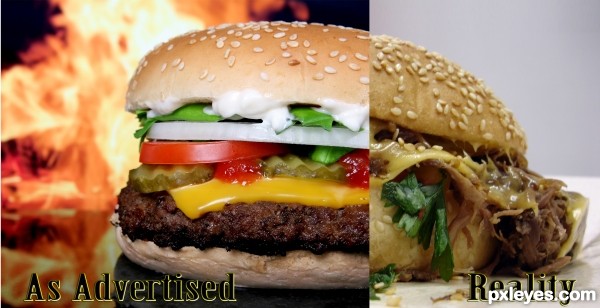
AWESOME AUTHOR!!! Simple and to the point (though bringing up the contrast on the reality burger might help, it's a bit TOO faded.. IMHO.. other then that.. RIGHT ON THEME
EDIT: MUCH improved... GREAT JOB!
ur right it is a bit faded, but it also adds to the point of reality. it dont come out lookin the right colors either ! lol at least in my experience, they never do......
updated the contrast. stil has the effect im lookin for of still not good enough (color wise)
Howdie stranger!
If you want to rate this picture or participate in this contest, just:
LOGIN HERE or REGISTER FOR FREE