(5 years and 3749 days ago)
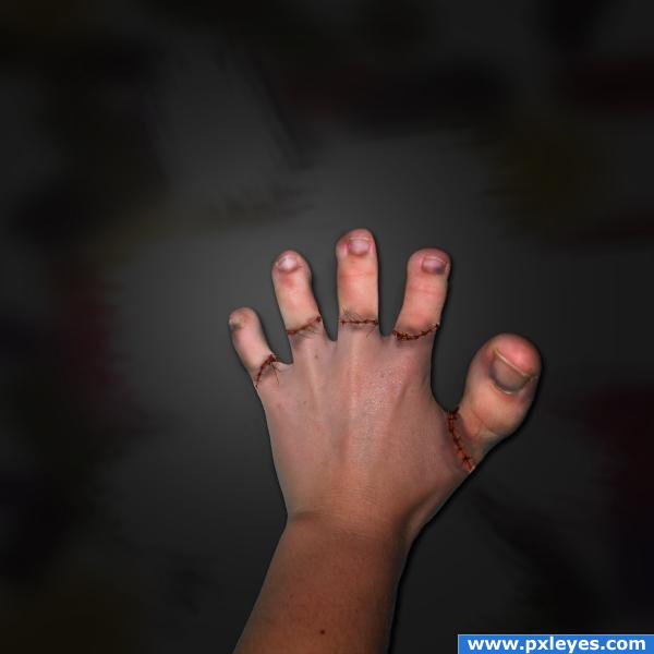
In a dark underground lab, a mad scientist makes experiments on humans, to see if he can "reconstruct" them and become a god of the mankind, to see if the human body can adapt to unexpected changes...Will the toes placed on the hand be able to function...?Will his victim be able to live like this...? (5 years and 3997 days ago)
cool! but you could match the toes with the hand maybe. also, add the stitches part in your sbs 
thank you for the comment and advice elficho, you were fast :d I was still working on the SBS, it's all up now  and the non-matching colors...they are on purpose, to emphasize the disembodied theme. anyway, thanks again
urple .. voting quickly to get away from this entry (very good btw) just very hard to look at.. good luck
Really nice idea here, the toes could do a bit of darkening i reckon, but good luck!
Good and creepy! 
Really creepy...! Love it...in a strange way....! There is still some slight hollow around some of the finger-toes.....! Maybe fix that by defringing or bluring edges....and it's perfect! Best of luck!
Very creepy, in a good way
Frankenstein would love this!  Creepy and good idea!
Creepy and fascinating at the same time! Good work
surgeons take toes to replace severed fingers, pretty good job recreating it!
ACK! That's so awfully creepy!  I can barely look at it!
I have to hand it to ya  great Author is a creepy one for sure
Nice ., i've seen a little similar idea in a movie ' Æon Flux ' ; Love the Stitches., 
bhaha creepy
HAHAHA cool!!
no chewing on your toe nail :P.. nice work
very nice 
Felicitari Giulia!!! 
Congratulations for 3rd
Congrats Giulia!
Congrats!!
thank you guys for the comments and the congrats 
congrats!!
Congrats for 3rd position
Congrats
congrats!
Congrats!
Congrats 
Howdie stranger!
If you want to rate this picture or participate in this contest, just:
LOGIN HERE or REGISTER FOR FREE
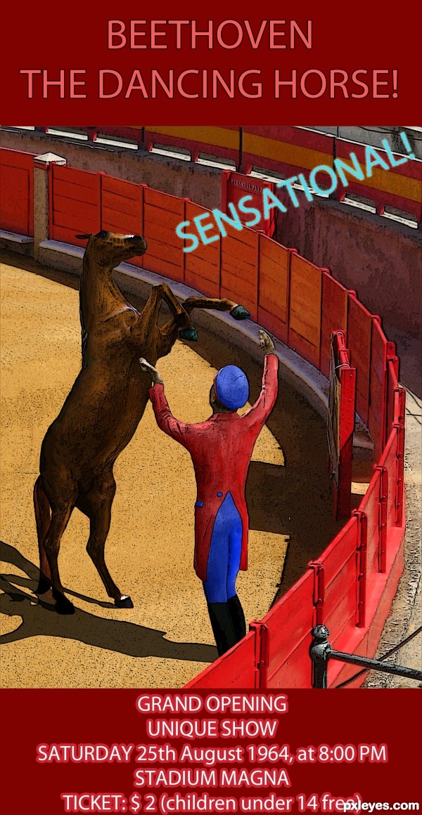
You still go to circuses...? Are they just memories? (5 years and 3604 days ago)
wow, love the idea!
Very Nice, GL 
GREAT IDEA . I LIKE IT. . GOOD LUCK
Very nice idea indeed and good colouring!
Just one thing... I think you should toggle the "n" and the "a" in "sensatioanl" 
Good to see something from you again. I suppose you ran out of excuses? 
Thanks for the comments!
Lelaina, I made the changes, you have a good eye  And yes, today I REALLY ran out of excuses
i like it
Nice mood. It seems people were good to children in the old times... nowadays (in my country at least) free entrance only for children till 3 or 4 years old. And a teen of 14 pays adult ticket! 
Very clever idea. Well done!
very nice work author...i like different approach to the source...best of luck
Pretty well done. Tiny suggestion: you added shadows for the horse and the guy. But there where the 2 shadows hit each other, it's like the one adds more shading to the other (it's darker), wile -I assume- there's just one light source. Therefore there should be only one shadow too (so the shadows shouldnt overlap each other but just be one). Good luck!
Great idea and execution (shadows kind of looks outlined), but really great take on the subject.
Thank you for the comments!
waz, you're right... now that I think about it. I should have done the shadows like you said, but it's late now 
Thank you anyway, I'll know from now on 
good and nice
Congrats for your third place, Giulia! See, having no excuses isn't a bad thing 
Congrats! for 3rd place 
hi,.....congrats,.....very nice entry....
Congrats for your third place
Congrats miss Giulia...
Congratulations! 
And your blog is excellent! 
Oh, thank you very much for the congrats!!! I missed this, finally to have a chop and get comments ♥
And erikuri, i'm glad you like my blog :P
Howdie stranger!
If you want to rate this picture or participate in this contest, just:
LOGIN HERE or REGISTER FOR FREE
(5 years and 3731 days ago)
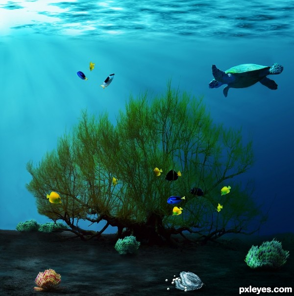
Very nice  and very interesting to see your new entry ^^. I just have a small suggestion of erasing the black strokes around some fishes, this can be seen clearly in the HiRes. Best of luck to you
I really like this one. I especially like how you created the ocean surface (being viewed from below) and the ocean floor as well. langstrum is right about the fish strokes, but again, only on close inspection. My only other nit-picky critique (again, only noticeable in hi-res) would be the pearls by the oyster. They seem to be floating instead of lying on the ocean floor. Maybe some shading or scaling? Just a thought. You have a great command of lighting. Impressive work overall. 
thank you for your comments, I will try to fix the fish asap  Thanks again, much appreciated!
EDIT: I tried to get rid of the black strokes... I hope this is better 


nice job but i think it will be more realistic if you put the algae in the side of the image or if you cut the trunk but still nice idea
beautiful 
Outstanding!
sheeesh... 
 thank you guys for the comments and Favs


Good job! 


Grrrreattt job.... 
Nice idea to turn the tree into a sea- weed 
Howdie stranger!
If you want to rate this picture or participate in this contest, just:
LOGIN HERE or REGISTER FOR FREE

(5 years and 4008 days ago)
good work
The focus is all on the right of the piece.. not that that is a BAD thing.. I'm just thinking how grand this would be as a Xmas Card with the Merry Xmas text in the floating dark area on the left.. for the contest I understand why the text is voided...good luck on this author..
neat
I know that I saw this image before on the pst site  Nice job
Nice!!
This would make a beautiful Christmas card...very pretty, love the Snata and the tree
Howdie stranger!
If you want to rate this picture or participate in this contest, just:
LOGIN HERE or REGISTER FOR FREE
go to Giulia's profile
Photography and photoshop contests
We are a community of people with
a passion for photography, graphics and art in general.
Every day new photoshop
and photography contests are posted to compete in. We also have one weekly drawing contest
and one weekly 3D contest!
Participation is 100% free!
Just
register and get
started!
Good luck!
© 2015 Pxleyes.com. All rights reserved.

outstanding.... Good luck author....
good one
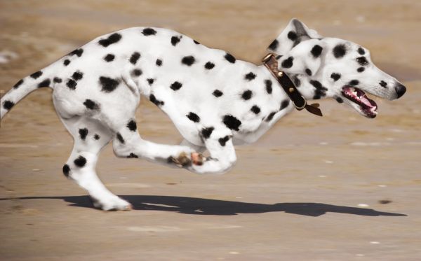
Very good work author...one minor minor suggestion,the black spot above the eye is too big and ruins a facial expression...Good luck
Thank you for the comments

@erathion: made the spot smaller. Is it better?
It is author...u really did great job there...one of my favorite in this contest...gl
Nice job. Would have been more realistic if you had used real dalmatians for reference on the spots.
Nicely done, but I agree with CMYK, about the spots...
CMYK46 and erikuri, thank you for the advice, maybe it would have looked better to use real spots, but I tried and wanted not to use other sources for this one
Good blend. GL!
congrats Giulia!
thank you Oana
Congrats for your second place, Giulia!
Congrats!
Congratulations for 2nd
thank you!!!

Congrats........very well done
Congrats!
Howdie stranger!
If you want to rate this picture or participate in this contest, just:
LOGIN HERE or REGISTER FOR FREE