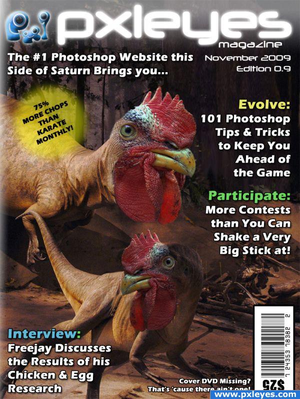
...well, it does doesn't it? :)
[Update] Added a gradient overlay to the LHS to give the effect of it actually being a mag rather than just an image. :) (5 years and 3908 days ago)
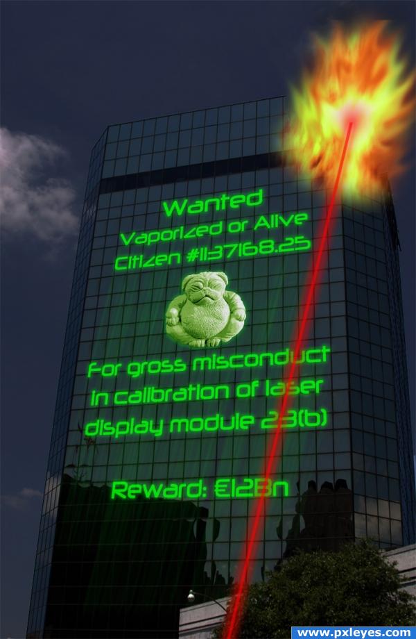
2 Sources:
go to Hippunky's profile
Photography and photoshop contests
We are a community of people with
a passion for photography, graphics and art in general.
Every day new photoshop
and photography contests are posted to compete in. We also have one weekly drawing contest
and one weekly 3D contest!
Participation is 100% free!
Just
register and get
started!
Good luck!
© 2015 Pxleyes.com. All rights reserved.


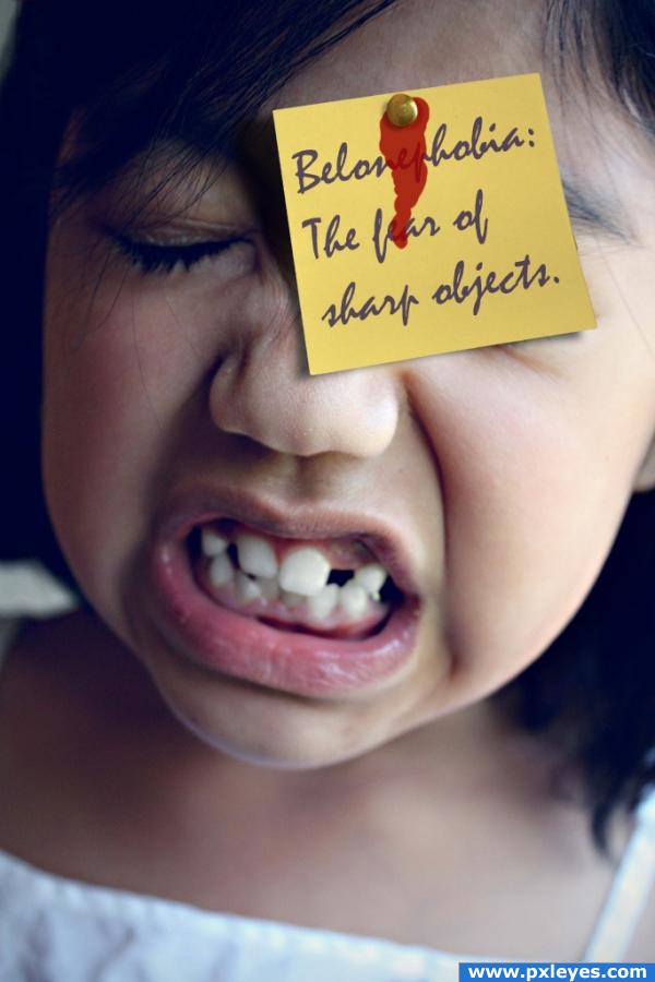

 Thanks for the advice on the shadows - I can see now that the post-it does make the background image look very flat - will sort that out in a little bit!


Nice concept author !!
i'd remove that "missing cover" thing.. i wouldn't want to buy a magazine and read something dissapointing before i even open it.
'tis just a bit of light humour. I'd be put off by the price tag, let alone the missing DVD.
lol.....good job
Thanks - I try my best!
You got my vote Author great layout

super cool! Nice job!
Thanks peeps - you're too kind!
This is really very nice
Hahahaha, great stuff!
Thanks guys / gals - have my fingers crossed for a podium finish...
i like the picture you used, but the white background of the title takes away from it
Without the white background, the title looks a little to 'stark' - do you really think it detracts from the image?
Oh well.....Was surprisaed with the results and i thought it would make top 3.... but my opinion is biased i guess! Congrantulation on 6th anyhow.
Thanks Freejay - and anyone else that voted me up there - 6th is still a podiumish finish - it's boosted my talent at least!
Howdie stranger!
If you want to rate this picture or participate in this contest, just:
LOGIN HERE or REGISTER FOR FREE