(5 years and 3674 days ago)

(5 years and 3678 days ago)
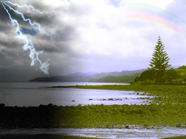
Erase some of the sharp foreground edge at the shoreline to blend it in & this will be great! 

It's fading... 
That´s so clever. Nice work!
Great work...fantastic blend...good luck author
Great idea but the blend still needs some work....
Wher ?????????????
It's obvious you liquefied the side we are looking at. That's where you could have better blended it. Sorry it's too late now but just thought you would like to know.
jawshoewhah thank you
Howdie stranger!
If you want to rate this picture or participate in this contest, just:
LOGIN HERE or REGISTER FOR FREE
(5 years and 3593 days ago)
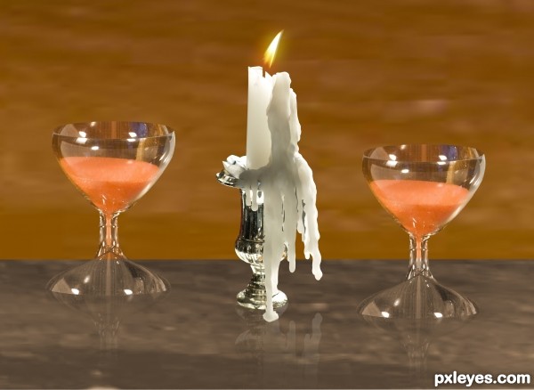
good idea, my only suggestion would be to reduce the opacity of the reflections and you'll have a great entry 
thanks i fix it
looks way better now 
Overall nice entry with some nice reflections. Not sure what the the white line is going through the middle, but it's a bit distraction. Also a full resolution file would be nice.
white line is going through the middle i mean it the glass is Transparent 
it is Separative between the wall and the table
Author, I understand that you were trying to show the transparency of the glasses by splitting the wall from the table. I would only suggest that you make the wall or the table a different shade or color instead of having the white line run all the way through your image. When I step back and look at your image my eyes migrate directly towards that area. There are plenty more details throughout your image which are overtaken by that line. This is just a suggest and after everything is said and done you have some nice work here. Good Luck!
thanks Chalty669 i fix it
Wow! Makes a big difference IMHO. Good Luck!
many thanks Lamantine and Chalty669
thanks 
good luck
Howdie stranger!
If you want to rate this picture or participate in this contest, just:
LOGIN HERE or REGISTER FOR FREE
source only (5 years and 3419 days ago)
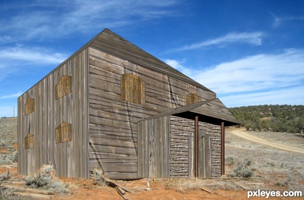
looks weird... image modeler? 3ds max?
Great idea, and perspective drawing, but the shed looks like an illustration still. See the shadows under the boards? Try to make similar ones with the door and window parts - separate them from the main image and then add them. 
good try...nice image.... good luck
Good work on the re-making of the shed.....gl
Howdie stranger!
If you want to rate this picture or participate in this contest, just:
LOGIN HERE or REGISTER FOR FREE
Only source (5 years and 3686 days ago)
Nice idea, but the stones are too green...
covered with Grass and Algae I mean life by green death by dark
not much of a fight.
when you colourized you lost alot of detail... I still have trouble with it myself... and this photo wasn't the best quality for that anyway ( i tried it lol)
might want to work on the blending more, GL
Howdie stranger!
If you want to rate this picture or participate in this contest, just:
LOGIN HERE or REGISTER FOR FREE
go to ONabil's profile
Photography and photoshop contests
We are a community of people with
a passion for photography, graphics and art in general.
Every day new photoshop
and photography contests are posted to compete in. We also have one weekly drawing contest
and one weekly 3D contest!
Participation is 100% free!
Just
register and get
started!
Good luck!
© 2015 Pxleyes.com. All rights reserved.

Nicely done!
fantastic idea.... like it...!!!
Very very nice
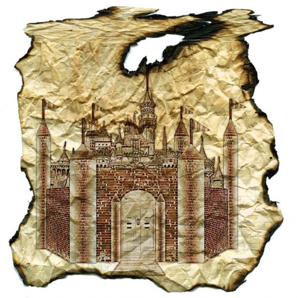
nice final result...perspective of the front wall is wrong...good luck author
Agree with erathion. There's no reason that the supposed vertical lines are almost diagonal. It can be easily be skewed back though. Loons nice for the rest. Good luck!
erathion wazowski thank you i fix it
You went through so much trouble I kind of wish you put the map on a wall or something, maybe lit by touch light. Make it go that last step ya know? Very neat concept though.
Howdie stranger!
If you want to rate this picture or participate in this contest, just:
LOGIN HERE or REGISTER FOR FREE