(5 years and 4038 days ago)
1 Source:
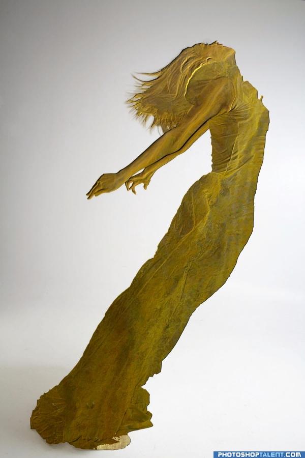
wood sculpture used as texture on the base image for the lace contest
Edit- added a displace map to the bump map for depth. is it better? (5 years and 4037 days ago)
go to Onager's profile
Photography and photoshop contests
We are a community of people with
a passion for photography, graphics and art in general.
Every day new photoshop
and photography contests are posted to compete in. We also have one weekly drawing contest
and one weekly 3D contest!
Participation is 100% free!
Just
register and get
started!
Good luck!
© 2015 Pxleyes.com. All rights reserved.


 Nice entry


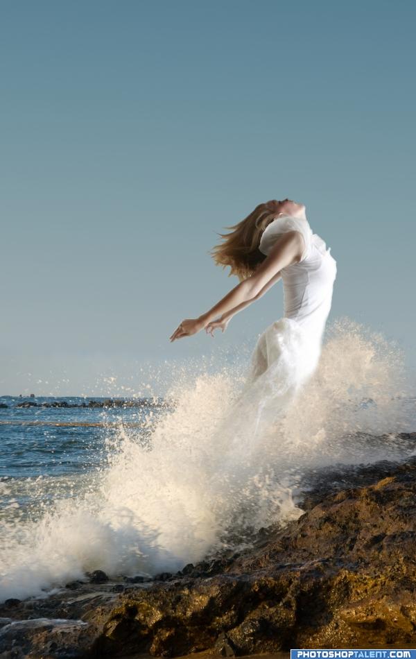
Nice image, but please level the horizon...I'm getting seasick!
sea... sawww... sea.... saw.. it is incredible.. but it does make you tilt.. sorta like being spun around very fast and having to run all of a sudden.. solid work
It is going to hurt when she lands on the sharp rocks! Good luck
good work
I leveled the horizon, I hadn't even noticed that in the source
Make her look more watery and it will be much better
Very nice. I noticed just a tiny tiny bit of white around her hand. Other than that, it's perfect as is.
The light source on the rocks is from the left, but the main area is effective enough that it's not real noticeable.
I lile the photoshop work but the composition is a little weak. Maybe would work better in a horizontal composition with less negative space and more air in front of the figure. IMHO.
Love the mood. Very good. Good luck
its a dolphin... its a walrus... its... a girl?? i like it
Howdie stranger!
If you want to rate this picture or participate in this contest, just:
LOGIN HERE or REGISTER FOR FREE