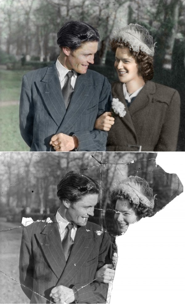
Had this photo with half missing. Fortunately had some others that had some useful components. Although the coat was from a very small photo. (5 years and 3742 days ago)
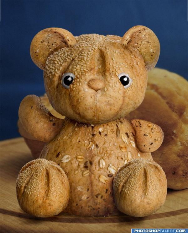
thanks to lejla for the bread (5 years and 3928 days ago)
wow this is excellent!!!
great! good job 

very good image i think its killer


 :P)
:P)
ohhhh how cute  well done
  I really like this one ,


Warm and delicious  Just for breakfast


greaaaaaaaaaaat job u are the winer
That's sososo sweet and cute! looks so real, amazing work author.
Great idea and use of the source -- well done
Good image. You left out the eyes in your SBS...
Nicely done.. Only thing I can see that needs some work is the eyes.. I think the more typical outline would suit them better? Your choice..
That's so cute!! High marks!
extremely well done and cute.. shadow work is wonderful
Excellent thought process...love that! Nice work and great execution! Good SBS!
So very cute!! Love it. It's even sitting on a bread board. GL
So cute lol XD
Beautiful Bread Teddy......Good Luck Author.
hmmm.. tasty, great job autor 

I know this word has been said here often... But this is "CUTE"  ... This is one hell of a image...
very nice!!
cuteee!
Fingers crossed it does well, I am still a bit miffed from when PST went down and I had several entires on the go, and I will never know how they did 
Very nice, GL
Very nice good luck!
cuuuuuuuuuuuuuuuuuuuuute!!!
Superb creation ..Truly sumptuous 
its sooooo cute  ......all the best
great work, nice usage of source image
Fantastic result
change in colour will work wonders.............gud work best of luck
Why would i want to change its colour, its made of bread???
Good Luck 
awesome idea
well done
very nice 
uber, don't be fooled though, it could be an assassin.
Excellent use of the source.No need to go through SBS to see where you used the source.
very good one author  looks so real ... how did you make the eyes? GL
nice...
Thanks for all your comments! The eyes were just three round circles, shaded withe dodge and burn. A little highlight on the top. Then Merged them in with the head.
Congrats! Well done!
Congratulations for 3rd, fab manip.
congrats!
Congrats!!
Congratulations on 3rd 
great teddy. congrats
Howdie stranger!
If you want to rate this picture or participate in this contest, just:
LOGIN HERE or REGISTER FOR FREE
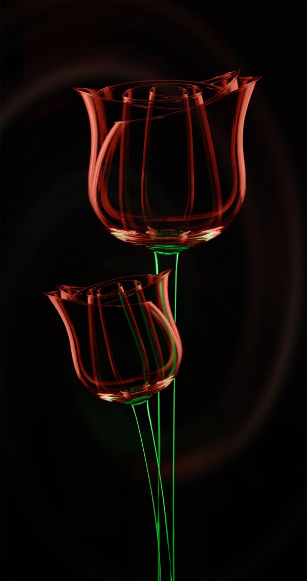
Rose, please veiw high res (5 years and 3761 days ago)
Not sure about the background, but the foreground is sweet.
EDIT: Lookin' better! 
Love it! Beautiful job author. Agree with CMYK about the background...perhaps use what you have and do a nice 'twirl' filter to it...or Gaussian blur it way more...just a thought. 
one thing.. AWESOME!
thanks, this has now been corrected, background has changed for the better
Oh beautiful....... love the detail on the roses.
Very very nice work author...with this background is way better...good luck
This is absolutely amazing!
Stunningle well done 
Perfect!!!
Beautiful and very creative. : )
well done and excellent use of the source
great and original one
Looks ok.
Super cool! 
Excellent Idea and looks fantastic
Very cool!!! Great use of source!
had to add this to my favs... lovely artistic entry. the red is just beautiful in colour contrast of the image.
Just one of those entries that looks stunningly simple - no need to overdo it, just rely on the skill. Awesome job and top marks!
very beautiful !
Very creative.....well done......Good Luck Author.
Congratulations for 2nd, really great work, keep it up.
Congrats for yxour second place, PhotoRepair!
Thanks to everyone who voted!
This was definitely one of my favorites and you used the source so well. Congrats on your placeent.
congrats!
congrats!
Congrats
Howdie stranger!
If you want to rate this picture or participate in this contest, just:
LOGIN HERE or REGISTER FOR FREE

just vectors! (5 years and 3208 days ago)
wow! cool
Wow ! That's really creative ! Hats off author 
I'm sorry, but I would never have realized that the caterpillar on wheels is a word. I admit I did feel "by Nature" seemed incomplete so I suspected the caterpillar spelled something, but that something was pretty obtuse (perhaps even less obvious to me who uses American spellings). I think the reflection just adds distraction to what is already a complicated logo.
Well I couldn't do the logo with both spellings! Sorry! Everyone else seems happy! 
Nice piece of work author......GL!
This got pulled cos a no sbs, put one up but really there isnt much to say its just vectors!
I still don't understand what it spells...
The clue is in the Title! but then you may not be English and do not understand the English spelling.
no, i'm not english, but i do see what your trying to say...but i dont think it's obvious enough, I really had to search
Really creative logo 
Congrats!!
Congrats!
Congrats on bagging the 3rd place...
Congrats
Howdie stranger!
If you want to rate this picture or participate in this contest, just:
LOGIN HERE or REGISTER FOR FREE
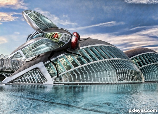
A robot fly tends its huge mechanised egg pods.
Thanks to nezbitten for the fly from sxc.hu
(edit yipes i refitted his top leg!) (5 years and 3643 days ago)
Great job author...well done
Amazing 
see if you can smooth out the hairs on top, they're a little rough, otherwise, I like this a lot - that is one big-a** fly! 
Great work author 
For the sharp eyed amoung you, I have just refitted a missing leg top right! its perfect now!
Excellent shading. Good work
Top-contending entry, great work.
Great picture. One of the best I've seen.
Wicked!
very well done
Wow......that is awesome. Incredible work, author, just beautiful.
Oh, my... where's the Raid? 
Nicely done, author! 
nice use of source :-0
Stunning graphics, very good author!
nice work, i love it
Thanks for your comments I hope it will do well.
beautiful ! awesome entry ! 
Good Luck!!
congrats 
Congratulations! 
Thanks to you all! maybe if I'd had got the full amount of votes who knows!
Congratulations! 
Congrats 
Congrats!!
Gratsss!! I'm really glad this placed!
imaginations streched too well.... congrats...
wow great ! congrats
Howdie stranger!
If you want to rate this picture or participate in this contest, just:
LOGIN HERE or REGISTER FOR FREE
go to PhotoRepair's profile
Photography and photoshop contests
We are a community of people with
a passion for photography, graphics and art in general.
Every day new photoshop
and photography contests are posted to compete in. We also have one weekly drawing contest
and one weekly 3D contest!
Participation is 100% free!
Just
register and get
started!
Good luck!
© 2015 Pxleyes.com. All rights reserved.

we need to see the original here, not just in sbs
Corrected thanks
Its only meant to be a 6x4 inch print so please view with this in mind, many thanks
the work in this is magnificent............there are some differences in sharpness, from coat to another for instance, but the rebuild is superb.
Yes the coat cannot be sharpened any more as it comes from a postage stamp sized photo, and the original torn photo is a 6x4 inch photo. Therefore the lines that go to make up its shape are way more difused and spread out, there is no pushing them together and making them crips lines as in the mans jacket. This is the limitation of any restoration when you use photos of different sizes.
It's very good, but somehow I think you missed the chin position and shape.... I dunno, it just looks somehow 'fatter' than I suspect from such thin face and hands. I'd move it a little bit up, gl!
gl!
Very good, GL.
mmm thanks you are right I have fixed the chin, good call!
Better now! =)
if u could fix a bit better her rigth eye it wood stay perfect,it´s not easy i know,but u did a very good work congrats
Wonderful colours, and a great restoration!
Professional work,well done!
Just the right eye looks funny, other than that well done restoration!
Great job!
Well done

even though this is truely an excelent repair the womans shoulder is far too broard! nice work author
Nah, the shoulder should be like that because almost all women coats have the fake shoulder implants Oh, and I spotted something else - his hair has no colour. I know he's supposed to have black hair, but natural black hear appears brown when highlighted. Like this it looks like he's old. Lol, sorry, maybe we're to nitpicky... High votes from me anyway!
Actually his hair is coloured a slight warm hue, but you have got to look closely to spot it! Try laying one on top of the other and switching layer views, you'll see it then!
OK, OK
Other than her right eye, this is truly one of the best restorations I've seen. You get high points for just achieving the restore so well.
NIce work....well done
woww awsome , professional.
beautiful job
Congrats for your first place, PhotoRepair!
Congrats,nr1
Congrats! You deseved it!
Congrats, very well done
Congrantulations...well deserved, but i cant say that for some of the other results
congrats!! =)
This is my first entry to win first place, very proud! thanks to all who voted!
Congrats!
Congrats on your win... (the guy kind of looks like William DeFoe)
Howdie stranger!
If you want to rate this picture or participate in this contest, just:
LOGIN HERE or REGISTER FOR FREE