I make this art work just to raise a voice against home violence and to stand beside all the women who have been its victim... (5 years and 2926 days ago)

Hope You like it Friends :-)
The chain is an own source...uploaded in sbs.. (5 years and 3264 days ago)
The chain doesn't work for me.
nice,,,,,,i like it ^^
did u add the chain later?? IMO its distracting  otherwise wonderful work
Thanks for ur suggestions friends...i was a bit confused regarding the chain....i hope its ok now 
yup its perfect 

Very futuristic! I like it!
hey man its awesome GL 
Fantastic piece of work author...Every single detail is amazing...i could go on and on how this is great work and instead of that i will add your entry in my FAV collection...well done
Great work, author. IMHO you should have left more of the factory background visible since as it is now the character doesn't fit well in the rest of the scene.
Thanks a ton friends...ur comments are a great inhibitor for me to try and do bettr...thanks a lot...glad erathion nd nisha that u liked it and thanks a lot for the fav..... 
u r welcome author 

my pleasure man...
Agree about all the lost background, but lots of good work here! 
Howdie stranger!
If you want to rate this picture or participate in this contest, just:
LOGIN HERE or REGISTER FOR FREE

(5 years and 3518 days ago)
Wow...beautiful image and amazing mood. High marks for this...
Just one suggestion--dunno if the top-left edges of the man can be made to look more realistic. In high-res, the hair looks a bit jagged and it's like there's still a bit of an outline around him.
Very nice mood, good composition! I agree with gamemastertips a little clean up would be good but still a really nice image!
cool one
Very good, cool image! I like the mood, it transmits a kind of fear, dispair.
Fabulous entry author...well done
edit:i am note sure for the position of the shadow,u have light left of him,but watching your image very closely his back could not be lighted this way with shadow like this...gl
this is great
coool man . good luck
Nice work! Really .. WOW im stunnished!! It looks so real and yet it has something surreal over it .. Really great work and good luck author !
thanks to spaceranger, silencer32, erikuri, tuckinator neeraj55 and nickk....thanx a lot for for ur priceless appreciation...it gives a beginner like me a great moral boost....thanx agn
and special thanks to gamemastertips----i made some changes on the top left...specially the hair...hope its upto ur expectations....
and special thanks to erathion----thanks a lot for pointing out the shadow issue....hope its ok now....
god bless all and thanks again..
Wow...you did an excellent job on the hair. Thumbs up!! The body still has a bit of a black haze, unless that's on purpose. In that case, you're good to go. And God bless you too, author...been awhile since I heard that. 
Really nice scene you've created here Author,... good work and good luck.
Nice composition and color
Cool work author
were is sbs btw ?
Congratulations! Keep going on! 
Congrats, really nice work 
Congrats! for your 1st place, keep going 
Congratulations for first place!.... well deserved.
Congratulation on your wining...this was totally best work in competition...well done
thanx to all of u my friends....each and every one who voted for me, who gave me suggestions to improve my entry, who gave me those favourites...thanks to all....ths is the first time i got a rank nd tht to first.....really grateful to each nd everyone......take care....nd thanks again
Congrats!!
Congrats on a well-deserved win!!!
Thanx to each nd every one 
Howdie stranger!
If you want to rate this picture or participate in this contest, just:
LOGIN HERE or REGISTER FOR FREE

thank you (5 years and 3350 days ago)
You can post you entry via my contest entries and make the SBS so that you post all these in the same time. There's a small box to chech at the end of the uploading page.
I admire your type of work and you really inspire me because I just find it really impressive when someone like you can take a simple image, cut it um warp ect and make this!  Well Done!!!
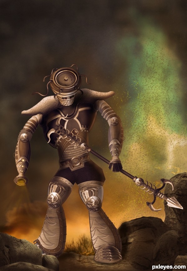
Ok, now that I've seen the SBS: the design is Ok, i like it cause of the contrasting elements that compound it. However i think the source could have been used more. For ex: texturizing + color adj, the red part of the Hydrant would give you something close to leather.
And you can make some of those metal textures from the source too - it would take time though.
Source was used for shoes, hips, belt & head - mainly.
Instead of those little eyes that make the Executioner look like a sad little boy, and not imposing, you can select that side of the disk they are standing on, and add a glow - red would be nice.
I like the background a lot - you didn't mention the source for the grass - or if it's painted, it's really good, anyways.
Thanx for ur suggestion greymval...and yes i did paint the grass...a few strokes of hard brush with a low opacity and then applied a bit of gaussian blur to make it merge with the background.....
Really like this. When I look again here, I kinda wish the light coming from the left arm were more intense. Way to go!
Great job, agree about the eyes. But I really like it! GL author!
Awesome chop! GL author! 
NICE! Creative thought 
Creative.......G/L Author.
WOW author...fantastic piece...great warrior...to tell u the truth,when i saw the picture i was sure this is creation of one other amazing artist too,but now author...hat down for u...fantastic work maybe yours best on PXL...well done and instant fav from me
THanks a ton to each and everyone who voted and for all the favourites and wonderful comments.....Erathion u wont blv how much that comment of ur's meant to a photoshop beginner lyk me....it really gave me inspiration and impetus to try and do much bttr....thaaaankkk yoouuuu
Congrats on 2nd!
Howdie stranger!
If you want to rate this picture or participate in this contest, just:
LOGIN HERE or REGISTER FOR FREE

PLZ DO WATCH HIGH RESOLUTION IMAGE...HOPE YOU LIKE IT (5 years and 3445 days ago)
Very nice! My only nit pick would be, the shadows behind the entry pillars, could be a little darker to define them a little more. Theres one spot that it looks like it blends in with the flowers. Otherwise, keep up the good work! 
i like it a lot, good luck !
Try to fix the horse shadows...light is from right, shadows would be toward the left. Also darken the edge of the pillar at right, since it would be in shadow.
I think you did a fantastic job blending the flowers together, and i can only reiterate the advice the others gave you.
Really good image. 
Very beautiful image, I love the coloring... 
CMYK46 thanks a lot for helping me out with the shadows...i hope its ok now....
thefinalcut i have added darkened the pillars as u said...
and thank u erikuri, nanaris and ponti55 for ur precious appreciation...
god bless
Nice lighting and coloring...dreamy photo effect
I like it!! but my advice would be this  -
-
the harsh light from the sun, (right of the castle)... would mean that it have more shade than the objects in front due to the fall off of the sun.... the objects in the foreground would benefit from ambient and bounced light... so you would see more detail. Of course moving the sun more to the right would justify the illumination of the right hand side of the castle.
I think you could construct a base for the angels to sit on, as they still look cut out... and redifine where the highlight and shadows are especially as they look they have just been copied and mirrored across...
drawing a triangle out from the sun should help you roughly determine where the light would most likely hit the other objects...
front pillars are feathered a little more than they need to be (inside edges) and are far too dark compared to everything else re the suns fall-off
The man also needs to look more 'grounded' as he too looks pasted into the scene.
But even still I think it's one of the best entries thus far so GL whatever you decide to do... 
since the angels r upshot the man wud b downshot wrt the angels imho
pillars esp the right one needz polishin.. everythin else ditto with all d kind experts above 
i just love d mood n hue of the work
just brilliant..gud one..my fav 
was that guy there the last time i looked? hmm... well I must say it was a good addition 
beautiful image author, goodluck 
amazing one
You did almost a perfect job. The only point in this picture that i dont like are the angels. You can see the cut outs and i can see that you duplicated the second one. But if i take a look at the whole picture, i only can say that you did a wonderfull job. For now you are my favorite to win this contest.
lovely composition..good luck
wow!!! Great work! 
great job - I love the mood and the blending and shadows are very well done 
the better the work, the more the critique..... remember that  ... well done
very well executed.....shadow of horses are not ok.....still a good job
i agree with Geexman 100% author....this is fantastic work,great compilation,amazing colors and fabulous colors and mood...
THANKS TO EACH AND EVERYONE FOR ALL UR FAVOURITES AND COMMENTS>>>LOVE YOU ALL AND TRUELY EACH AND EVERY COMMENTS ARE REALLY SO SO INSPIRING>>>>>AND GEEXMAN WELL SAID

 ..... god bless all
It's like looking into a fairytale!! Lovely image  Best of Luck
congrats :]
congrats
Wonderful.. congrats!!
Congrats!!!
Congrats....very unlucky not to win with this...excellent entry 
Howdie stranger!
If you want to rate this picture or participate in this contest, just:
LOGIN HERE or REGISTER FOR FREE
go to Siddhartha's profile
Photography and photoshop contests
We are a community of people with
a passion for photography, graphics and art in general.
Every day new photoshop
and photography contests are posted to compete in. We also have one weekly drawing contest
and one weekly 3D contest!
Participation is 100% free!
Just
register and get
started!
Good luck!
© 2015 Pxleyes.com. All rights reserved.

Great message. I'm not too sure about the paper on the floor. Some actual text, even illegible might work better for that and the paper is transparent. Great idea and good luck!
I, as a woman, thank you for the message. But I have to agree with pingenvy about the note stuck in the chain. It looks a bit fake, needs some real text. And you could fill man's back - just under the collar - because it's cut on the original image.
Howdie stranger!
If you want to rate this picture or participate in this contest, just:
LOGIN HERE or REGISTER FOR FREE