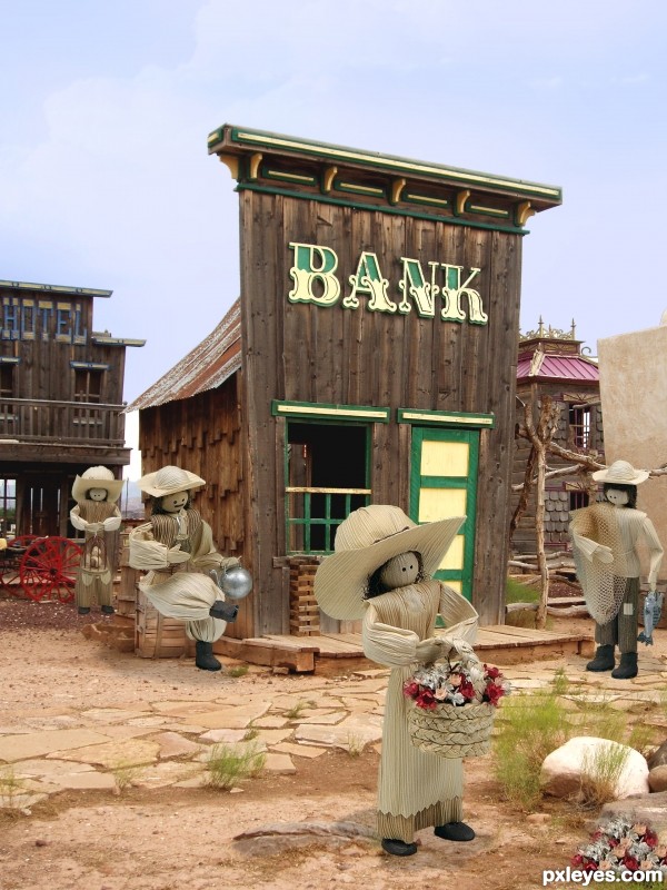
I chose a western motif, simple entry, just cut the images from the source and added to new background...I resized the cutouts to perspective and blended... (5 years and 3503 days ago)
go to UncleJimmy's profile
Photography and photoshop contests
We are a community of people with
a passion for photography, graphics and art in general.
Every day new photoshop
and photography contests are posted to compete in. We also have one weekly drawing contest
and one weekly 3D contest!
Participation is 100% free!
Just
register and get
started!
Good luck!
© 2015 Pxleyes.com. All rights reserved.
 the jumping one is my fav
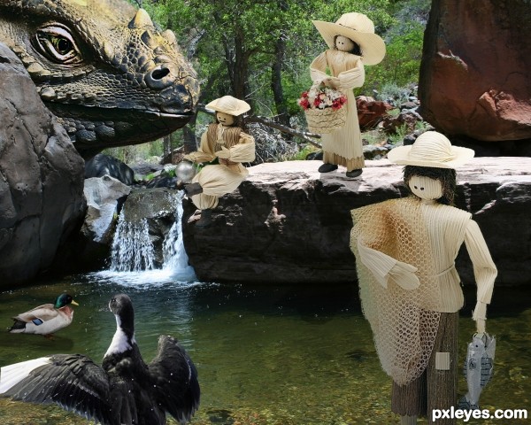
 Congrats again!


Nice masking job and good composition with the placement of the figures, author
 )
)
 Good luck!
I also have some suggestions: your figures have no shadows at the moment, so they look a bit pasted on the background. Considering that the background image doesn't really have a strong light source either, a very light shadow under their feet would be enough (at least that's what I would do, I'm no shadow expert myself
And speaking of feet: the man on the right side with the fishing net has no feet at the moment. What you could, if you want to, is trying to either place him a bit more to the left, so he's with his legs behind the wooden step or maybe try to give him the feet from the puppet with the cage.
And one more small thing: you forgot to erase a part from the woman in the foreground. There is a part from the former background between her hands and the basket.
I hope these suggestions are helpful
Good entry author. Just one thing the puppets must be really tall none of them would fit through the bank door without have to stoop their heads. lol.
GL
Regardless of simplicity, the composition and the entire feel of the image are very original and well created. It's a very well made entry. Good luck
Thank you all...i gave the man boots....added the shadows...fixed the missed area on the flower girl and added a flower patch for her by copying some flowers out of the basket...
Looks a lot better! The flower patch is a very nice addition
  Good luck again!
Not bad, but it looks like the foo-foo Wild West...no guns or bad guys.
very creative
simple, but right to the point
i love it
it looked like 3D for me... liked it...
Simplicity at it's best!
That is cute and imaginative.... good luck author.
Great work author...mood is great...well done
Haha, great job! What a great idea and perfect background. The placement of the figures is just wonderful. Very simple, but very well done. GL author!
Great idea ! Best of luck
Well done looks almost like a real museum set up
Very well done! Everything looks to be in the same scale, not easy to do!
Congrats for your first...
Congratulations! I really liked this one
Brilliant work!
Hey, you're getting pretty good at this! Congrats!
Howdie stranger!
If you want to rate this picture or participate in this contest, just:
LOGIN HERE or REGISTER FOR FREE