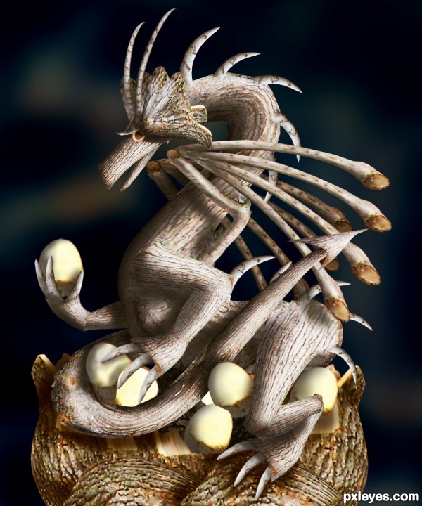
No aditional sources used. (5 years and 2990 days ago)
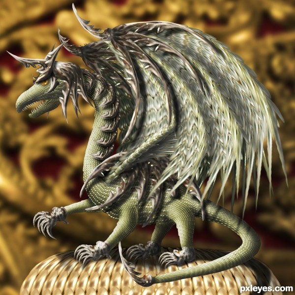
Made only with the source image, I hope you like it!! (5 years and 3434 days ago)
Concept is good. The background is more saturated and has more contrast than the dragon. Makes him look a bit weak. Wings seem a bit blurry compared to the rest of the creature. Tail angle doesn't look natural.
The highlights and shadows really make this brilliant!
Not sure about the anatomy, but it sure is intricate.
Good work and use of the source. Good luck.
I reiterate my previous comment about members with fewer entries having an advantage. Now we have an entrant with only 5 previous entries.
This is a nice image author.......... however, this seems to be the kind of entry alot of people are making lately.
An amazing amount of work on this ... cute little guy!
Gorgeous creature 
Wow, very beautiful and I see you've put a lot of hard work into it. 
Congrats for 3rd......!
COngrats for your third place, Zakfuego!
Congratulations, Marco! 
Beautifull - well done on third place!
congrats on third
congrats 
Congrats! I hope to see more of your entries. 
Congrats Marco on the next level of success in Pxleyes, keep it up buddy!
Congrats!!
congrats
Congrats...
I like the 3D effect, congrats for third place !
Thank you to all!!! this work take a lot fo time and Im happy you like it 
congrats
Howdie stranger!
If you want to rate this picture or participate in this contest, just:
LOGIN HERE or REGISTER FOR FREE
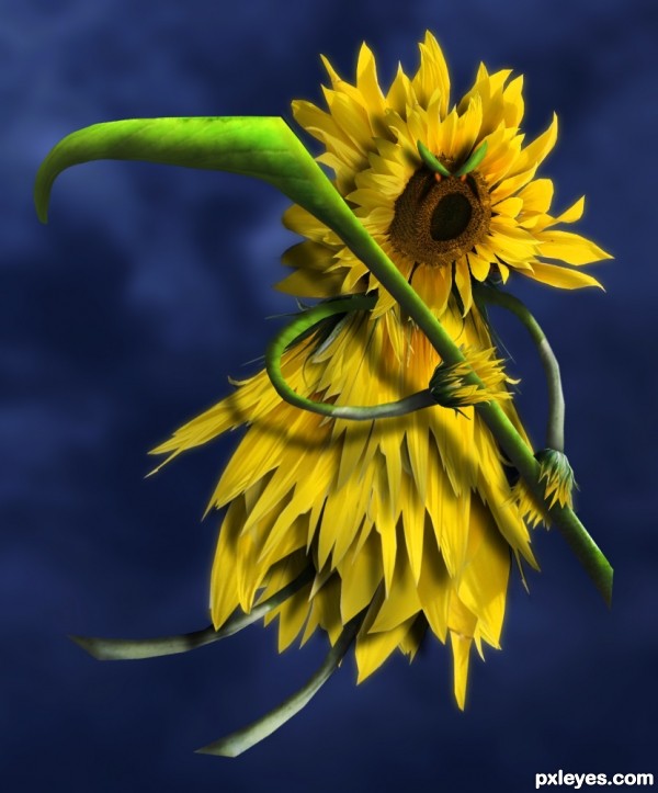
The reaper is comming for claim the life of some flowers... (5 years and 3449 days ago)
kudos to d reaper 
hi hi very creative, good luck!
Very nice! good luck
AMAZING!! I LOVE IT!!
SCARY LITTLE FLOWER!!! grrrrr!!! 
IIIIIIEEEEEEEEEEEEEEEEEEEEEEEEEEEEEEEEEEEEEE.. awesome
ACK.. author.. you are going to have to put together a Step by Step to show how you created this image.. I DO NOT WANT THIS PULLED ... It's to stunning
great job 
very nice 3D effect, original and colorfull. you have my vote author and good luck !
Thank you for the positive comments. I added a SBS guide. I hope you like it. 
Gotcha! Very nice work, your style is really fitted to our contest my friend  . The lighting, shadow are superb! Best of luck to you
Very cool  good luck!!
What a wonderful, unique image ... I have a smile on my face as I type this comment ... a sunny reaper ... LOL! Great!!! Into my favs it goes!
haha! Such an imagination 
awesome
top 3.............no doubt............GL
Nice idea.
great work author...well done
Amazing job Author......Good Luck.
what a sweet creation, nice work, author!
Congratulations for 1st place
Congrats, awesome work 
Congrats!! Great job!!
Congratulations..nice work
Congrats...
Congrats! Assume entry 
Oh thank you for the nice comments and votes, Im really happy 
Congrats!!!
kudos to d reaper again 
Cool chop.. congrats! 
Howdie stranger!
If you want to rate this picture or participate in this contest, just:
LOGIN HERE or REGISTER FOR FREE
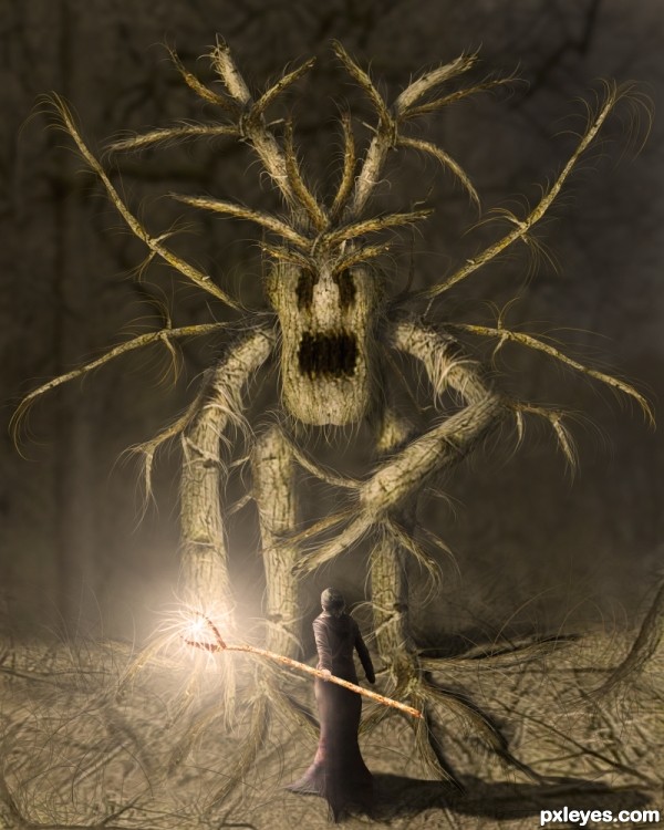
The brave sorceress is ready for her most hard test!!
No additional sources used. (5 years and 3440 days ago)
Really good job here. I love the overall feel of this work, and the lighting effects are well done.
smart uses of the provided pic,.......well done ,,..
This is so good! I love it! The monster reminds me of the Wickerman movie.
Really nicely done! The lighting, color and details pull it all together. Good luck!
Great piece of work, good luck author
I suggest blurring the woman's shadow a little more and adding a gradient mask that gradually reduces in opacity, right now the shadow looks a bit too strong.
Overall as an image i think it's fantastic though  The light.. the use of source.. the creature.. all look wonderful
  Well done!
Luuuv it!
Magnificent work author...i like the colors,effects,mood...simply perfect...Only one idea not suggestion,u could create some kind of light sphere at the top of the wand,to give the more effect on the spell...Instant fav from me and best of luck of course...
Nice entry, GL
Stupendous work ... I would not want to have to battle that one... he looks like one very mean creature!
What a beast! 
Congrats on first place!
Congrats, great idea and execution!
Congrats Marco, another awesome work, keep it up my friend!
Thank you to all for the nice comments and votes 
Congrats on first place 
Congrats on your win...
Congratulations!
Congrats!!! 
Congratulations ... this is one great creation!
Congrats for your first place, Zakfuego! Great image! 
Congrats!!
Howdie stranger!
If you want to rate this picture or participate in this contest, just:
LOGIN HERE or REGISTER FOR FREE
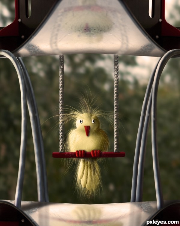
Made only with the source image. (5 years and 3425 days ago)
Oh my!! This is so cute!
Very clever! Nice touch with the reflections.. this little guy is awesome!
Cute & funny .
WOW
Fantastic thing...well done author
Really love this fluffy little guy!
cute lil birdy, enjoying the breaktime...

Beautiful fluffy creature 
Sweet bird.
Nice work - I like the long strokes for his feathers!
it look like my birdy :P
Lovely...cute....bird..... good luck
Congrats on first place!
Congrats on first place 
Congrats for your first place, Zakfuego!
Thank you for your comments and votes!!!!! Im happy 
Congrats  such a cutie
congrats on first prize.. really a cuty bird..
Congrats!!
Congrats for the first place.., beautiful entry
Howdie stranger!
If you want to rate this picture or participate in this contest, just:
LOGIN HERE or REGISTER FOR FREE
go to Zakfuego's profile
Photography and photoshop contests
We are a community of people with
a passion for photography, graphics and art in general.
Every day new photoshop
and photography contests are posted to compete in. We also have one weekly drawing contest
and one weekly 3D contest!
Participation is 100% free!
Just
register and get
started!
Good luck!
© 2015 Pxleyes.com. All rights reserved.

Wow, Impressive art.
great job, Is the White Hole in the Nest suppose to be there? it be an easy fix is it isn't suppose to be there.. only IMHO but good job and good luck, very nice sbs
nice creativity there .. keep it up
Awesome creature
well done ,looks like one of the top entry's to me.
wow,wow,wow best idea..
Congrats on 1st place!
Oh, thank you so much for the comments and votes, This was a nice contest!!!
Howdie stranger!
If you want to rate this picture or participate in this contest, just:
LOGIN HERE or REGISTER FOR FREE