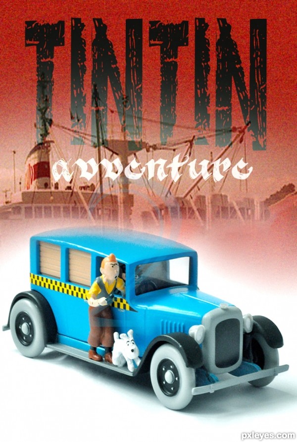
I used Two sources & several fonts... (5 years and 2619 days ago)
go to arifulbk's profile
Photography and photoshop contests
We are a community of people with
a passion for photography, graphics and art in general.
Every day new photoshop
and photography contests are posted to compete in. We also have one weekly drawing contest
and one weekly 3D contest!
Participation is 100% free!
Just
register and get
started!
Good luck!
© 2015 Pxleyes.com. All rights reserved.


author, please double check with copyright law on the image of the car and character, i think there is a lock on usage, red flag and ask a mod... good work but the copyright rules could wonk you out
Thank you, Problem fixed... is it ok now?
I'm pretty sure that source is okay
Foreground type and shadows really don't work. Too many fonts over all. A good poster needs visual continuity. If this was my poster I'd simplify it by removing "Everybody know him" and the foreground type & shadow. Simplicity is always best, let the graphic image stand out. GL author.
thank you for your advice
Good luck author, it's a clean graphic image now.
Love it, sweet and Tin Tin adventures was my favorite one! Congrats
Thank you mam ...
Good work - I like the overall feeling, the typo is detracting for me - I think you meant 'adventure' not 'avventure ? Good luck
Really it is,actually I didn't get it..
Thanx.
Howdie stranger!
If you want to rate this picture or participate in this contest, just:
LOGIN HERE or REGISTER FOR FREE