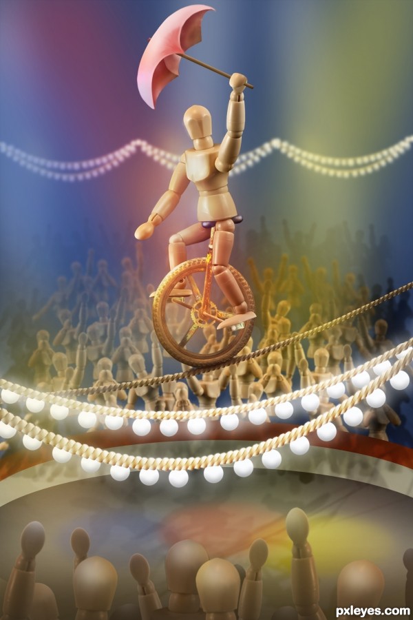
*Update: masking of crowd in the foreground has been refined.
*Update #2: a hint of bevel and emboss added to the foreground light bulbs. (See SBS for settings.) (5 years and 3306 days ago)
- 1: rusty bike

*Update: masking of crowd in the foreground has been refined.
*Update #2: a hint of bevel and emboss added to the foreground light bulbs. (See SBS for settings.) (5 years and 3306 days ago)

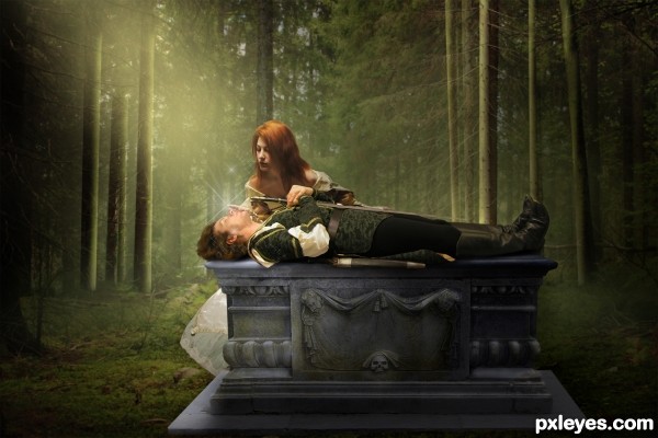
Here's a twist on the usual story of Sleeping Beauty... it's Sleeping Handsome.
After her kiss, they live happily ever after, of course. That part of the fairy tale doesn't ever change.
Many thanks to lockstock, cobweb-stock, frozenstocks, and CAStock for the images. (5 years and 2831 days ago)

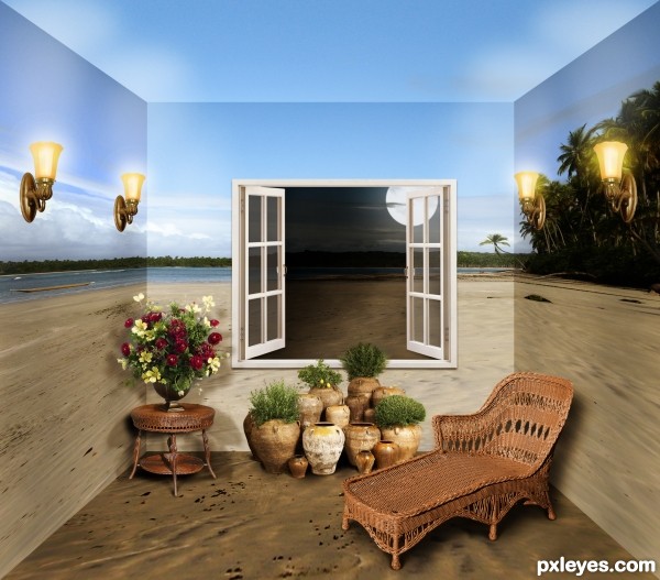
Thanks to Lieven Verbelen for the perfect background.
Special thanks to these photographers for their painstaking work in preparing their stock:
AbsurdWordPreferred for the window, and
JinxMim for the light fixtures, wicker, and garden pieces.
I made the moon by drawing a circle (ellipse tool) filled with white, then using the eraser, set to chalk brush at a low opacity, to create three "craters," varying the brush size each time.
Shadow/color variations for the walls and floor were achieved with Brightness/Contrast adjustment layers. Furniture and object shadows employed some Drop Shadow and mostly black painted layers with low opacity.
Night scene through the window was achieved using a duplicate background layer (using the window as a size guide) set behind the window, applying an Exposure layer mask, and painting selective light back in. Glass panes are white rectangles set to low opacity.
Two color adjustment layers were applied over the entire scene: one with greens made more vibrant, and one with an overall golden brown, set to soft light.
If I missed explaining anything, please just ask. (5 years and 3278 days ago)
go to elemare's profile
this is so cool!!!!!!!!!!!!!
A few masking fixes on the bottom cutouts and this is top notch. Good luck!
EDIT: Looks Good!
Nice Job well done
Chalty, after a good night's sleep, I see the MESS that foreground crowd was. Ugh! Sorry to inflict the pain on your eyes, all you early viewers, LOL! I did a complete re-do of the foreground crowd, starting with fresh originals rather than trying to repair the "template" crowd, which had already been made smaller once or twice. (Rule I ignored: You can make an element smaller, but you can't resize it bigger again afterwards without pixelation and lost definition... unless it's a smart object, which, of course, this wasn't.) Whew! Thank you, all!
Lovely, stunning work beautifully realized! A definite fav for me!!! Your lighting is exceptional!
Thank you, arca!
This is great, concept to finish! Love the color choices, gives a softness to the image!
very very niceeee!!!
Simply perfect! A show!
Fantastic job. Very creative.
Great work!
wow
Fabulous!!!!
YIPPEE!
Great entry....GL!!
wow great imagination!awesome
donot know what changes as this is my first view -- great work on building the figuire and ropes -- both foreground and background are very well done give noce depth to the overall image -- only one thing is the bulbs seem a bit flat -- glow is there but the bulbs need a touch of something to add some extra dimension
very nice !!!!!!!
Very nice work.
great work and use of DOF.... well done
brilliant job
Excelent creative entry, GL!
Awesome piece of work author...Very well done
Congratulations!
Congrats Elemare, wonderful work
Good One!
Congratulation on your 1st place!
Amazing!!, great work with lights and DOF!!
Congrats!!
Thank you, everyone!!
great image. Congrats
Congrats on first place Win
Howdie stranger!
If you want to rate this picture or participate in this contest, just:
LOGIN HERE or REGISTER FOR FREE