(5 years and 3244 days ago)
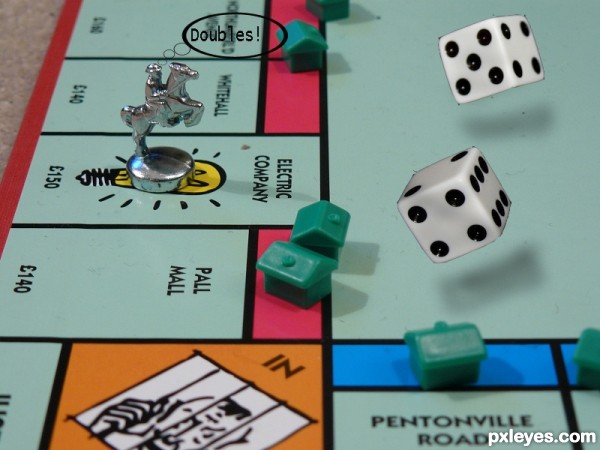
- 1: board
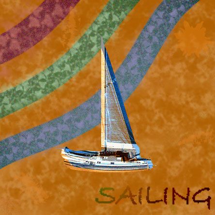
used this tutorial: http://www.webdevtuts.net/photoshop-2/create-a-retro-design-poster-in-photoshop/ (5 years and 3180 days ago)
Fun, except the wavy stripes stand out more than the boat and (especially) the text. (Try greater contrast for the latter two elements.)
updated a bit--hope you like it
Nice improvement. This came out well!
please let me know if you like this one better, or if I should go back to the old one
I like this version, the old one had too much noise for my taste...
I don't care much for the way the lettering is kind of faded at the beginning, though.
Howdie stranger!
If you want to rate this picture or participate in this contest, just:
LOGIN HERE or REGISTER FOR FREE
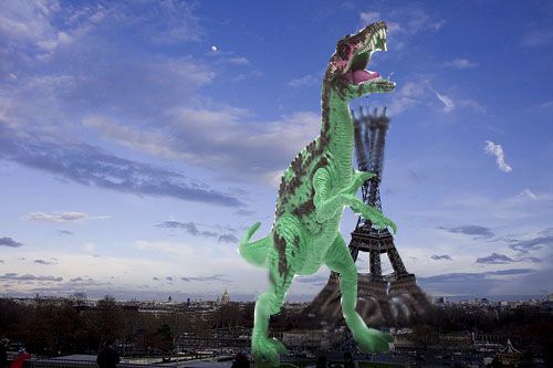
Oh my, what a slip! imagine this happening every time a parent messed up while telling their child to "go take a shower!" (5 years and 3240 days ago)
nice idea -- blurring the top(s) and bottoms(s) of the tower to give it the look of shaking the tower would be an improvement (IMHO)
done. thanks
could burn the feet a little to ground them a bit, very nice Idea 
done. thanks.
cool idea author...best of luck
Howdie stranger!
If you want to rate this picture or participate in this contest, just:
LOGIN HERE or REGISTER FOR FREE
(5 years and 3236 days ago)
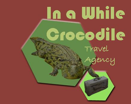
I think logos need to be more compressed so they fit on business cards and at the top of correspondence as letterheads. I confess I don't get how the apparent business name relates to travel..
"in a while crocodile" means "see you later" (one person says, "see you later alligator" and the other responds "in a while crocodile" so it's as if the croc is going somewhere, aka, traveling. It could be concluded that the actual logo is just the croc with the suitcase, and that the text would be part of an ad or a billboard
I understand what your trying to achieve, but only after you explained what it was in front of the alligator. With no high res image to look at the suitcase looks like a brick to me. Another suggestion would be to lower the color overlay you applied to the crock and let some of the natural color shine through.
I keep clicking "save full-res image" but it's not doing it.
Author, if it isn't saving a full-res image, its probably because your original image isn't big enough. Try making your original image bigger, maybe 1200 or 1500 pixels wide or long. I've discovered that usually does the trick. BTW, I understood the meaning of your logo and thought it was very clever for a travel agency.  I agree with Chaltry in that you might reduce (or even eliminate) the color overlay. Good luck.
it still won't do high res...but thanks for all the suggestions, I changed it up a bit
Nice idear 
The green font color is a bit to greenish, maybe you could pick a green from the crocodile that would make it more harmonic.
The background is a bit strong and kind of make the crocodile disapear a bit, for example would a plain white make it stand out more.
GL Author 
ahhh...changed it and thanks for all the suggestions! even i realize how much better it could have been! wow, now looking at it, i'm actually quite proud of my work
nice and inspired idea for a travel agency but work more on the logo itself...  jmo
jmo
Howdie stranger!
If you want to rate this picture or participate in this contest, just:
LOGIN HERE or REGISTER FOR FREE
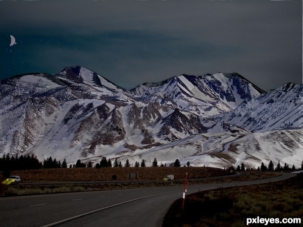
(all own images) (5 years and 3230 days ago)
The lights from the car is a nice detail, but something tells me that the sky can be way darker. Good luck!
I totally agree with wazowski. This looks like dusk at best. A snowy background is a good choice for maximum reflection of moonlight—except I see the (half) moon is in the background, so let me change my observation to 'mountains make for a dramatic silhouette with heightened star-light shadows thanks to the snow.' I think the rear vehicle's headlights could be stronger. And the angle on the front vehicle's headlights should be higher. More white in the headlight light would also be warranted IMO as would more feathering of the edge along the mountain ridge.
I think your source pic has a lot of potential and there's still lots of time to realize it. Note that the pole thing in the foreground needs to cast a shadow consistent with the primary light source.
thanks for your comments! I changed it up a bit. quick question though: what do IMO and feather mean? (sorry I'm a little new to this)
IMO - In My Opinion.
Feather - A technique to smooth the edges of an object.. or to reduce the hardness of the edges..
there we go. did some more editing. thanks for all the comments
This image reminds me of being up North in early September... it is quite light until very late ... this feels like it would be around 10-11PM!
Nice work ... it has improved from your first uploaded image... although it would be nice to have a Hi Res 
Howdie stranger!
If you want to rate this picture or participate in this contest, just:
LOGIN HERE or REGISTER FOR FREE
go to happyme27's profile
Photography and photoshop contests
We are a community of people with
a passion for photography, graphics and art in general.
Every day new photoshop
and photography contests are posted to compete in. We also have one weekly drawing contest
and one weekly 3D contest!
Participation is 100% free!
Just
register and get
started!
Good luck!
© 2015 Pxleyes.com. All rights reserved.

nice work author but some parts demand a bit more work...there is clearly visible black halo around the dices...also u could try to create some feel of the movement on them cause they are dropped in the air...i think that usage of motion blur can cover that...best of luck
Howdie stranger!
If you want to rate this picture or participate in this contest, just:
LOGIN HERE or REGISTER FOR FREE