source only, except for background.
background might not be recognizable but i'll post the link anyway. (5 years and 3903 days ago)
- 1: source1

well... it is what it is... (5 years and 2641 days ago)
Good idea & use of source. (Also good to see you back!). 
Thanks.
Looks like it has been so long since i have last been here, i forgot the rules for source usage. 
Sorry mods.
Very creative! Nice idea
Thank you!
Congrats! 
Thanks 
congrats 
Thanks!
Congrats!!
Howdie stranger!
If you want to rate this picture or participate in this contest, just:
LOGIN HERE or REGISTER FOR FREE

view Highres before voting. (5 years and 3676 days ago)
very nice , voted against myself here..... lovely work! good luck
killer image, great work! 
you could make the flames a little more hehehe, kidding, it's perfect
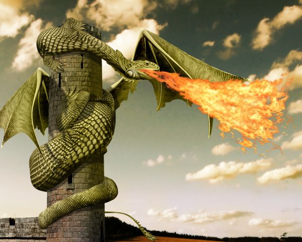
Nice work with the shading, I like the claws too. The lowest part of the tail on the left side can do with a bit more masking and the turn around the tower looks like the dragon has a knack there. If you make the turn from the tail shorter, it will look more natural curved. But well done for the rest! Good luck!
Edit: tail is fixed, including the masking 
Great job 
thanks for the tips wazowski. i believe i fixed the turning problem of the tail (you was absolutely right), but i'm sorry, i can't tell where is the masking problem.. anyways i hope it's better now.
it seems like your dragon is burning its wing, at least that's what i see. otherwise, i like the idea, good luck to you 
Wow... \o/!...
Fantastic work...Few minor observation...fire is just a bit strong and unnatural...and i think that the wings are to low...They have to start in the line of front legs...Beside that...fantastic thing...good luck author
not an awesome entry................ But Its an extra ordinary... Fantastic one......!!!! claps for you...!!
Flame could be better blended in Multiply mode...
My Favorite....!!
niceeeeeeeeeeeeeeeeeeee
i tried different blending modes and different settings for the fire, i was most satisfied with this one.
better without the fire
Really nice chop Author! Well done 
thank you.
aaarrggghghh, I've set fire to my bloody wing !!! lol Nice well done
nope. the wings are behind the flames...
nice!
In the top 2 for sure, congratulation in advance 
nice!!! 
Congrats for your second place, Inanis!
congrats for 2nd place...
congrats !!
thank you all for your high votes, favs and comments.
Congrats!! 
Congrats!!
Congratz to 2nd
Congratz to 2nd
Congratz to 2nd
Howdie stranger!
If you want to rate this picture or participate in this contest, just:
LOGIN HERE or REGISTER FOR FREE

this was fun to do :D
comments and suggestions are welcome.
you might want to check high res before voting. (5 years and 3871 days ago)
even though the result is technically horrific.. it's really quite cute.. good job and lots of work here
EDIT (Technically horrific in the sense that some one was technically sliced in half and it should be gross..(and it came out cute) it was a compliment)
what do you mean by technically horrific?
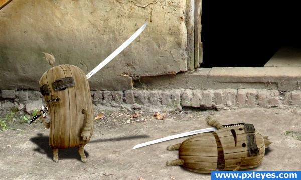
These guys are great! Light is from upper left in source pic, so you might want to rethink the shadows...still, high vote from me! 

LOL ohh thats funny..or sad.....very well done
So cute.
CMYK46 i was looking at the leaf in the center and from the shadow it casts i believe the light is coming from upper right.
also the light in the source comes form top left, based on the shadows, but the source part used in my image was flipped, therefore what was top left became top right.
GolemAura thanks for the compliment.
haha very nice and funny 
..i love it! xD
That's a great 'chop' 
love it
wow this is amazing man really like it, it just looks right to me!
simply wonderful and creative! Love it!
good and funny!!
great idea , great result, gl
thank you all.
a little darker on sliced area and thats it perfect!
excellent use of the source. Agree with on the lighting angles, I missed the leaf, but the brick behind the twin on the left's right hand (if that makes any sense) tells the story. Excellent work here, author. Top marks. (with the "confirmed" lighting angle, I'm not so sure the shadow of the "winners" katana would be present on the blade of the fallen twin - but I am a beginner, so use your best judgement.) Great work.
you're absolutely right, the brick shows clearly that the light comes from top right, maybe i should have made the shadows more to the left. but since that's the only thing that shows the correct angle of the light source i think i have an other idea how to fix that contradiction. thanks for noticing.
A few more cuts and nicks would sell this some more.. The main shadow I saw as out of place was the one of the sword. You have the body shadow off to the left and the swords out to the right? Maybe shorten the swords shadow?? GL.
ditto on most of what everyone has already side. nice entry.
i thought about adding some more cuts and nicks, but then i said having one single clean slice would only show how easy the fight was, how easily evil won against good.
but i do have to make some minor changes to the shadows, when i do, i will shorten a little the sword's shadow too.
EDIT: made some minor changes.
this is cute!
part 2 "...but good never gives up" :
http://www.pxleyes.com/picture/8301/but-good-never-gives-up-.html
Congrats for your first place, inanis! 
Congrats, really well done 
Congratulations for 1st
Congrats!
Congrats!
thank you everyone for your high votes.
Howdie stranger!
If you want to rate this picture or participate in this contest, just:
LOGIN HERE or REGISTER FOR FREE

source only. (5 years and 3908 days ago)
Looks like an minature dragon... But nicely done 
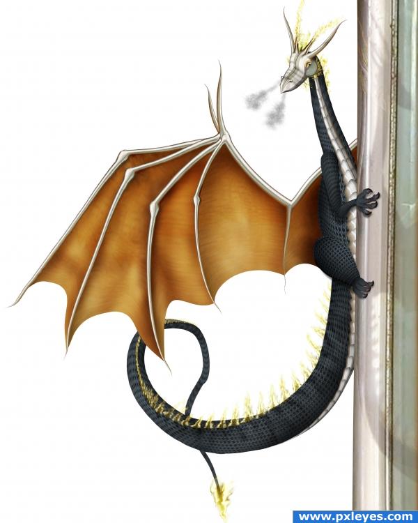
cool! High res looks great. good reflection and shadow.  well done. i would have had my problems with the background. But white is really good.
 good job!
very nice work
hehehe.. PEEK A BOO Dragon... hehehe.. great Great GREAT Work here 
NIce use of source....a background gradient would improve it, but till a good entry and the dragon looks great.
fantastically creative!
What a cute little guy! VERY nice rendering. A little background wouldn't hurt!
Nice job.....G/L Author.
top notch!! very creative, SBS for the fire would be great
very good use of the source image ... well done author .. GL 
Haha!! Cool! Very nice work, a background would be nice, but if you only want to use the source then it should be fine. Good luck!
I wanted to add some background, but since nothing nice came to my mind instead of ruining the picture with some unfitting background i decided to leave it white. this way the dragon is in the center of attention not some unnecessary background.
anyway I'm happy with it the way it is,so I hope it's OK with you if i'll just leave it the way it is.
ps:added sbs for fire
I like the white background. It doesn't exhaust the image with color and focus. 
wow, great works
so cool
Strong entry.. good luck !!!

whoah this is incredible excellent job!
wings seems to be connected to body in brainpower 

it's connected to the back, but it's not visible.
Nice dragon... very well crafted piece of work top job!
IMO a background would complete the composition, but still a high vote for your clever idea and nice reconstruction of the source. 
thank you all.
Congrats! Well done!
Congratulations for 2nd
Congrats!
great one, I love dragons  Congrats!!!
Congrats!
Congratulations 
Congrats! A very good creation and very well executed!
Congraaaats ... Nicely done!
Congratulations!!!! 
congrats 
Howdie stranger!
If you want to rate this picture or participate in this contest, just:
LOGIN HERE or REGISTER FOR FREE
go to inanis's profile
Photography and photoshop contests
We are a community of people with
a passion for photography, graphics and art in general.
Every day new photoshop
and photography contests are posted to compete in. We also have one weekly drawing contest
and one weekly 3D contest!
Participation is 100% free!
Just
register and get
started!
Good luck!
© 2015 Pxleyes.com. All rights reserved.

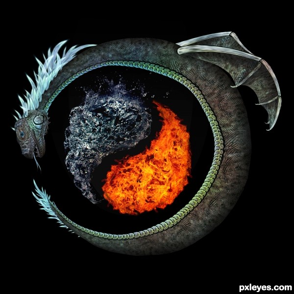
will add a sbs tomorrow. too tired right now.
COOL Good luck! and please upload a sbs i will hold my vote fo now!
Awesome !!! Why E-43? or it's just random ?
wow really cool~! ill hold my vote fo ya too
will add sbs first thing in the morning. E-43 is half-random.
wow..very elegant
awesome
Nice use of source, result reminds me a bit of the Björk video All is Full of Love (which is an excellent videoclip). It would be nice if here and there you can give the edges a bit more thickness (ie there where the body starts) and perhaps make the mouth and nose a bit sharper (inside the face then, not the outside contour). If you'd rotate the upper arm from the robot a bit (contraclockwise) and add a bit of shading (can do with some shading under the face and chest too), the shape will be more visible and may create more depth. For the rest nice result. Good luck!
great! looks very good
very cool, gl
Nice work -- very good use of the source
Superb entry!..WOW! High marks from me!
as promised i uploaded the sbs.
wazowski thank you for your suggestions, i will try to make some improvements based on your suggestions.
don't know when though, i'm quite busy right now.
great
wow, nice, high votes from me ^^
wow, nice, high votes from me ^^
wow!! Nice one remember me Hyperorbit sniff shob
thanks. not sure i understand the "remember me Hyperorbit sniff shob" part though.
Superb image great creativity & very nicely crafted quality work!!
ah nothing author...I was just raving there was a member (one of the best so far) who made an entry a little similar to this one, just reminds of him
  Great work ditto
if i understand correctly and you're talking about Hyperorbit, i remember him form pst. i'm glad you're comparing my work with one of his, even though i'm not sure i'm worthy for such comparison.
perfectomundo
Ok..wow!!!! well done!!!
great job author ... very creative ... GL
GL
i made some minor changes, i hope it's better now.
Awesome work author

it´s better. plus sbs, i can fav now

super cool...gr8 job author
fantastic pic
love this one........................grt ntry..................grt wrk............
Good work and good result.
Excellent concept and job! I'm speachless!
thank you everyone for your high votes.
Congrats great work on this!
Congrats! Well Done!
Congratulations for 1st, fantastic
Congrats! I always stare at it for several minutes, before I scroll down... It's just great!
Congrats, fantastic work
Congrats!
Congrats!
congraaaaaaaaaaaaaaaaaatsssssssssssssss!!!!!!!!!!!!!!!!!!!! well done!!!
Congrats for 1st
Congrats!!
Howdie stranger!
If you want to rate this picture or participate in this contest, just:
LOGIN HERE or REGISTER FOR FREE