(5 years and 3930 days ago)
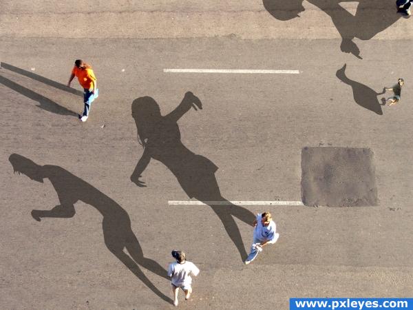
Well I have fixed the few problems that ppl told me about and well tell me what you think. Comments that will help me improve in photoshop and manipulating images are highly appreciated. THANKS (5 years and 3931 days ago)
nice image, but change the name! :p
Yeah I sort of forgot to do that but it's fixed.
The idea is good, especially this dancing shadow. But have a look at the original shadows. To match them to the existing one, maybe you could make them more blueish and maybe also a little bit more leant to the left side, so they look more natural in comparison to the persons shadow with the orange shirt. Beside that... I don't get the duck shadow at all, cause there is nothing, that could cast a shadow. Maybe you could add a dog there, so it'll look like someone is feeding the dog, but the dog casts a duck shadow or something like that. Good luck 
Well Lelaina there suppose to be a a person standing there casting the shadow on the corner but i guess it's a little hard to see Thanks for the comment
Nice image great creativity would agree the shadows do need a little tweaking
just sample the original shadow color and it will look great!  also, change the direction the shadows are being cast because it would be pretty much impossible for the guy in the orange shirt to have his shadow in another direction
LOL...where's the duck? And the guy at upper left has a much darker shadow...
well first off to help you improve your photoshop, is that your shadows are going in the WRONG direction, and they arent blue like the real shadow on the top left...
I have been thinking about the changes that I did and looked at the title of the contest isn't it called "Wrong Shadows"? Well I made the changes all of you suggested.
try to change the picture of a dog with one that was taken form above. now it looks copy-paste-like and perspective is wrong.
This is much better than it was when I saw it yesterday.  Did you clone out some of the middle upper? I'm seeing some repeated patterns, you may want to break those up a bit.
really nice
Howdie stranger!
If you want to rate this picture or participate in this contest, just:
LOGIN HERE or REGISTER FOR FREE
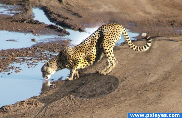
Not all cheetahs are as fast as they seem (5 years and 3931 days ago)
hehehehe.. good thinking author..very clever.. I think there might be some remenant shadow on the tail of the cheetah.. but the high res doesn't have that much detail... the composition and message is very well put together.. good luck
if u play more with the reflection of the of cheetah in water and brighten up a little more the opposite side of the shadow wil give it a effect.the source image is having the light coming from behind so brighten up the parts of cheetah having shadow to match with the rest.
This is a cute concept, when you changed the colors of the cheetah, something weird happened so it looks like it's not native to the photo though. If I hadn't look I would have thought it was pasted onto a new background. It's a little to saturated in color on the bottom of the main part of the body.
i love it. it is a bit hard to tell that it is a snail, however with the lighting that has it. the snail does go in that way, and the angle and perspective in my opinion make the shadow hard to see which to me is realistic
cute
Nice! I didn;t get it was a snail until i looked at your sources, it looked like a gazelle at first glance xD Good luck!
great
Howdie stranger!
If you want to rate this picture or participate in this contest, just:
LOGIN HERE or REGISTER FOR FREE
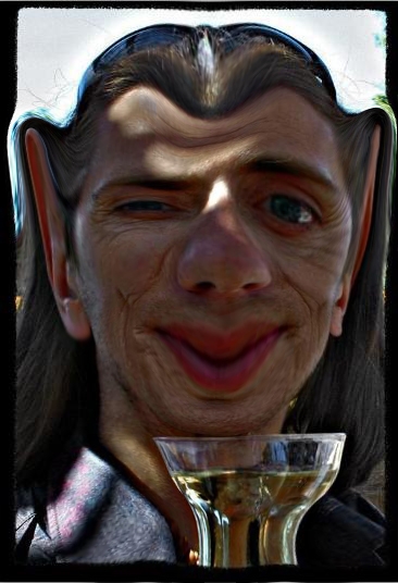
Thnx to Fille for his permision to use the photo (5 years and 3945 days ago)
WOOOOO HOOOOOOOOO.. hehehehe.. just wonderful and cool.. might want to lightly dodge to bring out some of the definition..but totally unnecessary.. high marks from me, and not just because of the subject matter 
way to show the love
Your subject is going to love this  nice job author
Elf? More like a vampire...
this is cool
Much better than his original image....
wait a minut! i know this guy! he is... OMG! 


wow
too much liquify
Like i've said before, too much liquifying isn;t good for an image. Nice idea, good luck!
good
Howdie stranger!
If you want to rate this picture or participate in this contest, just:
LOGIN HERE or REGISTER FOR FREE
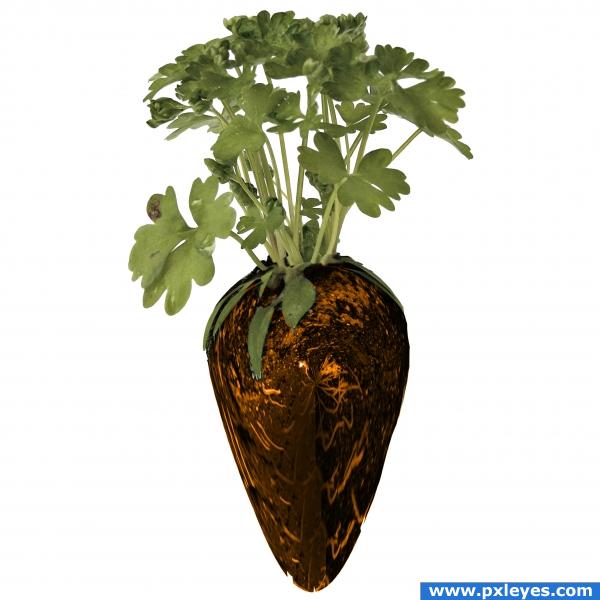
(5 years and 3932 days ago)
I like the feeling on this one... almost could look like glass.. good luck
wow cool
Haha, fantastic idea! Doesn;t feel too much like a carrot, maybe Nator's right, but either way you have a great imagination!
Keep going, you're halfway there...
great! funny carrot!
CMYK46 is right......stretch yourself some! All in all, very creative thinking.
Carrot gone wrong! but i like... GL 
very nice 
Howdie stranger!
If you want to rate this picture or participate in this contest, just:
LOGIN HERE or REGISTER FOR FREE
go to jra's profile
Photography and photoshop contests
We are a community of people with
a passion for photography, graphics and art in general.
Every day new photoshop
and photography contests are posted to compete in. We also have one weekly drawing contest
and one weekly 3D contest!
Participation is 100% free!
Just
register and get
started!
Good luck!
© 2015 Pxleyes.com. All rights reserved.

author.. you really should up load a Step By Step.. as I realize that this is a pretty simple chop, this makes the SBS even more valuable to people who are impressed by your work and would like to do something similar themselves.. (this would make and Awesome tutorial).. very good job on this.. (the best way to learn is from others who already know what to do..hehehe.. good luck and good job
Well GolemAura the SBS is ready I was just doing it when you commented.
good work
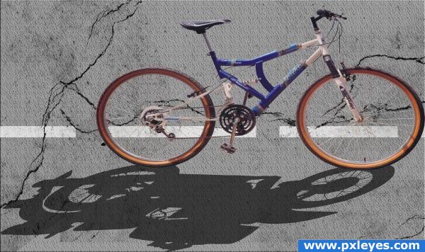
A good idea author. The perspective between the road and bike are way off though. From the angle we see the road at, we should be looking down directly on top of the bike, and not a side view as you have showing. I would skew the road, place it on the lower half of the image and then add some scenery in the background. I think by doing this it would improve the image imho. Good luck
Great idea, nice result!
lol, nice idea
wrong direction of shadows......the light source is frm top left....then shadows should be towards bottom right.....
really cool
Nice idea!!! good luck
The road texture looks too uniform and has no perspective. I found an easy way to make road texture is to start with the gray color then add noise for texture then use gaussian blur to give some blending to the texture. I agree about the perspective problem. One thing that would help is to angle the ends of the white line, as it is now the lines appear to be viewed from directly overhead. Concept is great worth spending a little tweak time IMHO.
Howdie stranger!
If you want to rate this picture or participate in this contest, just:
LOGIN HERE or REGISTER FOR FREE