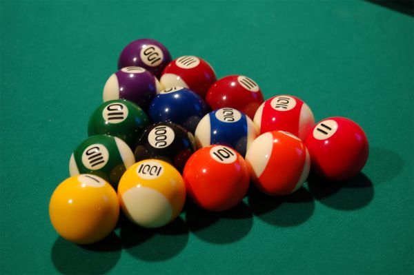
Was not as easy as I thought, especially because I wanted to make it look as realistic as possible. (5 years and 3659 days ago)
- 1: Pool Balls

Was not as easy as I thought, especially because I wanted to make it look as realistic as possible. (5 years and 3659 days ago)
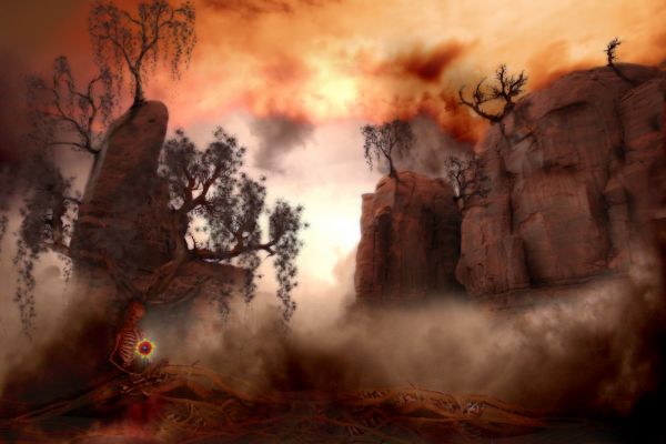
I originally wanted to enter the branches contest, but realized it was for 10+ level...lol. So I added the skeleton and flower. I think I like this one better actually. I made the moss with a brush using dynamic and scattered properties, then blurred the result. (5 years and 3664 days ago)
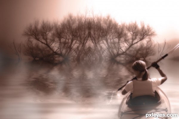
I used the flood filter from flaming pear. I cropped some of the tree and then mirrored it. I created a lighting affect to come down from the right top to match the light on the woman. I added some fog with a simple white brush and then did a gaussian blur.
After all that, I combined all the layers, created a copy, then desaturated the copy and did a posturize (11). Then I changed the blend mode to overlay and played with the opacity to give it the soft look.
Finally I made a new layer and colored it a reddish brown and made the original layer as luminosity. (5 years and 3643 days ago)
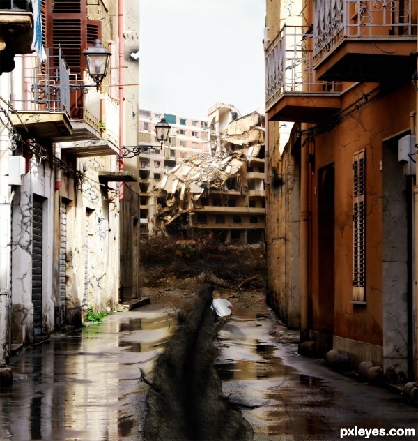
This was a whole lot of blending with the background and each individual crack. I used crack brushes for the walls and the outside of the main tear, but I did the tear from scratch using liquid tool to make it look like the earth came up a bit. I used the texture option and a lot of burning to get the look of the earth. (5 years and 3648 days ago)
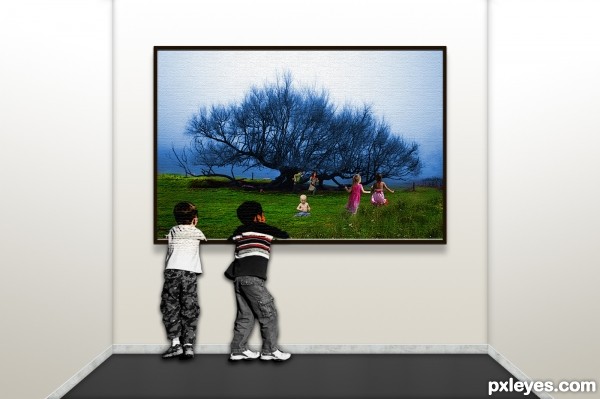
The children are supposed to be merging into the picture to go and play with the other children.
I basically just used the burn and dodge tool to get a greener grass. I changed the hue to the blue, made a copy of the layer and deleted the grass part so the green shows through.
I made the walls and floor shading with inner shadow and used the gradient tool as you can see on the walls.
The floor boards were made using the texture fill. The frams was just a simple fill of color and then inner bevel. (5 years and 3643 days ago)
go to lou23m's profile
Quite original and convincing. Good luck!
Very good, GL
111 needs a bit of warping, but great idea!
As hard as it was - U succeded with making it realistic. GL
GL
good take on theme.. good luck..
Yeah,this is great idea and great blend...gl author
Very realistic! But, as CMYK said, 111 needs a bit of curves...
Took you guys advice and made the fix. Thanks!
brilliant idea... well done
Looks real to me, and a very clever (i.e., non-obvious) idea for the contest theme.
I believe we found a winner, this one is the most realistic I've seen. The reflections are perfect and the warping of the numbers are just excellent. This is highly believable! Great job, author!
nice work good luck
Congratulations! I pinned it didn't I? hehe
Nice job!
Congrats
Congrats on the win -- nice effort on this one
Congrats, well done
congrats lou
Congrats
congrats
GR@TTIS!!!

Thank you all for you comments, I really appreciate it!
Congratulations!
Congrats!
Howdie stranger!
If you want to rate this picture or participate in this contest, just:
LOGIN HERE or REGISTER FOR FREE