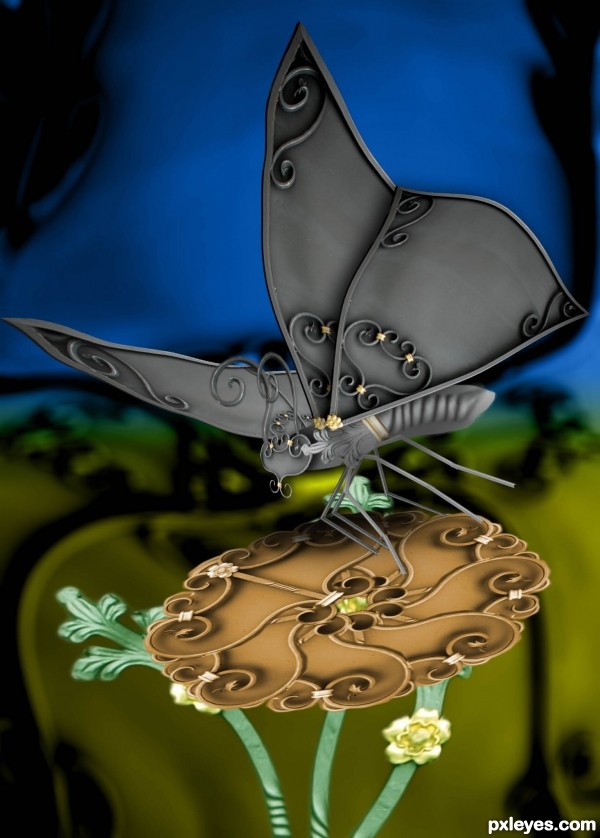
An illustration/collage using only parts of the source image. (5 years and 3248 days ago)
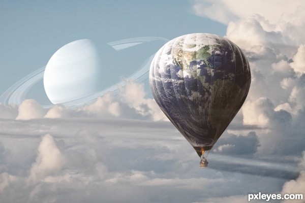
A ride in an earth-like balloon somewhere near saturn ;) (5 years and 3246 days ago)
Good job! 
Just one suggestion: Step 10 looks better without the white streak across the balloon. GL author!
Thanks CMYK! I'll have some more work on it, I wanted some cloud stripes in front of the balloon to give the scene some more deepness, I guess it needs some more work to make it clear but subtile.
Very creative literal take on the theme (which would be emphasized if the title were "World Balloon" . I like the calm, restful mood evoked by the muted color palette.
While greater depth is a good objective as a general rule, I like the uncluttered simplicity of Step 10 which I think already shows a lot of depth starting with the front-plane clouds in the lower right corner and then going diagonally back to the balloon floating over the cloud "plain" in front of the cloud "mountains" in front of Saturn in the far distance.
It's the best description I could ever hear about this scene. Thank you so much! I'll take off the front layer of clouds.
Really nice take on this theme. Like how you distorted the earth image to match the shape of the actual balloon. I'd like this even more I think if Saturn wasn't monochrome. This works too...though! 
EDIT: Author your explanation makes perfect sense. Thanks for sharing. I like the way it is now too. Upon looking again...I think the way it is now lends more of an attraction...because it ISN'T typical. Nice job! 
Thanks for your comment pixelkid, most of what we do as artists is in certain way a recreation of visual fantasies that are part of our self made inner world. This goes for the monochromatic vision of saturn: I've always been seduced by the idea of how would it look to have a big exotic planet near earth, and the thing is that actually in daylight it would probably look very similar to what I did in my composition, due to the color filtering of our blue atmosphere.
Yes, this is more about visual poetry than about optical realism... Thanks again!
Very pretty scene 
Thxs!!!
nice one..good luck
Thanks everyone for your votes!!!
Congrats for 2nd
Congrats!
Howdie stranger!
If you want to rate this picture or participate in this contest, just:
LOGIN HERE or REGISTER FOR FREE
(5 years and 3249 days ago)
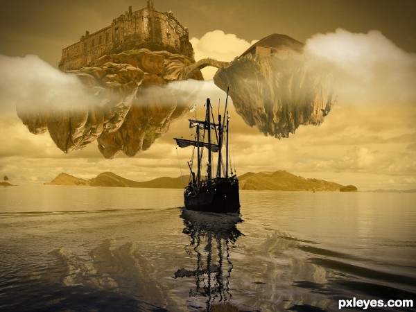
Nice work. I might color match the smaller island some more. GL author. 
Thanks! I agree, it's too evident that both islands come from different sources. It's a matter of time, I like ending my works as fast as possible, and these are the consequences. 
very beautiful!
Author, you have plenty of time to do the color correction and resubmit! 
Love it now. 
Thanks CMYK46!
I don't know why but I always adore the saturated colours which gives that surreal feeling to the artwork like in this one. Loved it! good luck
Thanks velkanx, I like using this type of color matching when I need the picture to transmit a sort of distant emotion.
Howdie stranger!
If you want to rate this picture or participate in this contest, just:
LOGIN HERE or REGISTER FOR FREE
(5 years and 3241 days ago)
love the haunting feel.. good luck!!
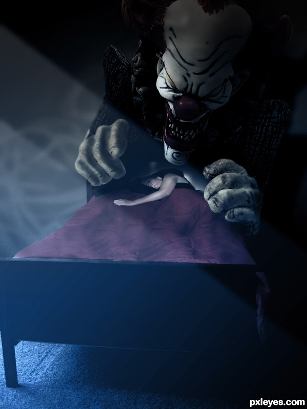
Thanks drivenslush! There's something about clowns and sleeping that really scares me... Maybe I saw Poltergheist too many times...Who knows.
Good mood, but the figure is distorted.
Yes CMYK! I didn't spend enough time on it and the source I used didn't match the perspective... I'm happy with the overall result anyway...
Clowns are soooo scary... and the symbol clapping monkey is another thing my parents put in my bedroom to traumatize me when I was little... great work author, I may have to see that specialist again... lol... I'm kidding..... or I'm I? lol
Great idea and nice execution author...agree about distortion of the girl...U still can work on this author, there is enough time for fix...best of luck
Nice ideea! GL
Howdie stranger!
If you want to rate this picture or participate in this contest, just:
LOGIN HERE or REGISTER FOR FREE
(5 years and 3249 days ago)
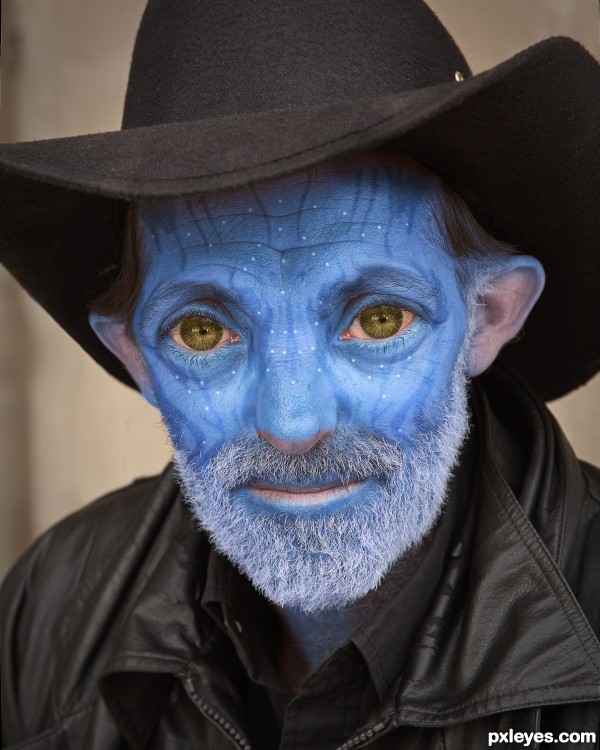
Been waiting for this one!!!  Great work author
LOL, I had fun with it!
lol! that is sooooooooooooooo funny! 100%
Nicely done, good SBS! 
Very cool...... nice job.
Thank you all for your comments! I knew this was probably a bit of a naif idea, but it was this photo or never!
Howdie stranger!
If you want to rate this picture or participate in this contest, just:
LOGIN HERE or REGISTER FOR FREE
go to manelic's profile
Photography and photoshop contests
We are a community of people with
a passion for photography, graphics and art in general.
Every day new photoshop
and photography contests are posted to compete in. We also have one weekly drawing contest
and one weekly 3D contest!
Participation is 100% free!
Just
register and get
started!
Good luck!
© 2015 Pxleyes.com. All rights reserved.

quite fun author, excellent job (If you want.. you could repeat the flower and add just a wee bit of drop shadow and place it on top of itself several times to give it a bit more thickness)
It's super fine just the way it is, but a bit more thickness to the bloom might give the image a tad more punch, it looks a bit thin at the moment compared to the thickness of the butterfly, but of course that is just IMHO... GOOD LUCK and GOOD JOB!!
Very creative idea. Lovely job.
Thanks all for your comments! I'll try to improve some details on it (if I have time to do it).
You've created a masterpiece in just using the source picture. WOW! Very interesting. Best of luck.
beautiful entry..good luck
beautiful entry..good luck
congrats!
Thank you all for voting!
Congratulations!
Congrats for 2nd
Congrats!
Congrats!
Congrats for 2nd
Congrats
Howdie stranger!
If you want to rate this picture or participate in this contest, just:
LOGIN HERE or REGISTER FOR FREE