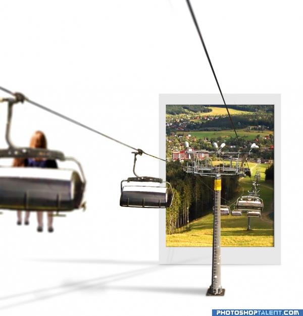
shadow fixed.
Add woman and her children on another glider.
Add depth of field by give it a lens blur.
your comment please! (5 years and 3959 days ago)
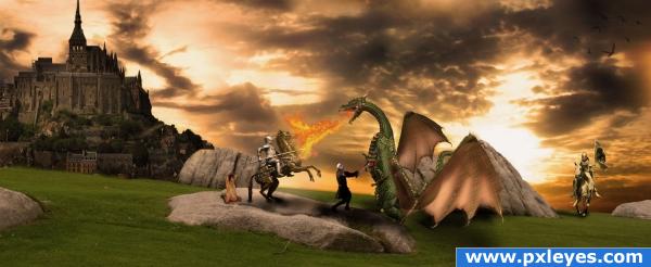
step by step coming soon (5 years and 3897 days ago)
good job!
you cant use dragon images sorry... they are classed as pre manipulted. Awsome image but unless you find other dragons then its no good 
all the best with finding another dragon. nice entry.
Looks great but you are using others art works even though they are CC
Rule says : DON'T use an image that has been previously manipulated into artwork, satire etc, even if it is offered under creative commons.
im going to be interested in this sbs...!
i guess i have to create my own dragon. took more time but i'll try.
Very nice manipulation! Shouldn't the castle be a bit bigger? Compared to the characters it's a miniature o.o
wow, just like in a PC game with fairies and knights. GL!
The people aren't too big. The castle is far away. What has that dragon done to you? He was probably just hungry and likes his food extra crispy. It's just not fair.

amazing job
Overall a good image but i must agree, the castle does seem quite far out of the picture, loving the birds in the top right corner though...
nice
Awesome!!! love it!! excellent setting Author!!!
AHHHHH, My favoriet time period! Great work.
you could maybe try using a slight lens blur on the castle but otherwise awsome
Howdie stranger!
If you want to rate this picture or participate in this contest, just:
LOGIN HERE or REGISTER FOR FREE
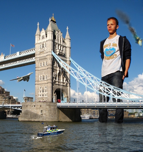
Bridge used from sxc.hu (5 years and 3966 days ago)
He seems mad! Watch out :P Nice idea!
good luck and welcome back!
Nice..If i do that i dont make reflection.
nice work, i would love to see a plane heading towards him, that way he would have a good reason to look so mad lol
@CSevrip: The bridge has reflection on water surface. Why he shouldn't?
Nice integration...what's the red bit in the water where is leg reflection is?
Nice - yes i agree that there should be some reflection in there.. But as you say, use the bridge as a guide.. Your leg reflection is way to defined. Straight edges?? Break them up a bit more.. GL.
Very well done.
Nice work
Yeah,you should work on Lodd's reflection a bit more(to make the reflection more realistic,use a water displacement map,google it!It may take a while to make the map but it's definitely worth it)
very cool idea and well done good luck!
maybe darken the bottom of the jeans as if the were wet !!!! 
Now that would just freak a man out. 
Following OliviasArts: add a plane toward him. ReapRevenge: darken lower jeans. And from many comment: break the reflections. Another comment please.
The boat in the foreground is way too small
@lchappell: I've change the boat to a bit larger. Another suggestions please.
how about some people jumping off the bridge??  nice one.. gl
Make the police boat bigger and add reflection under it. Bigger F16 and bigger exploding plane behind him.
Looking better!
good job and good luck
interesting idea
Howdie stranger!
If you want to rate this picture or participate in this contest, just:
LOGIN HERE or REGISTER FOR FREE
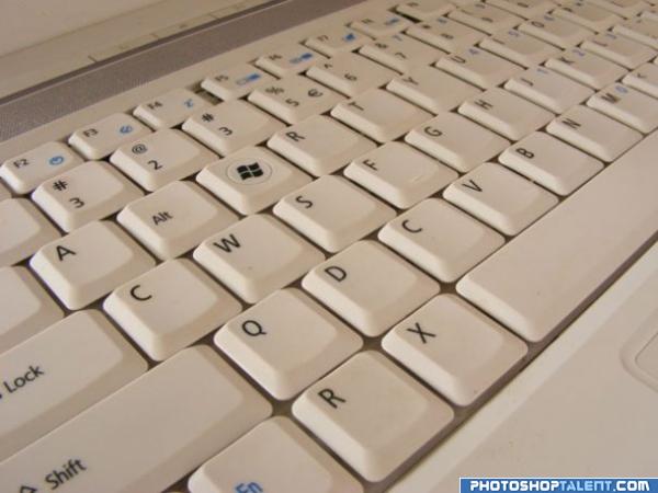
what's with QWERTY? Can i have my own keyboard set? (5 years and 3966 days ago)
welcome back and good luck!
Cool idea!
Lol nice idea! I guess it's a way for us all who uses computers decorate the key's place, anywhere :P
Any reason why you have 2 C's or 2 R's or 2 3's?? That means there are a few missing letters in there somewhere?? Good L ck! 
@animmax: Yeah. I didn't notice that. I guess that's what happen if you make your own keyboard layout 
doesnt stop you doing the rearranging though? just add the others back in - in different places? You may have to use additional sources for perspective?
very cool idea and well done good luck!
 do you need "any key" too?
  just kidding! cool! good luck!
so practical 
Very simple and nice 
hehe awesome 
good
good job and good luck
Very good!
Howdie stranger!
If you want to rate this picture or participate in this contest, just:
LOGIN HERE or REGISTER FOR FREE
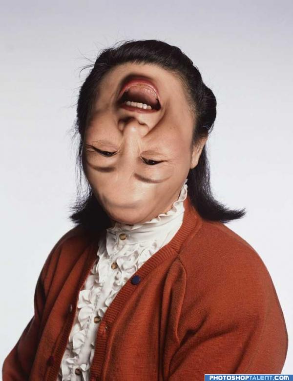
I don't want to see your smile. No. I don't even want to see YOU alive. (5 years and 3966 days ago)
This was freaky the first time around! Good luck and welcome back!
good luck and welcome back =)
link???????
well done... still creepy as all get up... LOL
lol
Well yeah... sort of?? Have you considered making it a touch more realistic?? Maybe just flip the mouth? I mean she couldnt even go out in the rain! She would drown! 
Nice blending... 
Now that is a BAD DAY...LOL Great Job 
Well done.
your inspiration???dali?mone?da vinci? hehehehehehe GL
Nice work author!! 
damn is too funny good luck!
Nicely done but somehow got a feeling it's off topic :s
Lol impressive
yep.. i dont want to see the face again.. source? nice idea.. gl 
Now, she looks healthy...
Nice entry, but as with one of the other submissions, its not an ugly smile, just an ugly head. 
Pretty freaky, but I think I agree with robvdn and Ory. After all, it's not an ugly smile (she has a sweet smile in fact  ), but more a freaky head . Good luck!
something about this makes my stomache turn lol
Howdie stranger!
If you want to rate this picture or participate in this contest, just:
LOGIN HERE or REGISTER FOR FREE
go to mjeprie's profile
Photography and photoshop contests
We are a community of people with
a passion for photography, graphics and art in general.
Every day new photoshop
and photography contests are posted to compete in. We also have one weekly drawing contest
and one weekly 3D contest!
Participation is 100% free!
Just
register and get
started!
Good luck!
© 2015 Pxleyes.com. All rights reserved.

Photograph's shadow seems awkward to me, but nice job overall
window to europe!
@kid: any idea why? The shadow for pole looks like that.
very good oob work
that's a good example of thinking outside the box:P
what about the shadow for the cable's and the seats
This image just scares me. Like a dream I once had.
The photo is so thin, it wouldn't have much of a shadow at all....
This concept is a good one, but I think it would be more effective visually if the car going into the photo was brought outside into the "white space" a bit. the partial in and partial out of the frame is distracting from the idea.
except for a couple of blurry spots on the photograph, this one looks visually brilliant.. do get rid of those blurry spots.. gl
I LIKE IT... really is good work AUTHOR.. in my humble opinion.. this would be magnificent in a billboard with an ad in the white space.. "leave your white dimension behind.. etc.. etc.. brilliant.. the tech stuff will happen but the composition an Idea are out of the park.. good job
Nice change of pace. I like the depth too. Great job! The white space area can have all it's own properties...shadows, color etc....since it's separate from Tatra. Very good.
Now you've got two light sources: one for the shadow of the pole and one for the cables...pick one.
good
love the idea, gl author
seems like the images should be blury farther away not close up?
AWESOME ! I LOVE IT!
very good concept!
Good work author!!!!
original
Good work, they would enter the tatra realm, but where are they coming from? My mind is aching!!
good work but if there is no camera blur it will be perfect
nice idea, very creative, good luck!
like the white background and shadows. very cool. maybe the woman+chair is too blurry?-you could just blur the second chair a bit if you cant make the woman clearer. good job!
nice job
Very Nice!
Brilliant idea very well executed!
Nice entry! If I were doing this pic I would hide the base of the pillar. GL!
you did very well, keep going.
Howdie stranger!
If you want to rate this picture or participate in this contest, just:
LOGIN HERE or REGISTER FOR FREE