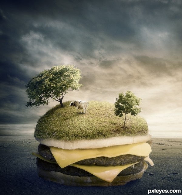
Thanks to NightFateStock (5 years and 3213 days ago)
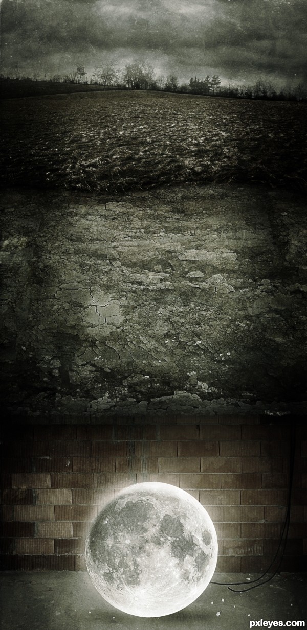
Thanks to Bigfoot112, most of the stock images used belong to him and Wchowicz for the image of the moon :)
Texture thanks to Artofdecay-Stock (5 years and 3195 days ago)
NICE IDEA, Author!!
Great choice of images and very nicely blended --- glow on the moon is nice -- one small thing is the edge between the wall image and the soil might look a bit better if the line between then was a bit more defined -- more of a cross section effect (IMHO)
Interesting idea, but the inconsistent lighting and side shadows are hurting it, visually.
You have a "glow" around the moon, yet it can't seem to even reach the top or sides of the chamber encasing it...Perhaps if you feathered it out further, it would help appear more as part of its surroundings.
The side vignette shadows from top to bottom just looks like an uneven attempt to shine a dim spotlight down on the scene. If you try toning those down, especially as you descend down the image, you will achieve a much more effective visual movement to your main focal point, the moon.
The moon also looks a bit too black and white for its brick surroundings. Color refraction would impart at least a very slight warm tint (3-5%) to it.
If the average brick is 9" wide, this is a 27" moon. Oh wait, these bricks may be as big as 24"...that would make the moon 72".
nicely done..great creativity also..i think the textures u have here work very well with your image..GL author 
Reminds me of the song with the line 'carry moonbeams home in a jar...' - guess it's in the basement while you look for a suitable jar! lol 
Congrats Matteo  terrific work
That is definitely in a wrong place :P! Great work ponti55 Congrats!
Congratulations ... great concept and well done!
Beautiful Idea..and great work.I love it.
Howdie stranger!
If you want to rate this picture or participate in this contest, just:
LOGIN HERE or REGISTER FOR FREE
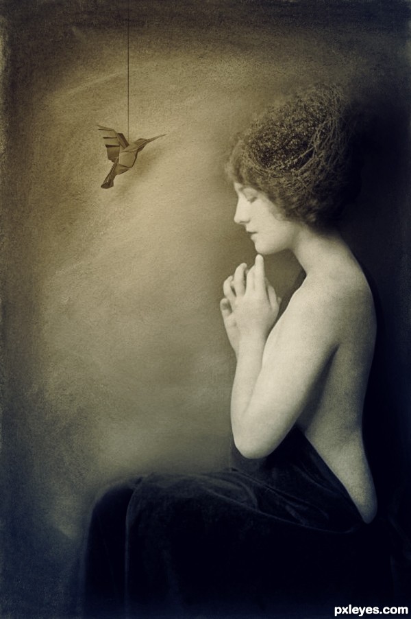
Thanks to Goblin-Stock, Step-In-Time-Stock and Geek-Stock. (5 years and 3162 days ago)
blending is superb author..
I love the tones you used...the blending is well done, and the mood is just right.
I LOVE that you used a vintage model. She's perfet!
wow nice work author..
Simplicity at it's best.
great image author, but you didn't really do anything to the source image..i think you played it a little too safe, i like the over all tones and vintage feel
No, i usually like to keep the source image intact and i don't really consider it playing it safe, but thank you all the same. And thank you for all the comments and the favourites  (h)
(h)
This is a very good manipulation. "Simple" can be just as effective as CBR (chopped beyond recognition), sometimes even better.
I agree that the vintage feel is very well done. Nice image!
why the string on the bird... such a perfect image... 
Cool!..like it a lot.
I think its a beautiful image. I love that you didn't chop the hell out of the bird 
Nice one author, well done 
What a lovely creation...Nice job author! GL!
Congrats Matteo  lovely work
Thank you very much for the comments and favourites! 
Howdie stranger!
If you want to rate this picture or participate in this contest, just:
LOGIN HERE or REGISTER FOR FREE
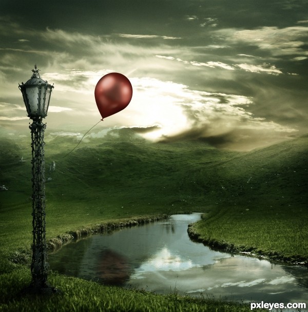
Thanks to Chulii-stock for her "Misty Mountains" (5 years and 3588 days ago)
Stunning.
loving the way the clouds appear to wisp off of the top of the hills!
wow...very nice
Great work on the lighting
Nice one!  Good luck!
Agrees with Lamantine!!
beautiful blending..............
Great choice of colors!
Remove the reflection of the balloon, the balloon is in front of the water so it can never give a reflection IN the water, a shadow: yes. Furthermore there's a reflection of a cloud which should be behind the mountain not in front of it.
The overall mood is good though.
So beautiful... GL! 
awesome......
Nice mood! But the reflections are of the old source and don't fit this image. As robvdn said, also the balloon wouldn't have a reflection because it's in front of the water. Good luck!
I disagree with the comment about the balloon reflection but that may just be me. This is beautiful....the only issue I have is that there are two light sources hitting the front of the balloon. From what I see, the sun is behind the balloon so this is a little confusing. Great job though!
I give high marks for this one, But...... Every time I come back to look at this, that dang reflection keeps jumping out at me. screaming " I'm here and I'm not supposed to be and there's nothing you can do about it". Maybe I'm going crazy! I would really appreciate it if you could replace him with another. Good luck!
Absolutelly stunning work,love the mood,colors match so well,blending is fantastic...Congratulations author. 
Wrong balloon reflection I think =) But Really nice work . Good luck =)
excellent... gudwork
realy cool and lovely
Great mood and very nice composition. 
Nice 1! GL 2 U!
Great and full of hope 
You did a good job with this author...
Nice work Ponti. Grats on 1st.
Congratulations!! Beautiful entry!
Congratulations and jubilations *sing*
Congrats, lovely work 
Congrats....fantastic job
Congratulations for the 1st. place, Matteo! 
Congratulations Ponti! 2 very creative entries!
congrats, you're so great...
Congrats! What an amazing landscape you've created
Howdie stranger!
If you want to rate this picture or participate in this contest, just:
LOGIN HERE or REGISTER FOR FREE
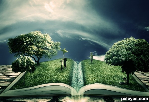
Ahhh... Photoshop was constantly crashing today and I lost the Step by Step guide.. I ended up re-doing the entry about 3 times. Well i hope it was worth it :/
Thanks to Jesuisautre (5 years and 3586 days ago)
another excellent entry
Shoulda known it was you....fantastic work. Beautiful color scheme. Very imaginative and almost "fairy-tale-ish" Is that a real word? You know what I mean!!!
awsome!!! ... great inspiration and motivation to try to do something better..
Yep, reading can open our minds and grow our imagination!... You really got to show us the meaning of reading good things! Nice entry, author! 
Great job
great as always......
Ok... this is great! and I mean REALLY great. The idea, and composition is... can I say great again?. You have some issues w/ lighting but over all, color me impressed. REALLY original.
Holy crap Author! Way to step out of the box. Awesome image and I didnt guess it was you first.
yes the image you have done is really good
but the idea is not yours
its a tutorial... i don't know but i have seen it somewhere
otherwise good efforts you have put in there author
Thank you all very much for the support! I didn't think that many people would actually like it.. Ankitsuhaill, i created this image myself, i used no reference tutorials or images, I give you my word.
Edit: The closest i came to using a reference was Lelaina's "The Magic of the Written Word"
http://www.pxleyes.com/photoshop-picture/4a8b0e00ec014/The-magic-of-the-written-word.html ... this was the image that inspired the idea.
Very nice idea! Whether it's from a tutorial or not. Just a few things; The grass in front is kinda ugly blurred. Can you keep that as sharp as the grass in the back? Also the blending with the book in the front is a little unsharp. Sharpening the edges around the grass would make it a lot better. Where is the water source, in the middle? In that case why is it white? if it's supposed to be water make it blue and ripple the grass thats in the water  Good luck!
hey please author don't take my comments in a wrong way....
i am very impressed by your work...seriously i am...
i just said about the idea that was from a tutorial but it is not certainly a copy of that and you have done much better than that tutorial
just fix some small errors like lighting
and you are on the top of this contest....
my wishes
Great work author ... Good luck! =) Fav !
This is really good. This could be great with a bit more work. The grass should extend the page on the left the same as it does on the top. The grass should also have a sharp edge on the bottom of the book. The water needs a lot of work, it also needs sharper edges where it meets the book and also between the underwater and above water part. At first I really didn't know what the water was, perhaps having the water pour off the page or just adding a duck would help. The shadows need more attention as well. Overall this is a nice entry which will score high, but with some minor adjustments this has the potential to be one of the greats. Good luck!
great finish
I'm speechless... thanks to ALL of you for your comments and your advice.. Chalty and Ressiv in particular, i've sharpened the grass, removed the soft edges at the bottom, added a waterfall falling from the centre. I hope it looks better this way.
Again, thank you all so much! I never expected this entry to do well... 
Very good! Just one last thing, the water kinda spoils the image for me. Try to create horizontal waves in the waters structure, the structure is really weird now. You could do it with the smudge tool, stroking horizontally. And in the front where the water is going over in a waterfall smudge a little vertically so that the water really looks like its transforming into the waterfall. Nice concept anyway! Good luck!
Fabulous work author...good luck
ooohhhhh dear.  i'm enthralled. you've blended and worked the sources so well together. you've captured my full attention. i can't say anything that someone else hasn't already say, except...wow. just pure ..wow.
Well worth it...  GL
GL
Great work author. Nice blending of images 
 .
.
Love your idea, very creative, gl author.
good work
This actually rocks! best entry in my opinion and yeh, slightly off your normal track but i knew it was you  specially when i read the style of the authors comment! :P nice work dude!
Really magic image! 
Lol and congrats on 2nd as well. 
Congrats!! Great job!
Let me say, that I'm really honored, that one of my entries was the inspiration for this fantastic entry!
Congrats for the second place!
In spite of PS crashing, you were rewarded! Congrats! 
Howdie stranger!
If you want to rate this picture or participate in this contest, just:
LOGIN HERE or REGISTER FOR FREE
go to ponti55's profile
Photography and photoshop contests
We are a community of people with
a passion for photography, graphics and art in general.
Every day new photoshop
and photography contests are posted to compete in. We also have one weekly drawing contest
and one weekly 3D contest!
Participation is 100% free!
Just
register and get
started!
Good luck!
© 2015 Pxleyes.com. All rights reserved.

Great work author! You have a very unique style and I guessed that it would be you :P GL

IMO i would darken the bottom of the burger a bit or somehow soften it because it doesn't look like it's on the ground.. I mean it does look like it is a lot but it could even more I think :P Good luck
oh lord.. hehehehe, great idea
I don't see any industry here...
the light is very good, but it seems to me that the burger is floating... maybe a little more shadow... the rest is good... good luck
Great composition, GL!
Very nice composition ^.~
so milk is free with burger ha..lol great idea
Good job!.... Good luck!
Very cool and technically good work but this become a bit boring, trees on the cheeseburgers, umbrellas, turtles, boots, small planets, elephants, books and so on and on. U are great chopper author try to get out from the mood box that u created. Don't get me wrong, i always give high marks to your entry's but would be cool more artistic evolution.
Very interesting with the whole field on the bun idea. Good Luck Author.
wonderful entry
Congrats for third.....!
Congrats Matteo !!!
!!!
congrats for the 3rd place....
Congrats
Congrats!
Congrats.... man
Congrats!!
congrats!
Howdie stranger!
If you want to rate this picture or participate in this contest, just:
LOGIN HERE or REGISTER FOR FREE