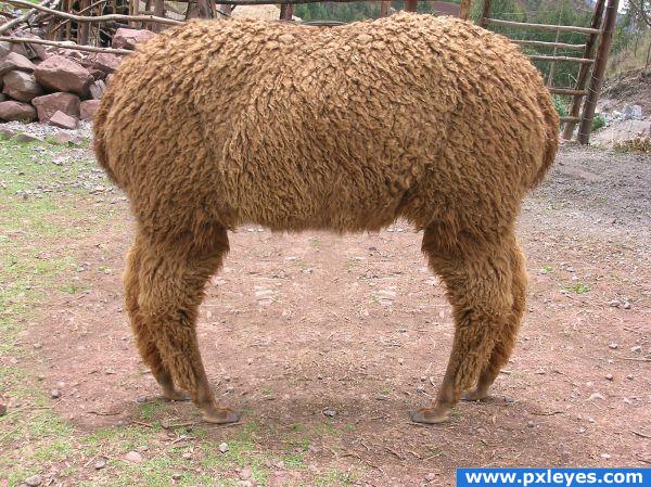
The opposite of a 'Push Me Pull You'...
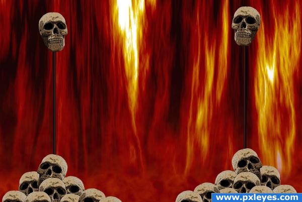
I'm practicing with masks and cloning at the moment, so this was a good exercise. (5 years and 3947 days ago)
go to sjpeters's profile
Photography and photoshop contests
We are a community of people with
a passion for photography, graphics and art in general.
Every day new photoshop
and photography contests are posted to compete in. We also have one weekly drawing contest
and one weekly 3D contest!
Participation is 100% free!
Just
register and get
started!
Good luck!
© 2015 Pxleyes.com. All rights reserved.

 something retro games?


Good job! There's just a bit too much symmetry on the ground between the legs...
Yeah! Dr. Doolittle!
Oooooo, mercy! Really cleverly done!
great imagination
Nice result. In fact I wanted to say the same as CMYK about the ground between the legs. If you can make it less symmetrical (just add some other ground parts), would be very nice. Good luck!
You can see where the top layer overlaps the bottom layer near the left legs. Also the shadows of the legs go in opposite directions, which makes no sense.
very nice one!
Thanks for the comments. I can see what you mean with the symmetry, I forgot about that area. But I also forgot about the shadows... lesson learned *hopefully )
)
Howdie stranger!
If you want to rate this picture or participate in this contest, just:
LOGIN HERE or REGISTER FOR FREE