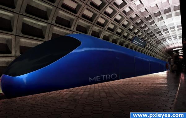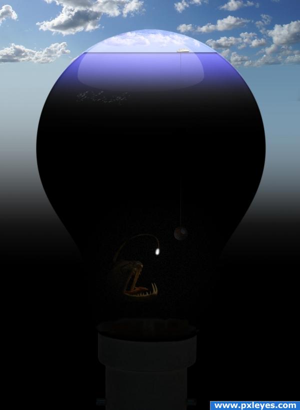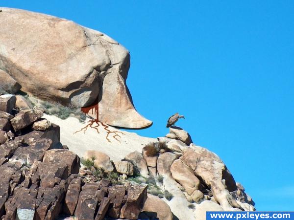
The little "Cafe Metro" sign inspired me to use a subway / metro theme for this one. From the source image, I pulled the blue bulb in the foreground, the street sign and the word "Metro" from "Cafe Metro." I also used the airbrush tool to do a fair amount of digital painting rather than relying on blending layers this time.
Thanks to frozenchipmunk from Flickr for the background!
I hope you enjoy this -- please feel free to offer any and all thoughts! (5 years and 3894 days ago)


Great idea!!!!
Maybe continue that wonderful white reflective line through the blue and continute it through the black cover shell (the black cover is looking a little flat) great visural over all
the idea is superb!
Really good idea. I agree with GolemAura about the black window, it does look a bit flat. Bring back the highlight that was there before you blackened the window area. Black glass would reflect light just as when it was blue. Try copying the original before adding black and put it on a layer over it. Experiment with layer types like luminous and different opacities till it looks right. Adding the highlight would really make it pop.
nice idea ... GOOD LUCK
Howdie stranger!
If you want to rate this picture or participate in this contest, just:
LOGIN HERE or REGISTER FOR FREE