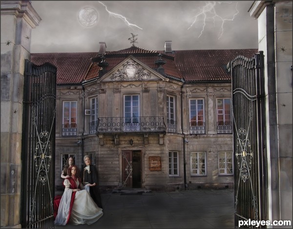
Betty's Brothel is in need of some repair and perhaps has a bit of eccentric clientele. (5 years and 3257 days ago)
8 Sources:
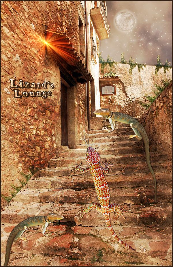
Good time at Lizard Lounge (5 years and 3264 days ago)
go to trim49's profile
Photography and photoshop contests
We are a community of people with
a passion for photography, graphics and art in general.
Every day new photoshop
and photography contests are posted to compete in. We also have one weekly drawing contest
and one weekly 3D contest!
Participation is 100% free!
Just
register and get
started!
Good luck!
© 2015 Pxleyes.com. All rights reserved.


Sara Barth and Lies Meirlaen have both been notified of their image being used, by note thru Stock.xchng.
I like the overall colours of this image, it suits the elements in the image so well. Good work!
I like it overall however I think it could have been straightened up to make it look level.
I thought of straightening the right entry post, but decided it added to the state of decay. Therefore, I left it as it is, to be fitting of the theme.
This is nice entry author and with few tweaks this can be even better...Sky image and the overall mood don't go with each other...U have day light for the house and people but rainy dark sky...U have to made image darker or to find some other sky for this image...I think that some other sky would be better in this case...Also IMHO spiders are to big..For better blending u can use some color layers in different blend modes..There is slight difference in resolution of provided source image and images that u used so some color layers would fix that difference...sorry for this nit picks...
Erathion, all the changes you requested have been made, with the addition of a nicer weathervane and lightening.
Cool concept. The fairly uniform lighting makes it all rather blah, however. A lot more shadows would make it a lot more dramatic. Some green (for example) interior lights might convey both "open for business" and "eccentric."
it looks loke a painting, very nice good luck!
It's sort of scary, really like it!
Howdie stranger!
If you want to rate this picture or participate in this contest, just:
LOGIN HERE or REGISTER FOR FREE