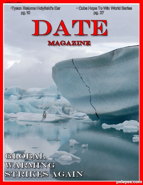
Instead of Time magazine, I changed it to Date magazine. As you can see, global warming is striking again, with a few side articles at the top. (5 years and 3300 days ago)
Boy, that's an old song!!! Nice rendering, but the large hands are too blue in tone, and the dancer's legs and feet look very odd. she looks like she is wearing blue/purple tights (the same color as the blue hands), and her visible foot is squished up, making her leg look really fat.
author says:
Thanks for the tips! I'll work on them when I get the time. Been very busy lately. I appreciate the tips though
We usually provide a SBS so that people like me won't have to ask: What happened to the source?
Is it only the coat of arms on his shoulder ?
author says:
Sorry for the trouble of not posting an SBS. I am new and fully do not understand all the regulations and normal procedures of this site, and the coat of arms is the noticeable one, the eyes on the angel statue are coins, but is almost unnoticeable after all the tinkering I did, also there was another face in the torch, but all the tinkering made it completely unnoticeable. I always appreciate tips though.
People here are eager to help once they get what the author intended to do - that's why you can use the description . For ex. I see you have an overall pattern but is hard to understand how did you achieve it. Instead you can make it out of coins. You can experiment with masking the negative so that it looks like your image is made of different coins, stuff like that.
nice thinking and great title...best of luck author
author says:
Well I'd appreciate all the help I can get. And I completely understand what you are saying and I will start doing that from now on, and for this piece of work, i didn't apply any patterns. First off I spent a couple hours messing with my work, so there are no real clear steps since I kept going back and changing/adding or subtracting. But if you want I can try to go over all the steps I did.
author says:
To clarify on the "patterns", I actually merged all the layers at the end, and duplicated the product a few times and took a gaussian blur to one of them, and i used the twirl and wave distort filter on another layer. Which my original piece of the bottom layer with the blur and distorted layer above the original with the blending modes changed.
Great concept. I do agree with Lolu though ...You can add very nice and easily editable textures by:
Add a 50 percent gray layer with the blend mode set on Soft Light (Overlay and Hard light work too ... just stronger); apply filters (you can combine them until you get a look that you like - e.g. stain glass, monochromatic noise ...you can do this in more than 1 layer). You can warp them or transform them; you can paint some out or back in (using gray); you can blur or sharpen.
Once you think you like what you have created. Voila! You now have a texture that you can work on, change opacity, lighten (use lighter grays to white), darken (use darker grays to black) and all without harming the main image.
Trick: the neutral gray layer is also a great way to play with the lighting almost like dodge and burn but non-destructive ... use white for highlights, black to darken and/or intensify and 50 percent gray to bring back to neutral (no change).
LOL! Tyson returns Holyfield's ear! LOL!! Great job!
Howdie stranger!
If you want to rate this picture or participate in this contest, just:
LOGIN HERE or REGISTER FOR FREE