- photo contests ▼
- photoshop contests ▼
- Tutorials ▼
- Social ▼Contact options
- Stats ▼Results and stats
- More ▼
- Help ▼Help and rules
- Login
30 Useful Adobe InDesign Tutorials
Adobe InDesign, which happens to be a contemporary of Adobe’s other software Pagemaker, in many ways has been Adobe’s saviour. In the year 1998, Pagemaker had almost all the business to its rival software QuarkXPress 4.1, which offered many more superior features which came into the market in 1998. There was a time when Quark planned to buy Adobe but then came the creation of a new independent project which was named “K2” by Adobe. K2 was later on released as InDesign 1.0 in the year 1999 and proved to be an instant hit amongst designers.
Over the years 8 versions of InDesign have been released after the first one, the latest one being Adobe InDesign CS 4 which was released in September 2008. With different versions have come up different compatibility issues and other problems but the myriad of desktop publishing features which has made this software a hit amongst publishing houses overshadows them all. The most attractive feature of InDesign CS 4 is scripting. Scripting lets you carry out almost all functions that a normal user interface would let you do such as adding text and graphics, export and import data etc. In this article we deal with some basic tutorials that would help you get around with working on InDesign CS 4.
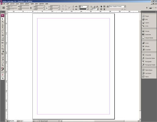
How the InDesign Interface works
This tutorial explains the five basic elements of the InDesign CS interface and helps you in understanding the basic interface elements better.
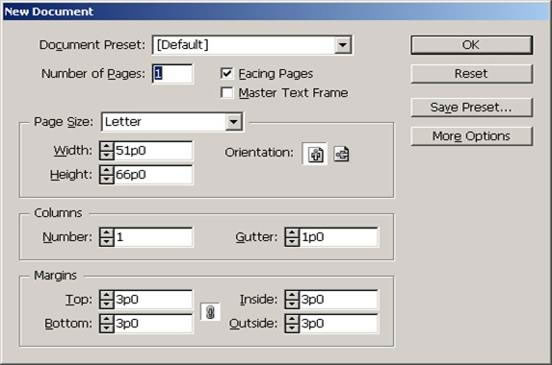
Creating a new document in InDesign
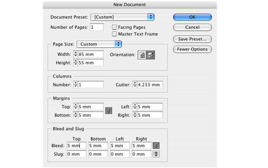
This tutorial deals with starting a new project in InDesign. You will learn how to open a new Document and understand the important settings that would help you in getting started with your work.
Adding text with InDesign
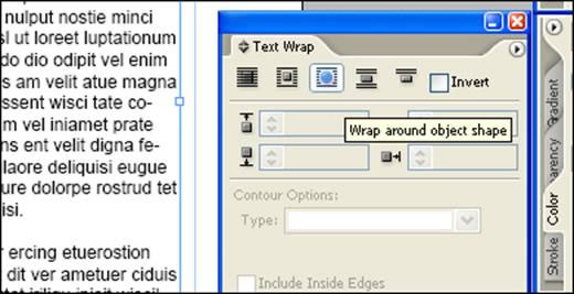
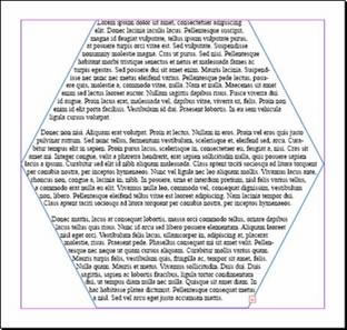 Adding text in InDesign is very different from how you would add text with other programs. With InDesign, you need to work with text frames, shapes, and ports. You can even wrap the text around a frame as shown in the pic.
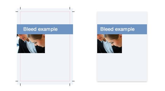
Bleed in InDesign CS 4
Learn about how to add the proper bleed in Adobe InDesign with this tutorial. The term bleed is used for all objects overlapping the border of your document.
How to use the Story Editor
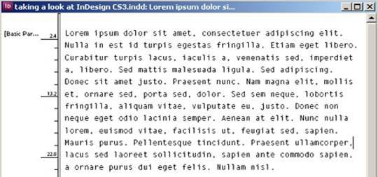
Read this tutorial to find out how to use the Story Editor and how to customize it properly for your monitor. When editing large amounts of text, you can save a lot of time and frustration using the Story Editor.
Learn how to edit text like a professional
Some people can edit text in InDesign at amazing speed and accuracy. In this InDesign tutorial, we will show you several techniques to enhance the way you type text.
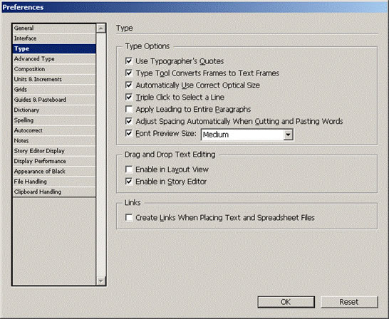
Considerations for printing blacks
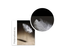 In print there are many different ways to represent black. The simplest is “plain black,” or 100% black ink (0C, 0M, 0Y, 100K). However, you can also create a “rich black” by printing other inks along with black.
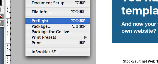
Preflight Checking in Adobe InDesign
The term preflight check originates from the aviation industry where it is a standard procedure for pilots to go over a checklist before lift-off. Preflight checks for print documents are based on similar ideas.
Text Wrapping in Adobe InDesign
This tutorial would teach you how to wrap text into different frames and boxes using Adobe InDesign.
Setting Margins, Columns and guides
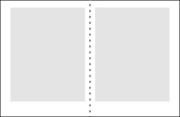 This tutorial deals with the setting of some basic margins, columns etc in your InDesign project.
How to create a table of contents using InDesign
This is a very useful thing to do. Not only do you automate the creation of a table of contents, but by creating PDF bookmarks you also make life a lot easier for yourself when you later come to format your document.
How to create Paragraph Styles
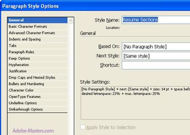 Creating paragraph styles in InDesign can simplify the task of formatting your text any time you lay out an InDesign project. By creating a variety of paragraph styles, not only can you save yourself a lot of precious time when it comes to adjusting font size and leading, you also offer yourself a myriad of different styling options.
Quick kerning, Tracking and Leading in InDesign
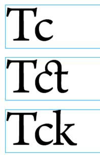 This InDesign tip may be a bit basic, but it did elicit a small “wow” of appreciation from at least one seasoned QuarkXPress user who hadn’t discovered the keyboard shortcuts to quickly tweak kerning, tracking, and leading in InDesign.
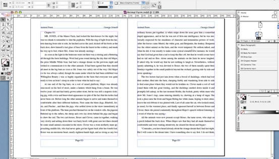
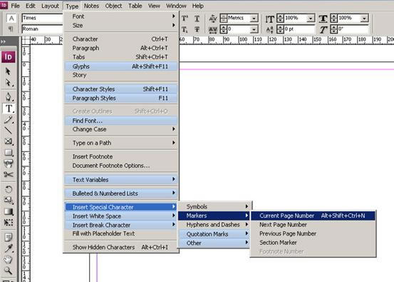
Inserting page numbers into Master Pages in Adobe InDesign
This tutorial helps you with inserting a number into an Adobe Design Project. InDesign will automatically number pages in the style you designate when the proper page numbering code is placed on the Master Pages of your document.
Creating and using an Alpha Channel
 Alpha channels serve many purposes when editing images. This tutorial talks about how to create alpha channels that will contain transparency information for use as clipping paths in a page layout application.
How to add corner effects in your InDesign Project
Adobe InDesign CS2 allows you to round, inset, or add other effects to the corners of objects. (e.g., images or text frames.) Applying a corner effect to an object will change all of the corners of the object.


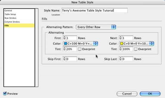
How to stylise your table in Adobe InDesign
This tutorial deals with tips to stylise and format the tables that you have built with InDesign. It makes your project look attractive and helps with better presentation.
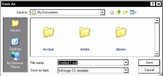
How to design and use a template with InDesign
A template is a document with predefined settings and formatting that can be used to format new documents. This tutorial guides you through the steps to use different templates on your project effectively.
Working with Independent Graphics
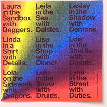 Independent graphics are graphics placed outside of a text frame. This tutorial gives some useful tips and tricks on how to get around with using independent graphics.
Learn how to cast shadows
 This tutorial would teach you how to add shadows to graphics using InDesign. Adding shadows makes one’s work look much more realistic and lifelike.
Learn the art of creating custom brushes
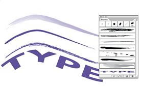 This tutorial discusses about using Live Trace to turn a scanned “brush stroke” into vector, Expanding the Live Trace object to make it usable in the process of creating a Brush, options involved in designing an Art Brush, applying an Art Brush to a path, and adding finishing touches.
How to create a business card for printing
This is a simple exercise to demonstrate how to produce press-ready InDesign files by creating a basic business card layout design and preparing it for press.
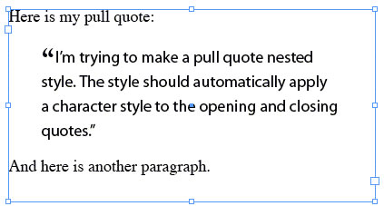
Use of nested styles and Quote Marks
This tutorial teaches you how to integrate nested styles and quotes into your project and how to use them effectively in your project. This is feast for people looking for something new and useful about InDesign.
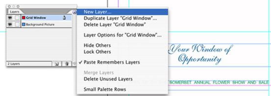
How to create a window through your brochure cover
One area of Adobe InDesign that sets it apart from any other layout program is Transparent Effects. This tutorial talks about how it’s possible to cut a window right through your page to a beautiful picture below using Layers, Custom Grids, soft Drop Shadows and the Pathfinder palette.
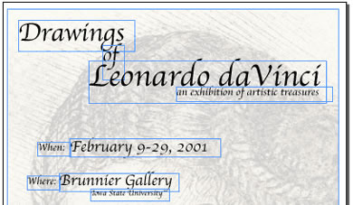
Learn how to design a poster for an exhibit
This tutorial explains in very simple steps the procedure to be followed when you need to design a poster for an exhibit using different graphics and text.
Adobe InDesign useful Keyboard shortcuts
Here is a list of some very useful keyboard shortcuts that would come in handy when you are designing a project with InDesign. Shortcuts save you from a lot of pain and time while working.
Applying character and paragraph styles
 Learn how to apply character and paragraph styles in Adobe InDesign using this tutorial. Paragraph styles apply formatting to an entire paragraph of text. Unlike paragraph styles, character styles can be applied to a word or even a single character.
How to create Island Spreads using Adobe InDesign
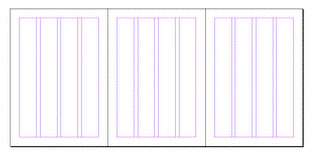 An island spread is three or more pages joined together, rather like the fold-outs that you sometimes see in magazines. Unlike Quark this is not easily accomplished with InDesign. This tutorial will guide you through on how to accomplish this task.
Some quick Adobe InDesign tips and tricks
Here are a few tips and tricks that you would find useful when tooling around Adobe InDesign. There are no big revelations here, but sometimes it’s the little things that make you more efficient.
Text Designing
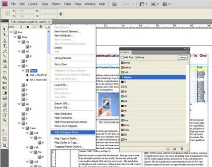
This tutorial guides you through a few useful tips that would help you with styling text in Adobe InDesign. Text styling forms an important part of Desktop Publishing so make sure you check this link out.

Howdie stranger!
If you want to participate in our photoshop and photography contests, just:
LOGIN HERE or REGISTER FOR FREE
-
says:
-
says:
Adobe Photoshop will do the trick. It allows you to create poster in big size.
( 2 years and 4651 days ago )
I used photoshop as well to develop front poster for Gyukaku Restaurant in Singapore and the size is 1.4 metre Width X 2.4 metre Height. I saved it in high resolution, 350dpi.
Hope this will help.
-Krakatau011-


I need to develop some large graphics for a tradeshow (4 meters tall by 6 meters wide) and I am unsure how to create these large files as illustrator does not allow me to make a document 6M wide.
Please advise!
NH
( 2 years and 4800 days ago )