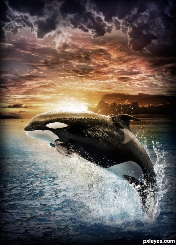
I decided to put this guy somewhere more dynamic and colorful! Hope you like it :) (5 years and 2984 days ago)

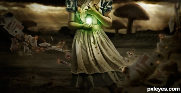
I found a great source image and just went from there...I do wish she had a head haha but oh well I think the composition worked out in the end. The card source images are in the SBS and I didn't end up using the rabbit in the final picture so I wasn't sure if I needed the link but I gave it just in case :) (5 years and 3072 days ago)
go to Robart523's profile
Instant Fav!!..
Perfect lighting...
and love the dramatic effect
Looks very nice
Awesome Image ... Great work!
Good composition and very successful work, luck
I like your idea and work here.
The end result looks good.
I have my doubts about the vignetting, for me this doesnt add to the image. It gives me the feeling that the animal is beeing squished, instead of making it stand out. But that is a personal prefference.
Awesome, well done
Congrats Rob lovely work
Great image. Congrats!
Howdie stranger!
If you want to rate this picture or participate in this contest, just:
LOGIN HERE or REGISTER FOR FREE