(5 years and 3502 days ago)

(5 years and 3706 days ago)
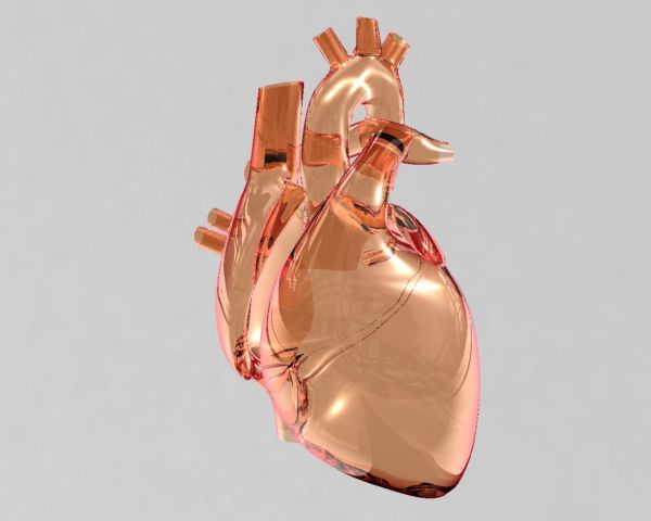
The detailed model looks good. I also like the colored glass. You could of course add small variations to different channels to make it look slightly worn and thus more realistic. Also, the specularity makes it look more like plastic glass. Easy things to fix though.
But just like another entry in this contest you've excluded one of the more vital parts of transparency - background and surrounding objects. It's not really coming to life with this setup. I can see that it reflects some kind of image, but there's no trace of it in the image.
I think it looks marvelous just the way it is Good work!
Excellent job
Spectacular! Good job!
Awesome work.....Great entry......
fantastic !
Wow!...cool render!!!
nice modeling and render for a crazy shape! 
Top notch work
mast faad work
awesome 
Very realistic. Nicely done.
Wow! I would have sworn this was a photograph! great shine and everything! GL! (adding a bg would be even better!)
Nicely done.
Very Nice......G/L Author.
Congrats for your first place, Viren!
great work
Howdie stranger!
If you want to rate this picture or participate in this contest, just:
LOGIN HERE or REGISTER FOR FREE
go to viren's profile
Photography and photoshop contests
We are a community of people with
a passion for photography, graphics and art in general.
Every day new photoshop
and photography contests are posted to compete in. We also have one weekly drawing contest
and one weekly 3D contest!
Participation is 100% free!
Just
register and get
started!
Good luck!
© 2015 Pxleyes.com. All rights reserved.

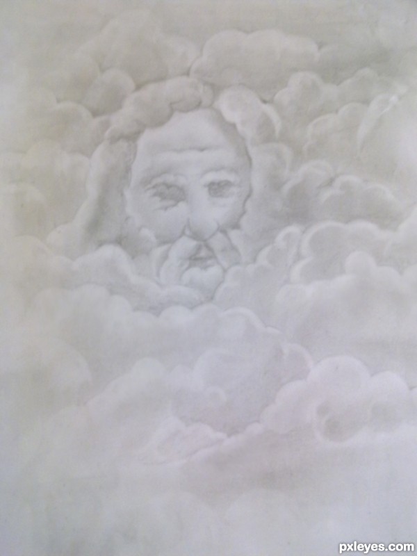
very cool drawing...good luck
very nice work.
great
nice work
Howdie stranger!
If you want to rate this picture or participate in this contest, just:
LOGIN HERE or REGISTER FOR FREE