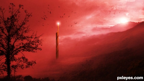
Mystic land matte painting, almost all source images are captured by me. :)
Thanks to http://www.sxc.hu/browse.phtml?f=view&id=956137 for providing bird image (5 years and 3409 days ago)
- 1: Bird images

Mystic land matte painting, almost all source images are captured by me. :)
Thanks to http://www.sxc.hu/browse.phtml?f=view&id=956137 for providing bird image (5 years and 3409 days ago)
go to AdhirAnimator's profile
Lovely image; very dynamic and creates a real mood!
Compostition wise it might be better to have the tower a little more off to the side ... it isn't quite centered but a little more to the side might give the image even more tension ... it is one of those things that I would have to play with as you may already have found the "ideal" composition. Just a thought, not really a critique. ;-D
Thanks for your comments "arca"
But I am not clear what you want to say little more off to which side?
Arca has a good point. Usually in art or photography it isn't "eye pleasing" to put your main subject in the center of the picture. It would have been better if the tower was more to the left or right. Here is an article about the "Rule of Thirds" http://en.wikipedia.org/wiki/Rule_of_thirds
Just trying to help. = )
Thanks for sharing the knowledge with me, I moved the tower.

Once again thank you arca and EmiK.
Let me know if you have any suggestion to improve this.
the thing in the middle looks like it has some orange on it.. idkkkkk
Is there pure Black ? I am asking this question all the entire entries. Please tell me if there is pure black & tones of red not black.
Lovely ... I love the mystery in this and IMO I think it is better now. How do you feel about moving it?
Sorry I did not get back to you on the question of why ...thank you Emik ... I was not able to get to a computer until now.
Definate fav for me!
Hay arca,
1st of all thanks a lot for your suggestion, EmiK suggest me and share a link with me which really help!
Looks much better, and it also added more depth to the picture. Great improvement = )
this is good.
Very nice image, appropriate title. Interesting addition of the tower, and better placement off to the side.
Thanks greymval and pearlie!!!
great work author...well done
Well done on second place!
Thanks a lot Disco...
congrats!
Congratulations ... Nice work
Stunning ... and congrats!
Thanks a lot nanaris, priyeshbeohar and arca!
Howdie stranger!
If you want to rate this picture or participate in this contest, just:
LOGIN HERE or REGISTER FOR FREE