thank you (5 years and 3353 days ago)

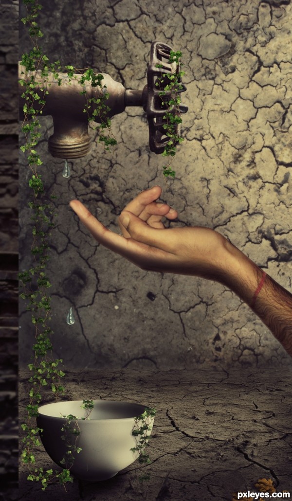
Save Water...Don't let such a moment ever come in our life.......!!!!
The hand is my own image provided in the sbs...
hope you like it friends...god bless all (5 years and 3383 days ago)
i like it author, the only thing not really sitting with me is the vines on the tap and in the bowl, yet there is no sign of vines on the walls or floor. Maybe add a few coming down the wall or something 
A really cool entry. But it needs some improvements... Firstly the tap seems to be directed to the right and not pointing straight down.And secondly the bowl doesn't seem to be sitting down correctly... To my eye it is just a tiny bit off to the right and seems to be not floating on the ground but just distorted.. Finally but just IMO you should get rid of that wall that the tap is stuck to. To me it just doesn't look nice and you should just have the tap stuck to the left end of the image if you know what I mean.. Try it out because I think this creation has potential if improved. 
 GL!
GL!
I also see a couple of things that could be tweaked: notice the difference in size between the vine leaves and the golden leaf to the right? Seems the vine leaves are way too small. Also, in the original photo of the tap, the drop of water is translucent - in this, the water drops are blue and not translucent at all, try lowering the opacity and maybe the blueness. Also, maybe blur slightly the background wall. Good luck, overall this has a nice feel. 
Excellent idea and well executed.
Love your creation author very much, its original with great mood...IMHO u should made stone block at the left just a bit softer,now creates small distraction...and this is my only nit pick...everything else is amazing...well done
This is very nice work! I just love all the imagination 
I personally would've used a more feminine hand to create a sense of softness, but you did a brilliant job here. The vines looks great and the background is well crafted. Good luck 
Good idea, but the leaves are not proportional to the rest of the image.
Nice entry with a great mood.
However i got a few things that u might want to concider changing.
I am not completely sure about the left wall it's perspective.
Seeing only the edge of the wall while the tap has a different perspective.
Also the hand has shadow on top of it, so i think the light comes from front top side.
And for the tap thel ight comes more from the right top side possitioned a little behind the tap.
Same problem with shadows for the leaves.
For example the leaves on the bowl it's left bottom side should not have a shadow to the right side. Also i think the leaves on the ground should also be darker.
Also IMO the light in your image has different colors. (leaves, tap, hand (tap and bowl seems to be matching)).
Also i think the middle finger might need some work.
Still it's a great image.
And i just see all these things cause i like to look at the image.
So thats possitive. And all of this is just to help you to improve the image.
Finaly i have to say that all of these things is what in my eyes should be changed,
this does not mean that all of those things are wrong.
Good luck.
Awesome, author, my fav in this contest so far. 
Excellent use of the source and combined sources. Definitely one of the best entries! GL! 
very nice work!
Very beautiful scene.
Awesome work and so true - each drop does count =)
And ALL OF UR's VOTES , FAVOURITES AND PRICELESS SUGGESTIONS AND COMMENTS DOES COUNT TOoooooooo...THANX TO EACH AND EVERYONE FOR UR SUPPORT AND APPRECIATION...THANK YOU ALL...LOVE U and GOD BLESS...
Congratulations! Great message, we really have to protect and keep our water sources! Water is life. 
Congrats on 2nd! Great work!
congrats ...
Congratulations!
congrats 
Congrats!!
wow congrats
Howdie stranger!
If you want to rate this picture or participate in this contest, just:
LOGIN HERE or REGISTER FOR FREE

PLZ DO WATCH HIGH RESOLUTION IMAGE...HOPE YOU LIKE IT (5 years and 3448 days ago)
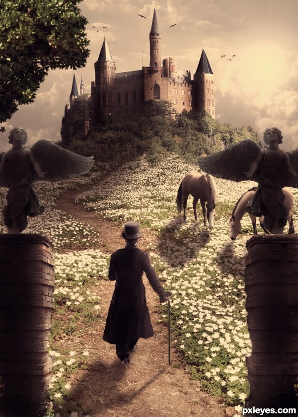
Very nice! My only nit pick would be, the shadows behind the entry pillars, could be a little darker to define them a little more. Theres one spot that it looks like it blends in with the flowers. Otherwise, keep up the good work! 
i like it a lot, good luck !
Try to fix the horse shadows...light is from right, shadows would be toward the left. Also darken the edge of the pillar at right, since it would be in shadow.
I think you did a fantastic job blending the flowers together, and i can only reiterate the advice the others gave you.
Really good image. 
Very beautiful image, I love the coloring... 
CMYK46 thanks a lot for helping me out with the shadows...i hope its ok now....
thefinalcut i have added darkened the pillars as u said...
and thank u erikuri, nanaris and ponti55 for ur precious appreciation...
god bless
Nice lighting and coloring...dreamy photo effect
I like it!! but my advice would be this  -
-
the harsh light from the sun, (right of the castle)... would mean that it have more shade than the objects in front due to the fall off of the sun.... the objects in the foreground would benefit from ambient and bounced light... so you would see more detail. Of course moving the sun more to the right would justify the illumination of the right hand side of the castle.
I think you could construct a base for the angels to sit on, as they still look cut out... and redifine where the highlight and shadows are especially as they look they have just been copied and mirrored across...
drawing a triangle out from the sun should help you roughly determine where the light would most likely hit the other objects...
front pillars are feathered a little more than they need to be (inside edges) and are far too dark compared to everything else re the suns fall-off
The man also needs to look more 'grounded' as he too looks pasted into the scene.
But even still I think it's one of the best entries thus far so GL whatever you decide to do... 
since the angels r upshot the man wud b downshot wrt the angels imho
pillars esp the right one needz polishin.. everythin else ditto with all d kind experts above 
i just love d mood n hue of the work
just brilliant..gud one..my fav 
was that guy there the last time i looked? hmm... well I must say it was a good addition 
beautiful image author, goodluck 
amazing one
You did almost a perfect job. The only point in this picture that i dont like are the angels. You can see the cut outs and i can see that you duplicated the second one. But if i take a look at the whole picture, i only can say that you did a wonderfull job. For now you are my favorite to win this contest.
lovely composition..good luck
wow!!! Great work! 
great job - I love the mood and the blending and shadows are very well done 
the better the work, the more the critique..... remember that  ... well done
very well executed.....shadow of horses are not ok.....still a good job
i agree with Geexman 100% author....this is fantastic work,great compilation,amazing colors and fabulous colors and mood...
THANKS TO EACH AND EVERYONE FOR ALL UR FAVOURITES AND COMMENTS>>>LOVE YOU ALL AND TRUELY EACH AND EVERY COMMENTS ARE REALLY SO SO INSPIRING>>>>>AND GEEXMAN WELL SAID

 ..... god bless all
It's like looking into a fairytale!! Lovely image  Best of Luck
congrats :]
congrats
Wonderful.. congrats!!
Congrats!!!
Congrats....very unlucky not to win with this...excellent entry 
Howdie stranger!
If you want to rate this picture or participate in this contest, just:
LOGIN HERE or REGISTER FOR FREE

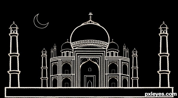
It was really a challenge to make the taj mahal with a piece of rope...and without the puppet warp tool in cs4 it made the job harder..a lot of work went into this...HOPE YOU GUYS LIKE IT...PLZ DO VIEW THE HIGH RESOLUTION IMAGE....only source image used (5 years and 3460 days ago)
Simply awesome work! Lot of effort went into this, and it shows. VERY well done!
awesome.....
beautiful work add ur reference image as i dont want to see this removed
thanx a lot mistic , nishagandhii and mossyB....and nishagandhi i drew it on a piece of paper....ok i l scan it and upload it in my sbs.. 
goshhhhhhhhhhhhhh... i mean wat `s this 
i`ve no wrdz in the shelvez of ma tongue
to comment on u author
this is jus AWESOMMMMMMMMMMMMME
i wish the fonts were bigger enf to exclaime that :p
..... n over 700 layerz !!!!! thats crazy dude
wowwww... sorry author actually i`m unable to glorify ur work
i was thinkin of participatin n now i shudn`t
:P
seriously 
anyways
GOODest  LUCK author
Amazing  what you can do with a peace of rope
!GL
Meticulous and stunning work. The elegant simplicity is breathtaking! Bravo!
great work
Great idea author,and very very good work...Best of luck
THAAAANNNXXXX A TON TO EVERYBODY WHO VOTED FOR ME AND SPECIAL THANKS FOR THE FAVOURITES.....AND ALSO FOR ALL YOUR PRECIOUS COMMENTS.....GOD BLESS YOU ALL
Congrats!
Congratulations ... beautiful!
congrats
congrats
Congrats!!!!
congrats  nice work
Congrats!!
THANX AAAAA LOOOOOOTTT
Congrats, beautiful image
Howdie stranger!
If you want to rate this picture or participate in this contest, just:
LOGIN HERE or REGISTER FOR FREE
go to Siddhartha's profile
Photography and photoshop contests
We are a community of people with
a passion for photography, graphics and art in general.
Every day new photoshop
and photography contests are posted to compete in. We also have one weekly drawing contest
and one weekly 3D contest!
Participation is 100% free!
Just
register and get
started!
Good luck!
© 2015 Pxleyes.com. All rights reserved.

You can post you entry via my contest entries and make the SBS so that you post all these in the same time. There's a small box to chech at the end of the uploading page.
I admire your type of work and you really inspire me because I just find it really impressive when someone like you can take a simple image, cut it um warp ect and make this! Well Done!!!
Ok, now that I've seen the SBS: the design is Ok, i like it cause of the contrasting elements that compound it. However i think the source could have been used more. For ex: texturizing + color adj, the red part of the Hydrant would give you something close to leather.
And you can make some of those metal textures from the source too - it would take time though.
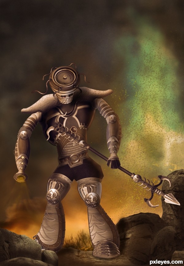
Source was used for shoes, hips, belt & head - mainly.
Instead of those little eyes that make the Executioner look like a sad little boy, and not imposing, you can select that side of the disk they are standing on, and add a glow - red would be nice.
I like the background a lot - you didn't mention the source for the grass - or if it's painted, it's really good, anyways.
Thanx for ur suggestion greymval...and yes i did paint the grass...a few strokes of hard brush with a low opacity and then applied a bit of gaussian blur to make it merge with the background.....
Really like this. When I look again here, I kinda wish the light coming from the left arm were more intense. Way to go!
Great job, agree about the eyes. But I really like it! GL author!
Awesome chop! GL author!
NICE! Creative thought
Creative.......G/L Author.
WOW author...fantastic piece...great warrior...to tell u the truth,when i saw the picture i was sure this is creation of one other amazing artist too,but now author...hat down for u...fantastic work maybe yours best on PXL...well done and instant fav from me
THanks a ton to each and everyone who voted and for all the favourites and wonderful comments.....Erathion u wont blv how much that comment of ur's meant to a photoshop beginner lyk me....it really gave me inspiration and impetus to try and do much bttr....thaaaankkk yoouuuu
Congrats on 2nd!
Howdie stranger!
If you want to rate this picture or participate in this contest, just:
LOGIN HERE or REGISTER FOR FREE