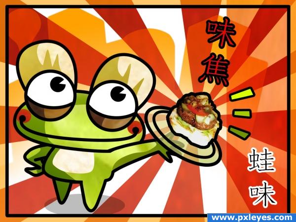
I used the shape of the first burger to draw the head of the frog, and little pieces of the source have been enlarged to create big flat shapes of color. Then I putted the burger on the dish.
The japanese ideograms (seen that i don't know Japanese) come from an online dictionary: I simply used the ideograms for Delicious - Hamburger and Frog - Taste
*
Don't you find it enticing? (5 years and 3961 days ago)


nice
i love this one, love the colors and very fun
Beautiful job, very cleverly done! high marks from me!
This is quite good! If the burger was in the same style as the rest of the image it would look a bit more cohesive, but then again it would lose the detail of the burger itself so you can do whatever you want with it.
I think this is great!
uhm o.o; cant you make an exception and give me a burger from just normal beef froma cow?
This is so adorable and well done!
Well, it's original...
why is the plate see through? This is really cute, it would be neat for an ad!
The plate is transparent because I liked the idea of a transparent dish, and you're right: to make this work I've imagined a japanese ad!
Congrats for your second place!
Congratulations for 2nd
Congrats!
Congrats!
Howdie stranger!
If you want to rate this picture or participate in this contest, just:
LOGIN HERE or REGISTER FOR FREE