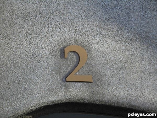
It looks simple but it took me a while to match the shadows and color the best i could.
All original image.
Typed a "2" that looked like it matched the "1"; used the clone tool to cover the "2" with the "1" texture; duplicated the "2", offset it and darkened it for the 3D effect; clone tool to fill the surroundings over the "1"; duplicated the "2", stretched it left, lowered opacity for shadow; paint black with gaussian blur around the edge to create a darker shadow. (5 years and 3603 days ago)


Actually, even though it looks simple, it's very effective and believable and a nice chop. Very convincing and a good blend. GL!
Oh but you do have to make an SBS. I imagine you're new so check out the guidelines when you get a chance.
It's perfect, it seems no. 2 really exists!
Nice job! Simple, but tells the story! GL
As you say: matching colours and shadows and - not to forget - doing the "2" so it matches typed "1" is not a easy match. So I am impressed by the "simpleness" outcome of this effort. GL
very nice...gl
How do I change the description for this entry or add an SBS?
My Stuff / my contests
I should have known that... Thanks!
One is the loneliest number that you'll ever do

Two can be as bad as one
Hehe love the idea
Very nicely done, gl
Congrats for your second place!
Congrats!
Howdie stranger!
If you want to rate this picture or participate in this contest, just:
LOGIN HERE or REGISTER FOR FREE