
(5 years and 3506 days ago)
Thanks and credits to the following people for the awesome pictures. haylesbaby,Vidor,bullet69,Mattox (5 years and 3528 days ago)
Pretty good! Just a few things, you could make the shadows of the chair and the glass a lot darker and pointed to the left (the glass shadow looks like its pointed to the right). The chair has almost no shadow at all. The overall scene is a little confusing, the surface looks like an outside valley picture, but the wall looks more like an inside picture. I would try to make a indoor scene (maybe a wooden floor and a wall with a wall covering for example). Like the inside of a kitchen / living room. Or maybe a bar... Good luck!
I agree with Ressiv about the shadows. But I think a slight shadow (for kid, frame and for stool) is enough, in spite of the floor, I suppose it's an indoor scene. I also think that stool is quite far, if the frame is hung on the wall, 'cause the way it is now it seems floating. But I like the colors, it has a dramatic tone. GL!
The stool should be closer to the wall (or bring the wall forward) but the mood & color are good.
i like it so much ,good luck
well done, good luck!
nicely done! g l
Great mood author What about adding some more shadows to the chair and a drop shadow to the frame ? Good luck !
Nice composition and great color. Agree with above. Need some shadow work
Wonderful composition author..just a lil typo'stealing' instead of steeling.. GL
Love this idea made me smile
very nice entry i agree with cmyk about the stool needing to be closer... it realy does...and, the shadows need a little work other than that, aces to ya'
One of the best in competition for sure,great colors,nice idea and cool mood...Just few minor nit picks,u have to work a bit more on shadows,chair legs demands shadow,and picture frame too...any how i like this image very much and wish u best of luck author...
simple idea but super well done finishing,......one of the best so far....and my fav too
Very unique image love the colours and textures gives a very nice warm rustic feel quality job!!
Super well done.. only 3 suggestions as above.., stool need to be closerto the wall as cmyk said, and a little more accuracy in shadows... and the 3rd suggestion.. keep up this great works.... good luck
Thank you very much for the great suggestions, Ressiv thatks for your great suggestion.and for you how about a uncompleted building. Is that justify the floor? and lot of thanks to CMYK. I moved the stool towards the wall and adjusted the shadows. hope it’s better now
Nice color and mood, Going to be my favorite
That will do author. Good adjustments, looks better now!
good job and nice clor mode
Nice edit Author.., good luck again , And I have one more question.., If it is not 'stealing' what you wish to call that..
Thank u Ressive and anoop, and anoop i think u r a master in making titles, so please suggest one .........
Brilliant effort. Love the colours. Definately top 3.
No author.., this title fits the image...
have to come back to this.... still my fav
This artwork is the best i've seen so far well its my opinion.
Pretty cool.
nice work -- depth is very well done as is the overall look
Seems so simple but so effective at the same time. Well done. GL!
Thanks for the nice comments my friends .................
Well its top of my top 3, well done author
Thank u Geexman .................
Congrats for your second place, Swordfish!
My favourite - congrats on second place!
congrats for the second, fish.....
congrats for your secod place............
Congrats! for 2nd place. Repeat: Great color
congrats for your second place
Congrats Swordfish
Congrats with the 2nd place!
Congrats!!!
Howdie stranger!
If you want to rate this picture or participate in this contest, just:
LOGIN HERE or REGISTER FOR FREE
Only source used (5 years and 3609 days ago)
spectacular entry......... Nicely finished...... Goodluck author
amazing job
beautiful entry ! very well done
beautiful entry
Very nice work
Great!
nice job
Congratulations for 2nd
Congrats for your second place, Swordfish!
congrats arun .....
Congratulations for the 2nd. place!
Congrats on 2nd place !!!!!
Thanks to all for the great support.............
Congrats!!
a little late.. congrats though
Good job! Congrats!!!
Howdie stranger!
If you want to rate this picture or participate in this contest, just:
LOGIN HERE or REGISTER FOR FREE
go to swordfish's profile
Photography and photoshop contests
We are a community of people with
a passion for photography, graphics and art in general.
Every day new photoshop
and photography contests are posted to compete in. We also have one weekly drawing contest
and one weekly 3D contest!
Participation is 100% free!
Just
register and get
started!
Good luck!
© 2015 Pxleyes.com. All rights reserved.
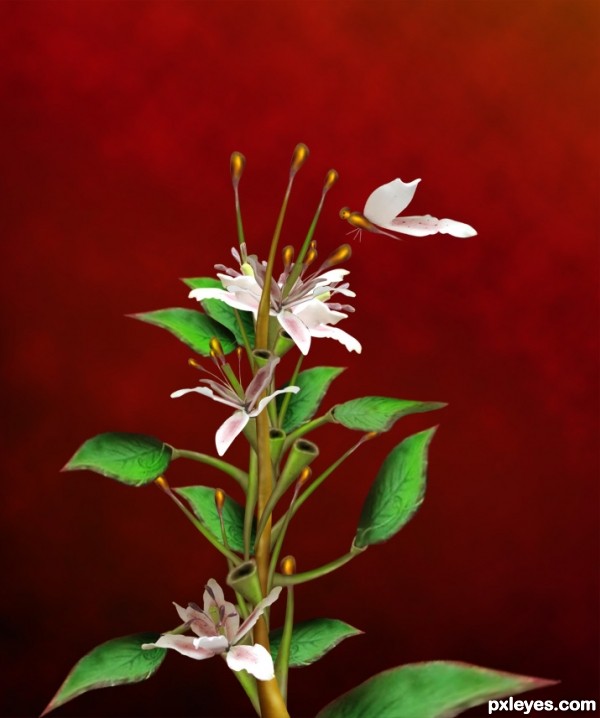
Lovely entry, I like it a lot. Flowers could be bigger, IMO.
I have to agree with erikuri. This looks more like 'green beauty' as the leaves dominate the white flowers.
simply beautiful..., leaves are awesome..., gdlck
very nice creation...gl
it is very nice work ,but is not esy to see the photo from contest,but i like it ,and good luck
OMG...
so beautiful.
I love the soft colors combination and the contrast with the "hot" background.
Congratulations.
good use of source,
excellent art
beautiful!
I LIKE IT !! G L
IF i talking oneword simple.....................
Nice
love it.... good work.... good luck
incredible work!
GL to you!!
ehh....i just wonder where is the cake?
Very nice.
Thank you for the great support my friends ...........
congrats for ur second place.... U r on a top 3 hunt.., great improvement i ur portfolio
Congrats for your second place, Swordfish!
Congrats! for second place
hi,.....congrats,.....wonderful......
Congrats...
Arun, congrats! It's really a beautiful work (but I still think flowers could be bigger...)
Howdie stranger!
If you want to rate this picture or participate in this contest, just:
LOGIN HERE or REGISTER FOR FREE