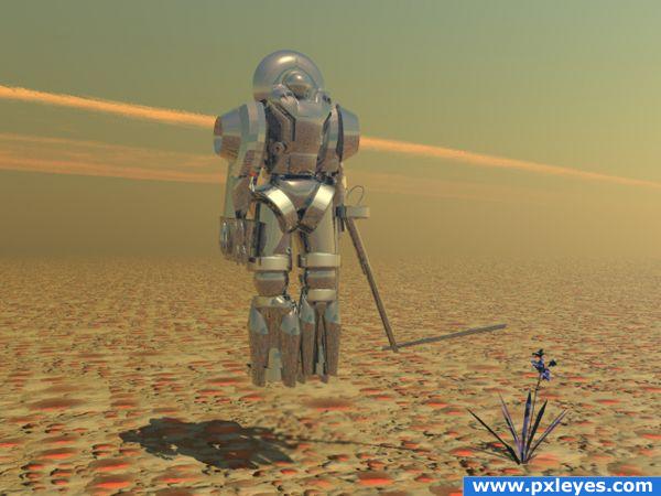
Planet Research Bot
All Bryce (5 years and 3816 days ago)

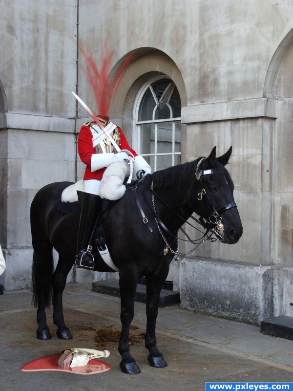
Or does anyone have a bandaid. Clone stamp brushwork and transform for reflection. (5 years and 3833 days ago)
I worry about you author (instant fav) hehehe
Great idea! (might look good with a little more blood on the ground though....) good job!
I would make the blood a little darker. It seems kind of bright as it sits right now. Good luck.
.... bad day at work lol ! good luck!
Haha!Great idea!(maybe you could blur the highlights on the blood and decrease the opacity of them)
Somehow reminds me of Kill Bill... >.>
I agree maybe adjust the shine on the blood, perhaps make it less glossy but NICE on the originality!
Nice image, the blood seems unconvincing.. perhaps a darker shade of red with a darker shine.
YEEEEEEESSSSSSSS! My winner! Must have been a pesky American
great job 
Congrats for your second place, whiteshade!
Congrat... 
congratulations!
Congrats!!
Congratulations for 2nd
Howdie stranger!
If you want to rate this picture or participate in this contest, just:
LOGIN HERE or REGISTER FOR FREE

All source and PS (5 years and 3900 days ago)
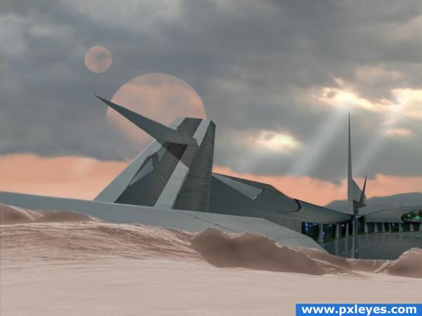
Really creative use of source image!! It looks great, maybe add a colour overlay so that everything matches up perfectly - but this looks great!!
wow thatss real cool
Good use of source! The shadow of the triangular piece of the building should conform to the shapes, and I'm not sure about seeing the moons or whatever through those clouds. Good imagination, though. What's the source for the foreground?
very cool... like the time mashine has turned the panel into an space-cool-thingy... uhhhh...
nice
well done, high marks
very good imagination & nice excution author , GL 
Congrats for your second place!
Congrats!!
congrats!
Thankyou all 
Congrats!!
Congratulations for 2nd
Howdie stranger!
If you want to rate this picture or participate in this contest, just:
LOGIN HERE or REGISTER FOR FREE
go to whiteshade's profile
Photography and photoshop contests
We are a community of people with
a passion for photography, graphics and art in general.
Every day new photoshop
and photography contests are posted to compete in. We also have one weekly drawing contest
and one weekly 3D contest!
Participation is 100% free!
Just
register and get
started!
Good luck!
© 2015 Pxleyes.com. All rights reserved.

Very nice work, it looks really good, if its at all possible I would suggest that you yone down the reflections on the texture a little bit so that less of the ground is being reflected, its taking away from the chrome's beauty.
nice entry....gl !!!!
nice work.......but why final render is so poor.......it can be far better.......GL
Good and creative use of simple primitives! The robot has to much reflection and the ground is too repetitive. The final render looks grainy and the colors aren't very exciting. Easy things to fix though. Good luck.
nice--I agree about the render. It might take a bit longer but I would use normal or fine antialiasing in the document setup under file.
Superb!
O-O final render not in good shape! Fix that and you have a very good peice! GL
I love your image, but what's the stick thing off his arm?
Nice work
great
Congrats for your second place, Whiteshade!
Congrats
congrats
Congratulations for 2nd
Howdie stranger!
If you want to rate this picture or participate in this contest, just:
LOGIN HERE or REGISTER FOR FREE