(5 years and 3808 days ago)

(5 years and 3809 days ago)
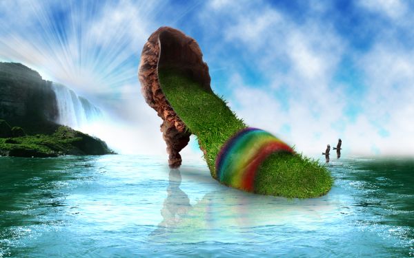
nice one dude!, but the moods are kind of different.. and i think the back part of the heaven misses some clouds .. anyways very cool
Thanks for your comment. Some parts of the image have been improved.
Nice use of source and amazing scene!
Thank you Akassa
Superb idea...Great source and a fantastic work..
very nice work...great idea...
Very cool!
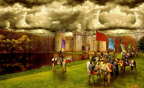
Kind of minimal source used.
fantastic scene!!
Congrats for another great third place!
Congrats!
Congratulations for 3rd
Congrats again!!!!!
Howdie stranger!
If you want to rate this picture or participate in this contest, just:
LOGIN HERE or REGISTER FOR FREE

(5 years and 3825 days ago)
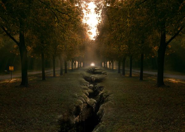
i really like this, but because you reflected the image the light and the trees in the center dont look right. try to blen them and it will be perfect.
Agrees with jaescoe. You should have called it faultline. 
Good idea, but change things in the top center & elsewhere, so it doesn't just look like you flopped the source...
thanks guys for your help. I ve worked a bit more on blending and shadows so it doesn't look as much as a mirror image. Hope it looks better now.
Oh, kreepy!
much better great job
I like this alot. A couple of the trees are so distinct that you can't help but see the mirrored source. Remove or alter those and it won't be so obvious. Still, an excellent and creative entry.
i think, to smooth.
i know its too late now but this would look better if after you flattened the image give it a light source from top center
I like it!
nice work!
Congrats for your third place, Graphopoly!
Congrats
Howdie stranger!
If you want to rate this picture or participate in this contest, just:
LOGIN HERE or REGISTER FOR FREE

(5 years and 3829 days ago)
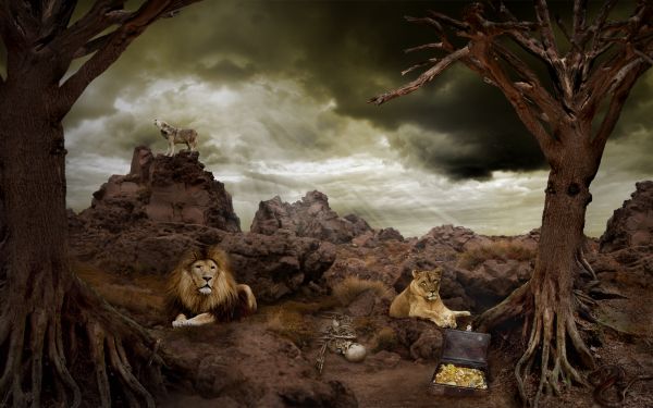
Good image over all...minimal use of source...could even have been done without it.
thanks.
(...except for lions and coyotes) Just a suggestion, but why not put more of the tree source in the image? Another on the left somewhere would give your image more balance and less judged as minimal source. I was thinking it was minimal use too. I think your lions are a wee bit bright and the coyote, well it looks huge, considering where he is in the image.
Thanks for you comment. I was also thinking that something is missing. I ve added one more tree and worked a bit more on lions and wolf. It looks better now i think.
Lovely chop! Tiny details... the left lion's main fades into nothing instead of blending, and there are tiny little blends that could be done to make 100% integrated. Bits of shadow, blend between lines etc. every so slight. Great composition though! One thing... the wolf should be quite a bit smaller as it's off in the distance in the landscape. Great Mood!
very nice 
I was going to say something about the lion's mane but didn't want to overwhelm you. You did a great job with the left tree. I was hoping you weren't going to make it look anything like the one on the right and you did well. Now just either bring the coyote closer or resize him, fix your slight blurred edges on the lion and I think you'll have a strong contender! 
worked a bit more on lion and wolf. Hope it's better now
I think your chop was the best at step 8. Just step 8 is a powerful image. The animals and such just made it too much. The other tree on the left is good there though.
The coyote looks much better. The lion's main may need a wee bit more work but overall it's a good image now and I'd glad I could help. Good luck to you 
beautiful,very good
very nice 
And even congrats for a third place! That was a great week for you 
Congrats! I thought it was a winner too 
thanks jawshoewhah and thanks for your help on the entry 
Howdie stranger!
If you want to rate this picture or participate in this contest, just:
LOGIN HERE or REGISTER FOR FREE
go to Graphopoly's profile
Photography and photoshop contests
We are a community of people with
a passion for photography, graphics and art in general.
Every day new photoshop
and photography contests are posted to compete in. We also have one weekly drawing contest
and one weekly 3D contest!
Participation is 100% free!
Just
register and get
started!
Good luck!
© 2015 Pxleyes.com. All rights reserved.

Author, the reflection is not right, just the reflection of the image underneath the heel is enough
I think you need to lift the curvature of the rainbow on the furthest side... just so it looks like a strap possibly would... or even exaggerate it, seeing as it is a rainbow??!!
and possibly a high res!?
Looks really good, Great job.
Thank you Akassa
Good one......
This is so pretty
very nice!
thumbs up!
Congrats for your third place, Graphopoly!
Congrats!
Congratulations for 3rd, great.
Congrats for 3rd Graphopoly ,well done !
Congrats!
Howdie stranger!
If you want to rate this picture or participate in this contest, just:
LOGIN HERE or REGISTER FOR FREE