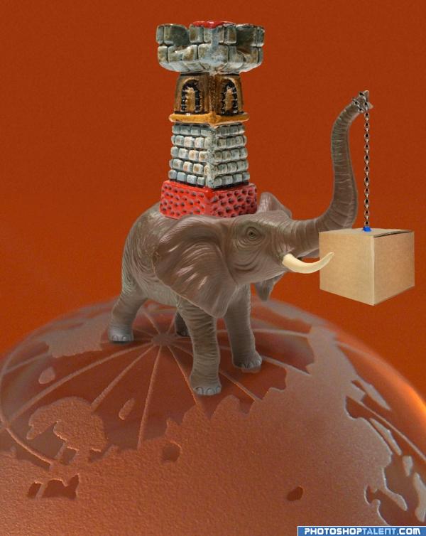
Apparently, elephant and castle is cockney rhyming slang for 'parcel'. (5 years and 3942 days ago)
- 1: by vierdrie
- 2: by sveres
- 3: by gugacurado
- 4: by sundstrom
- 5: by jeinny

Apparently, elephant and castle is cockney rhyming slang for 'parcel'. (5 years and 3942 days ago)
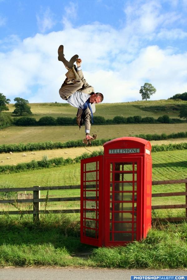
(5 years and 3948 days ago)
rofl nice touch... love that man's positon...
And this reminds me the song "Hanging On The Telephone" by "Blondie" lol
amazing work authur keep it up good luck
Phone looks a little flat. Other than that, great job.
HEY.. where's Doctor Who????.. hehehe.. great job artist.. really fun and RIGHT ON THEME
Oh yeah.. I forgot
YIPPEEEE YI YI YI
Great idea,great execution!
Nice job! Small suggestion...try and lighten top of head, hand and top of sleeve without phone. The bottom of legs and shoes seem too dark for his 'new angle' in relationship with the light source. Otherwise, excellent job and image choices. Good blend too! 
EDIT: Looks 
very nice! good idea
Saturate the shoes a bit...otherwise this is great!
Well done quite funny -- (one tiny thing would not the tie be floating upward as well??)
 ....very nice work.....
I love this one, it is amazing work. Favouriting this one. Good luck
Excellent entry, funny and well done  Good Job
lol
Fantastic! Colour correct the phonebox and remove light on top of his thight and you're there!
Creative pic! I like the man seems to be not worried that much about floating in midair)))
Cool. His feet look fake, but I'm willing to imagine that his body is floating (defying gravity) but his clothes (including tie and coattail) are still subject to gravitational forces.
LOL. good job author!! 
cool
very funny and good job  i only think that the scale of the man is a little bit big to the phone tube or may be it's my eyes?? i don't know ... anyway it's unreal situation so anything could happen.... GOOD LUCK
High points from me....is the feet suppose to be so blur- can't see the socks and pants well. But I love the image GL
good concept
Great work 
funny image right on theme
very good author
Interesting image.
Impressive - i like the idea.. But is that the phone on the side where the door is open? I would have thought by the shape of the box if that was the open side we should see some of the background through the opening.
gl
Thats looking a lot better  Well Done..
Very nice image.
Congrats! Very well done. This was a fave of mine.
Congratulations for 3rd
congrats!
congrats!!
Congraaaats 

Congrats!
Howdie stranger!
If you want to rate this picture or participate in this contest, just:
LOGIN HERE or REGISTER FOR FREE
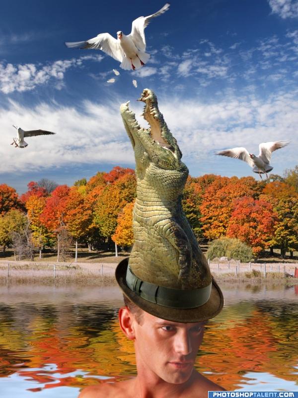
(5 years and 3949 days ago)
Very nice, good work 
Just pulled this right out of your hat huh???..High Marks.. and I want what your taking LOL
nice clean work...good job
haha cool (put a shirt on the guy though)
Lovely idea! Would never think about that xD. An interactive croco hat  aw he looks pretty hungry.
Very original idea like it a lot author
very funny ... GOOD LUCK 
nice hat. different!!
nice work, very nice good luck
what a hat 
great
Kudos! Great job. 
This is cool
Congratulations for 3rd
Congrats! Very well done.
congrats!
congrats!!
Congrats for 3rd!
Congratulations.you did very well
Congrats!
Congrats!
Howdie stranger!
If you want to rate this picture or participate in this contest, just:
LOGIN HERE or REGISTER FOR FREE
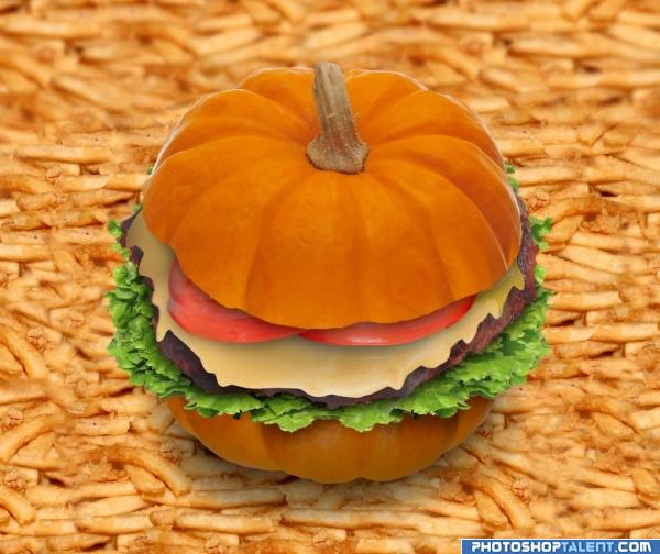
(5 years and 3958 days ago)
What an eye trick.!.. you can't really see the pumpkin.. you just see bun!!!! excellent
very nice
Not so tasty i guess, well done replacing the bread with a pumpkin
nice
Nice burger, but why the gigantic fries?
I really love the burger, but as CMYK 46 mentioned, the fries don't work at this huge size. Since you've made a pumpkin burger why not make the fries to the scale of a pumpkin. In other words tiny fries next to the pumkin size burger on a little plate. Just my thoughts, I do like the work on the burger!
Nicely done 
very creative burger; the fries look too flat imo
this is very good..i like the french fries blur in the background for depth
Nice work 
Spaceranger, CMYK - maybe it's just a tiny pumpkin?
nice job 
goog good good luck
Good work author!!!!
Fantastc idea and technique!
Well done! Love it love it love it! I really love pumpkins, but i'm not sure if i want to eat a pumkin burger! 
something different.... good luck
Congratulations for 3rd
Congrats!
congrats
Howdie stranger!
If you want to rate this picture or participate in this contest, just:
LOGIN HERE or REGISTER FOR FREE
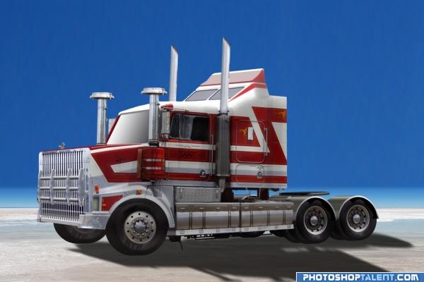
(5 years and 3959 days ago)
as it should be.. what can I say other than... what's a bigger hit then a Home Run.. perfect photoshop usage.. awesome
somehow it seems that it flies...  maybe you don't want that feeling... but work need high vote anyway
  good luck!
Nice job making it 3D  Though you would want to tilt the ground more flat so it doesn't seem like the truck is floating
  gl!
gl!
this is well done, try adding shadows, at this point the shadow looks a bit flat, i like it though, i may suggest considering inderect light by shading the ares that are closer together, etc. =)
very nice. good work
Great! 
Excellent work, well done 


 good work author!!!
great!!looks real 
nice work  good luck!
Shadow should be at a different angle...light source is on left, shadow should angle more to the right...otherwise, nice work. 
hheh your work your luck good job
good work, but what i think when i look is that lines are 2 mutch straits ande severe but good prespective work very good
very good job, showing the truck from different angle is cool idea, good luck
nice job 
nice work great SBS 
Uh great!
well done
Congratulations for 3rd
Congrats!
Howdie stranger!
If you want to rate this picture or participate in this contest, just:
LOGIN HERE or REGISTER FOR FREE
go to Paulus62's profile
Photography and photoshop contests
We are a community of people with
a passion for photography, graphics and art in general.
Every day new photoshop
and photography contests are posted to compete in. We also have one weekly drawing contest
and one weekly 3D contest!
Participation is 100% free!
Just
register and get
started!
Good luck!
© 2015 Pxleyes.com. All rights reserved.

thumbs up author.. great way to start the contest
This is great!
Very creative. The Rule of Thirds might suggest that moving the elephant and castle to the left and doubling the length of the chain would enhance the compostional impact. A slightly smaller castle riding a real elephant would also be more effective IMO. The elephant's foot shadows (or lack thereof) make it look like it's floating slightly above the earth, not standing firmly on it.
cool
good. nice colors
very nice!!
Nice kick off to a hopefully humorous contest!
good idea
very good composing, blending, allover work.
Congratulations for 3rd
Congrats
congrats
Congrats!!
Congraaaats ON 3RD

Howdie stranger!
If you want to rate this picture or participate in this contest, just:
LOGIN HERE or REGISTER FOR FREE