Credit:
"meltys" from deviantart
(5 years and 3356 days ago)
- 1: source1

Credit:
chuqui, nickdesignz.deviantart.com (5 years and 3380 days ago)
Expresion is beautiful...good luck author!
Good blending here, got only one suggestion, the face seems a bit flat like he is slammed in the face or something.. anyway mayby you coulg give him somewhat more volume  ?
?
GL
very nice work...gl author
Nice portrait 
Congrats!
thx all for your comm!!!
Howdie stranger!
If you want to rate this picture or participate in this contest, just:
LOGIN HERE or REGISTER FOR FREE

Credit:
http://jademacalla.deviantart.com
(5 years and 3407 days ago)
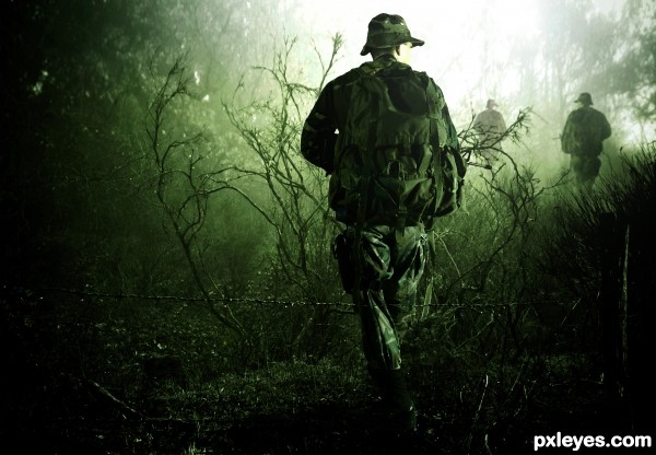
A really great image!  I feel the danger..
Amazing ! So realistic you make this picture live...You create a story in it, you give the pics a soul. Bravo  Good luck author
Great pic.. I like the green tint. Goes very well with the soldiers.
Gripping Condition...Keep watch,there enemies everywhere..And beware for mines...
Very very GOOD Story...
Great blend! The only thing that i don't like is that all 3 soldiers look the same ( flipping doesn't count).
You could search for other backheads, paint backpack, apply gasmask, helmets etc.
Since you're lvl 15+, blending shouldn't take you long, so no reason for lazyness :P.
Striking image! 
Nice chop, but I agree with greymval. I would use different guys in the background, as that was the first thing I noticed.
Have to agree, different guys needed. But still a great piece of work 
I honestly didn't even notice that the guys were all the same until someone pointed it out but overall it's an impressive blend so GL! 
Very impressive....looks like a call of duty c.d cover :P....but i agree with everyone else that u shud hv used different guys....
like an ideea!... Why should I use another guy,,,or soldier????...I want to know your opinion....not only as mere opinion...maybe even learn something....?!?!!!??
i se a lot of emotion, this is fabulous
"Why should I use another guy,,,or soldier?"
This way it will look like a platoon is advancing through enemy territory and it would make the image more realistic, cause right now most of the people can see it's the same guy pasted 3 times.
It will also mean you worked harder and bring you higher votes - but that's secondary.
As i said you can use the same guy, just change head, backpack, apply gasmask, helmets, etc.
Unfortunately the contest is over, so in case you modify your entry, just post it in your albulms, cause that would be really cool.
Congratulations! 
thx all...for your comm and tips!....
congrats ...
Congrtats.. very nice
Congrats!!
Howdie stranger!
If you want to rate this picture or participate in this contest, just:
LOGIN HERE or REGISTER FOR FREE

Credit:
1. http://mjranum-stock.deviantart.com
2. http://shoofly-stock.deviantart.com
3.
http://resurgere.deviantart.com (5 years and 3477 days ago)
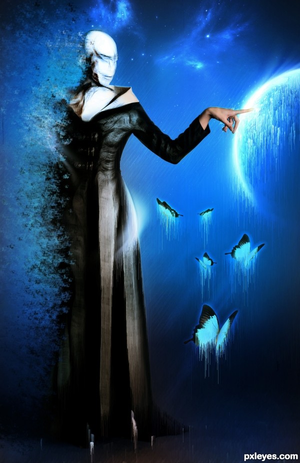
author.. I think you meant to name this MALICE.. not MELICE.. it looks like me Lice.. which is a totally different thing
superb work author, i love the style in this image  got my vote
It is absolutely stunning what you have done! The whole image is amazing ... it is fascinating what you have done. The creativity and imagination that went into creating this is a wonder. I am in awe of your talent to the point of being (almost) speechless, if I could fav it twice I would!

I would love to see an SBS just to know how you did it!
Very beautiful entry!
thank you all for your comments!!!
thank you all for your comments!!!
Gongrats
congrats!!!
Congrats!!
Congrats!! 
Howdie stranger!
If you want to rate this picture or participate in this contest, just:
LOGIN HERE or REGISTER FOR FREE

Thanks to ''mendisbrandy'' for source 1
Thanks to ''aliciarflowright'' for source 2
Thanks to ''mark-s'' for source 3 (5 years and 3507 days ago)
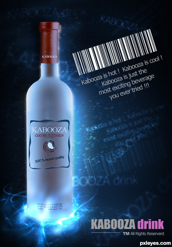
Coconut Flavored Brandy?!?!?!?!?! OY!!! (great job author)... it would be so sweet.. OY OY OY 
love the colors
cool !!! whats the home delivery charges .....
Very well done, author! It looks real!... 
I love the barcode details.
Good mood, I like the use of light. Nator has a good point about the color of "drink" and if you'd remove the last R from "Reserverd", would be nice  . Good luck!
I like the Font and the use of Light. 
I like the Font and the use of Light. 
Lovely with an appropriately refreshing feel. However, UPC bar codes aren't very attractive unless you're a computer, and this one isn't even centered above or (better IMO) as wide as the text under it. I would just delete it. Also, the label seems a tad too flat to be on the outside of the curved bottle.
well done author! Good poster.
superb!!
it is amzing ,good luk
thx all for your comm and suggestions!.....!!!
With bottle like this,its better to be Vodka in it...LOL...just joke author...your entry look like professional advertising...well done
great job, love the the colors and the glow effect under the bottle  , gl
, gl
Lovely work - congrats!
Congrats for your third place, Genuine!
You're very good on making ads  , congrats!!!
Congrats! for 3rd place 
Congrats!!
Congrats 
Congrats 

Congrats for the 3rd
thx all.....for your comm and congr...!!!
Congrats!!
Howdie stranger!
If you want to rate this picture or participate in this contest, just:
LOGIN HERE or REGISTER FOR FREE
go to genuine2009's profile
Photography and photoshop contests
We are a community of people with
a passion for photography, graphics and art in general.
Every day new photoshop
and photography contests are posted to compete in. We also have one weekly drawing contest
and one weekly 3D contest!
Participation is 100% free!
Just
register and get
started!
Good luck!
© 2015 Pxleyes.com. All rights reserved.

Wow well done! I look the mystic look it has.
What a amazing piece author...well done
Will await SBS before voting.
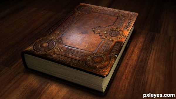
Really beautiful book!
But I'd bring up the lighting on the LH side, it's too dark and does not accurately reflect the lighting above the book on the table. The light will illuminate the entire surface, not just the book.
I actually really like he lighting, I prefer that to flat product lighting. Lovely..good luck
Classy lighting. Always like good lighting on entries. This one has it! Big time!!
love the lighting, too. Would want to open and read in it. I'm a sucker for books.
Suburb work, and the table is well done also
thank you all for your comm..and fav!
Congrats for 3rd, great.
Howdie stranger!
If you want to rate this picture or participate in this contest, just:
LOGIN HERE or REGISTER FOR FREE