I have drawn the ice cream in illustrator. It contains of a gradient background, a cone with a pattern and different shapes and lines for the ice cream. (5 years and 2938 days ago)

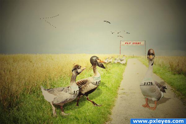
The masters of the air are making ready for take off. Pilot Goose, first officer Goostown and second officer Goosestreet will defend the gold medal from last year.
This is made by blending, scaling and rotating 12 layers. I have warped helmets and goggles to make them fit the geese heads. The most difficult part of this work was to find good stock images. I gave the image a color tone from the 50ties to match the leather helmets and goggles.
Thanks to flickr members:
Valerian Gaudeau
Kalense Kid
Pig Sty Avenue
Joel Abroad
Andy Hares
Joe Gasper
Thanks to deviantart members:
momerath
FantasyStock
Stock-Pony
thanks to stock.xchng members:
phelle
prepaan
These are two sources that I couldn't add in the form:
start number
http://www.flickr.com/photos/andyandorla/3691637380/
start line banner:
http://www.flickr.com/photos/gasper/14742015/ (5 years and 3844 days ago)

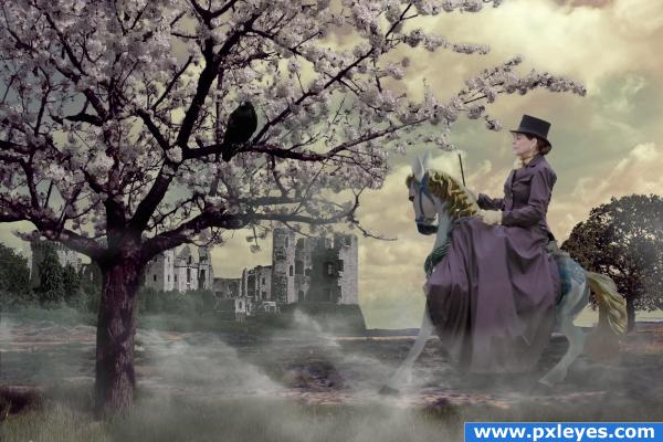
I thought the horse was elegant, and I wanted to give it an elegant rider. From there the image developed step by step, I didn't have a plan from the start
The background image with road is my own.
Thanks to ThePieman at stock.xchng for the Castle image, and to billingham for the raven - also at stock.xhng. (5 years and 3860 days ago)

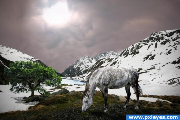
I have added the horse, lake, tree and the clouds. Further, I have made shadows to the ground and light from the sky (filter: lightening effects). I also have used curves to adjust the colours - one adjustment layer for each part of the image (snowy mountain, horse, tree, sky). I hope you like it!
Thanks to Chris Bond at for letting me use his beautiful tree, and also thanks to John tokarz for letting me use his beautiful lake. I found both images on Flickr.
From:
jtokarz2003 john tokarz
Subject:
Re: Use of image
Yes you can use the picture, thankyou for your interest, regards John.
From:
~Wizard Images~ Chris Bond
Subject:
Re: would you allow me to use your tree 3 in a contest?
That's fine. I will allow you to use it.
Thanks. (5 years and 3867 days ago)
go to isoflow's profile
I like it: plain and simple! Well done!!!
Nice one...
thank you for comments
Any thoughts on how it could become even better?
great use of color here, the colors swirl together...this looks like a logo for a "modern" ice cream place. lol
I like it simple too, but it would be nice to have some shadowing on the cone.
Great Job author! I really enjoy the clean lines and your choices of colors! Good Luck!!!
Very clean picture, I like it!
Howdie stranger!
If you want to rate this picture or participate in this contest, just:
LOGIN HERE or REGISTER FOR FREE