(5 years and 3250 days ago)
- 1: model by magikstock
- 2: source2
- 3: source3
- 4: source4
- 5: fish by pausimausi
- 6: source6

(5 years and 3250 days ago)
(5 years and 3425 days ago)
Interesting CBR. Nice colors.
SBS would be good to show how the source was used. 
Edit: Maybe some arms, too? 
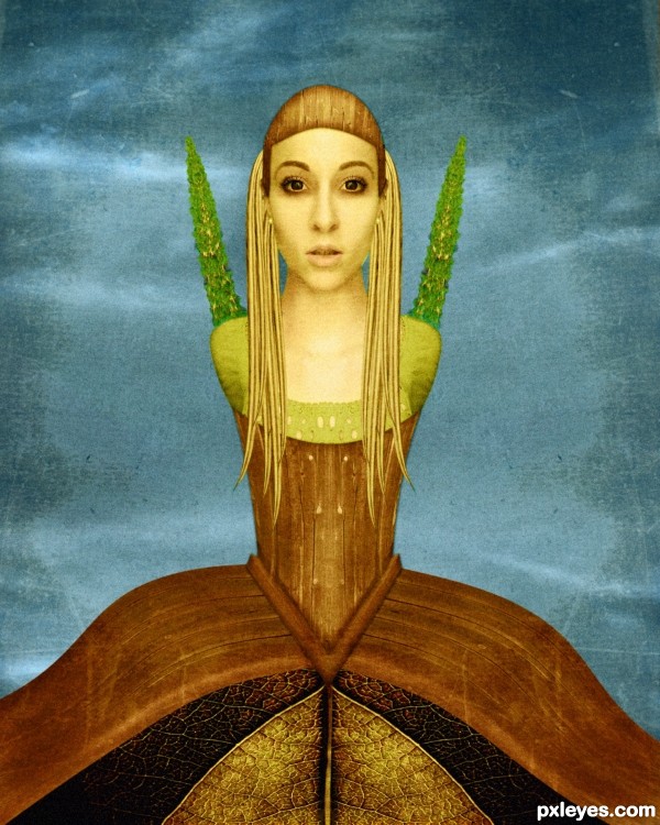
i used from the source picture the sky the road for hair, parts of the house for the concept dress and hat and the bushes from background for shoulder plants, the main job was the blending , the color and painting over.
edit: cmyk i prefer her without arms becouse I want my attention points on her head and bottom
Author, you need a SBS...what's the source for the tree things growing out of her shoulders where the arms might have been?
EDIT: How can she pick her nose with no arms? 
how can she pick her nose with no arms? hehehe...nice comment...and nice work too...
bad , bad CMYK
Wow, .....beautiful!
Lovely! 
Very very nice final result,but SBS for sure have to be more detailed,especially when u do some CBR...good luck author
Good things: chick, colors, textures, constrast, proportion, chick, formes.
Not so good things: source not easily enough recognizable, she could have had a window from the shed on her (Dali style) , Symmetry !!! = Makes it less interesting.
You know that short poem about the perfect cube ? It will make sense when you ll read it 
I explain in SBS step guys, practicaly was duplicate, flip horixontaly and for the dress i distors the part of the house with twirl on default setttings.
I know this isnt muchy but this came out ...what can I do.
the most job on her was to put the color togheder the blend and for this I used selective color, curves, hue saturation.
Also I paint over the shadows and lightning .
Thank u for your comments.
good luck.... it is an interesting work.....
Congrats for your third place, Nanaris!
congrats...
thank u!
Congrats!!
Congrats...
Howdie stranger!
If you want to rate this picture or participate in this contest, just:
LOGIN HERE or REGISTER FOR FREE
(5 years and 3453 days ago)
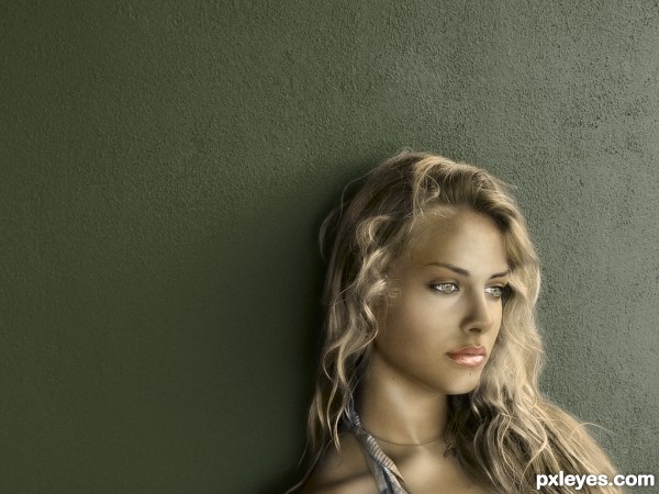
nice work -- the hair is especially well done
Nice one. Would love to see the SBS for the hair. Personally I hate a very glossy lipstick, but well.. it IS a model picture after all.
for the hair a aply a yellow color on multiply mode then two layer one in multiply and one in lighten mode i paint the ligtning and the shadows of hair, and ofcourse a tablet for pressure sensitive, on the lips yes widiar u are right i aply the color in color mode, and becouse the initial source picture had strong light maybe i should aply multiply again in lab color, i dont like either the lips.... maybe i will change it....
thanks for your comments.
Gongrats
congos!!
congzzzzzzzzzzzzzzzzzz 
Congrats!!
Howdie stranger!
If you want to rate this picture or participate in this contest, just:
LOGIN HERE or REGISTER FOR FREE
(5 years and 3540 days ago)
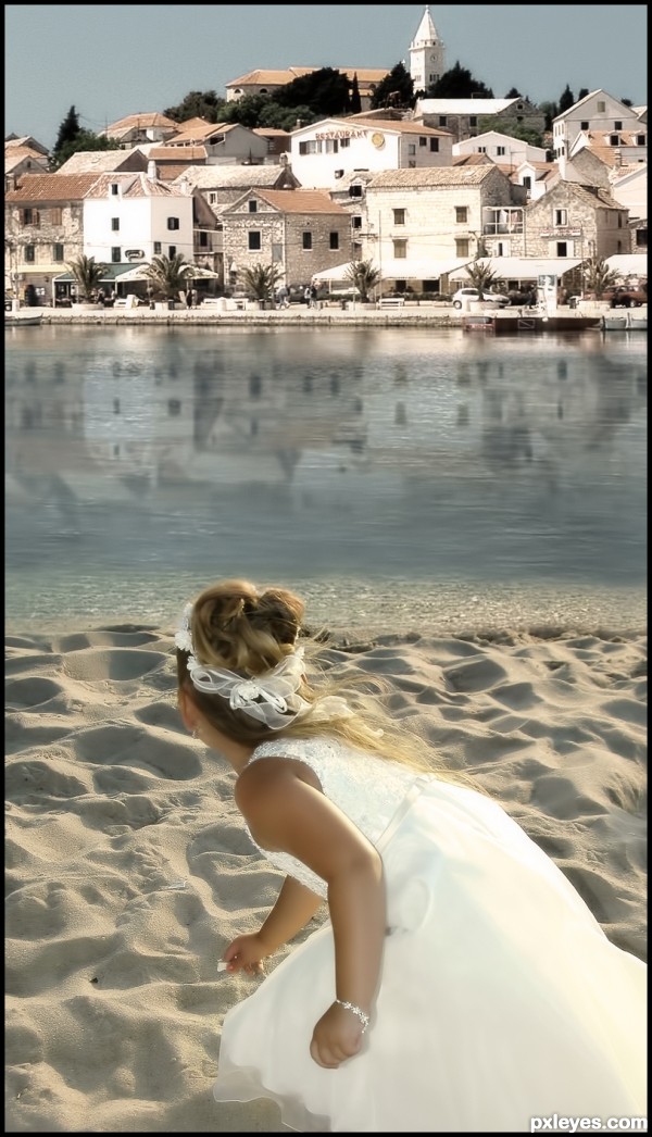
Very serene scenery... very good blend 
Well done
well done...gud idea...lyk da blending...
Really nice blend!
thanks for your comments apreciated!
i really loved this one...
Fantastic work author...best of luck
It will much better if you just use 4/5 the height of that picture because the composition will be nicer if you push the girl higher, so she has a part on the river area. This can reduce the unnecessary space in the middle of the image, which is quite distracting and it takes time to roll down to the main focus of the image. Otherwise, that's a good blending work. Good luck 
Good blend.
Congrats for 3rd
Congrats!
Congrats for your third place, Nanaris!
Howdie stranger!
If you want to rate this picture or participate in this contest, just:
LOGIN HERE or REGISTER FOR FREE
go to nanaris's profile
Photography and photoshop contests
We are a community of people with
a passion for photography, graphics and art in general.
Every day new photoshop
and photography contests are posted to compete in. We also have one weekly drawing contest
and one weekly 3D contest!
Participation is 100% free!
Just
register and get
started!
Good luck!
© 2015 Pxleyes.com. All rights reserved.

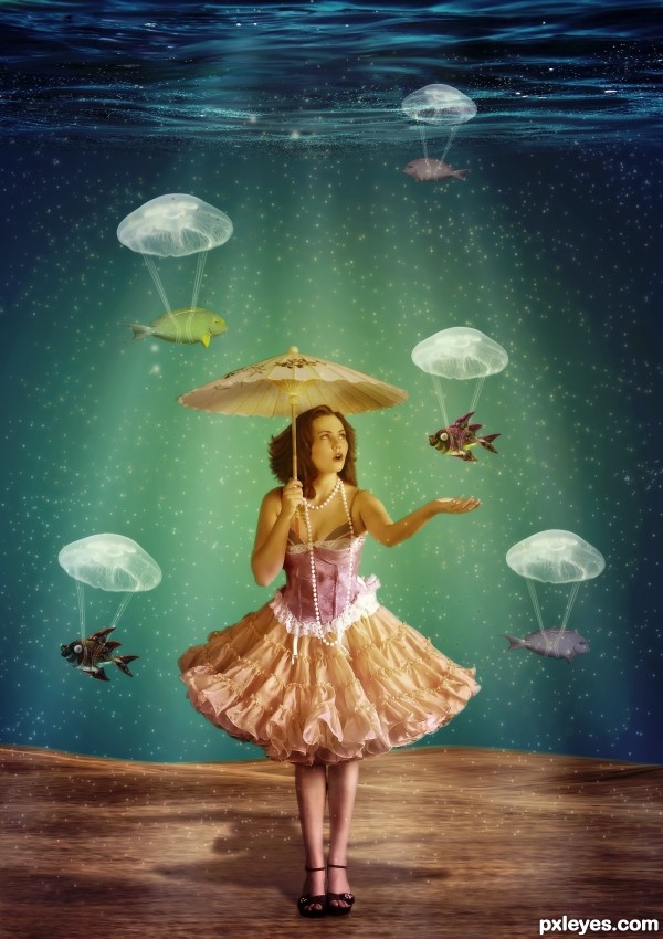
Very cool, what a great idea about the jellyfish = )
very creative! good luck!
Thank you Androla and Emik !
Awesome idea with the jellyfish as parachutes for the fish, nice chromatics and mood, as well.
I'm not a fan of:
1. Background. No idea if it's an aquarium or the ocean. In the first one you would have some form of "back" of the BG, like an outside word ( you could have made this look like a bubble/ bubble tank, enhancing your composition ). In the ocean, the floor would go further away losing itself in a blurred underwater horizon, or if it's the edge of an abyss you would see the other edge or some seamountains etc.
2. Fish. You only have 2 species repeated a few times with minor hue & scale change, even bubbles on them are the same -makes this very boring. Try using more species and more numbers, maybe a cluster in the background, one very close in the foreground, in order to create More Depth & variety. ( they can also be partially outside the screen.
3. Shadow cast. a) It should be a little more oblique since light comes more from the left, than from the front. b) Dress & umbrella would create a projected ellipse shadow, not a triangle. ( credits for this info: CMYK & his comment on my entry on mushroom shadows).
I wanna make sure that you know: I do appreciate your effort & idea, and I'm only commenting cause I see lots of potential in this entry. With some more time investment it would truly be outstanding.
Thank you Nator!
Grey thank you for your help , I will see If I will change something!
i love it ,good luck
This is so, Lil Bo peep, lol, where are the sheep, love this entry!
Congrats for 3rd
Congrats for the 3rd!
thank you!
Congrats
Howdie stranger!
If you want to rate this picture or participate in this contest, just:
LOGIN HERE or REGISTER FOR FREE