(5 years and 3390 days ago)
go to vimal's profile
Photography and photoshop contests
We are a community of people with
a passion for photography, graphics and art in general.
Every day new photoshop
and photography contests are posted to compete in. We also have one weekly drawing contest
and one weekly 3D contest!
Participation is 100% free!
Just
register and get
started!
Good luck!
© 2015 Pxleyes.com. All rights reserved.

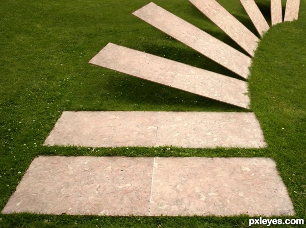
Great idea! Just 2 things: the stones should be thicker, and instead of faking it, you could have imported the grass edge from the foreground stone to the edges of the others.
(You still can...). GL author.
haha love the idea!
Moving stones!!! nice work Add thickness will be much better.
AWESOME IDEA (to thicken the stones easily.. just duplicate it and lower the back layer with nudge.. repeat and it will be plenty think in no time... other then that.. EXCELLENT WORK
Love it!
That's the definition of "simple & effective - less is more"
You could follow Driven's advice, pay attention to perspective though, the further the stone the thiner it is.
Also fix that grass like CMYK said and clear those masking problems.
GL.
Fantastic work author...love the idea and the execution...very well done man
Excellent work GL
Congrats for your third place, Vimal!
Very clever - congrats on third place!
thank you....
congrats, creative!
Howdie stranger!
If you want to rate this picture or participate in this contest, just:
LOGIN HERE or REGISTER FOR FREE