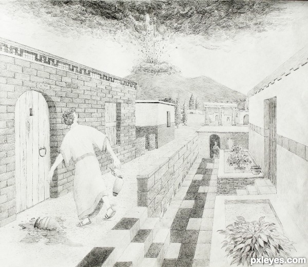
The figure in the picture was taken by me. The buildings were not from any particular source. I browsed some pictures from the ruins to get a general feel for the architecture & made my own using good old 1-point perspective. I also asked a few questions of ChaCha(424424) on the cell phone regarding things like doors & general architecture questions. (5 years and 3538 days ago)


wow, this is very incredible!
Could use some heavier shading and contrast here and there, but overall this is pretty impressing work. A lot of nice details. Very good job, author.
Wow!erspectives are welldrawn and despite the person is faced from us, you can feel his fear as he drops the vase... High votes from me! It´s very very amazing. PGL
Thanks for the comments! The original has a better value range than what was posted. I just now went into Photoshop to bring back some of the value range & lose some of the gray feeling that I get when I photograph drawings. Its hard to do without losing the finer pen strokes.
Super work and a very nice style. Composition and proportions are good, would agree that it is lacking contrast. I would also be very interested in how do you achieve your very uniform shading most Visible on the floor tiles.
Warlock, as far as the contrast goes, I have trouble duplicating the whiteness of the paper without losing the fine lines. I used 1 fine pen at various angles to achieve all marks.The uniform shading emerges gradually over many many marks. I migrate back & forth until I am satisfied with the distribution. You may notice that the wall bricks are not as consistent. That was by design, as even modern bricks have shade variation based on firing temperature, oxygen, and chemical composition of the clay. Thanks for the observations ; )
wow, nice shading and perspective. very well done
one of the sketches with real cool perspective.. you can adjust the levels to darken those lines I guess..
Nice work the perspective is very well done
Great work author,very realistic image,fabulous perspective and cool details...very well done...
Really good drawing here, author. I used to use soft graphite pencil, then a q-tip to smudge and shade, maybe try that. Great job on the explosion!

Super work Author.......Good Luck.
WOW!
Congrats, fabulous work
Congrats for 1st
Thanks all! ; )
Congrats for your first place, Pingenvy!
Congrats !!
Howdie stranger!
If you want to rate this picture or participate in this contest, just:
LOGIN HERE or REGISTER FOR FREE