(5 years and 3378 days ago)

Howdie stranger!
If you want to participate in this contest, just:
LOGIN HERE or REGISTER FOR FREE

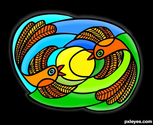
I didn't realise you were not allowed to use a gradient fill, so all gradient fills have been taken out. Have also included how i drew the bird as that was asked for by the mod. Its not the same one as it was drawn freehand on a tablet. The sbs still has the gradients, didnt want to do those again. (5 years and 3379 days ago)
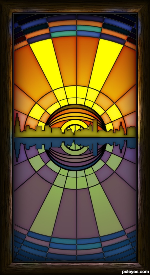
Nice entry! A very cool idea to add the city skyline to the entry! Well done author! GL!
Nice work, i feel the bottom half is lacking in illumination.
well done author,
like the lil details such as the wodden frame catching the tint of glass, grad on glass to imply the illumination...
but my personel choice for the city line wud be dirty orange something towards brown.. just me though...
Yes this is also very nice...lots of great entries in this contest so far.
Very interesting different work...best of luck author
Very good. I like the detail of how the coloured light illuminates the frame.
Great design. Love how the glass edges get slightly darker where it is joined. Nice color selection on the city and outside glass too.
Wow...impressive...great idea and effect!
Ha ha I had a hunch this was yours, Nice to see you back in action.
Congrats on the win.
Congrats for 1st
Thank You friends
Congrats well done
congrats on first...
Hey...congrats Stowsk!!! Excellent job!
Howdie stranger!
If you want to rate this picture or participate in this contest, just:
LOGIN HERE or REGISTER FOR FREE