
(5 years and 3653 days ago)
going green..  by iquraishi 16027 views - final score: 59.8% | E_grren  by vimal 10059 views - final score: 58.9% | E-green chain stores  by erikuri 12138 views - final score: 57.8% |
Lady bug 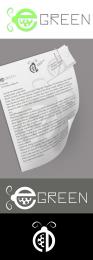 by Chalty669 12269 views - final score: 57.1% | E-green  by chakra1985 9537 views - final score: 57% | E-green logo  by oana 7227 views - final score: 56.4% |
Green shop  by rasellia 4316 views - final score: 56.1% | e-green Electronics  by dollmommy 8393 views - final score: 53.5% | e  by 6tann 2880 views - final score: 53.3% |
E green  by Lamantine 3986 views - final score: 50% | circuit green  by rakib888 4179 views - final score: 49.9% |
Howdie Guest!
You need to be logged in to rate this entry and participate in the contests!
LOGIN HERE or REGISTER FOR FREE
Photography and photoshop contests
We are a community of people with
a passion for photography, graphics and art in general.
Every day new photoshop
and photography contests are posted to compete in. We also have one weekly drawing contest
and one weekly 3D contest!
Participation is 100% free!
Just
register and get
started!
Good luck!
© 2015 Pxleyes.com. All rights reserved.


this is a good looking image, a sbs would make it better
@kefinice95 The text was just copied from a wikipedia article. It is only to show what a business letter would look like.
Author, your work it's very nice. But the business letter is an extra, and an extra is only for SBS...
i really like ur idea.. but if u could make it more ''electronic'' (coz it's for electic store) it would be my fav.
  )))
)))
The E looks like the one in the game of pacman...Nice one but a little less on electronic store i guess...it doesnt apparently give an idea that its related to an electronic store...Overall a nice work....
I see where some of you are coming from as far as the electronic theme. I have to disagree that the logo has to look like something electronic. Circuit City, Best Buy, Radio Shack, Walmart, Nike all have logos that do not resemble their store. If you start to look at popular logos, almost all logos are this way. This is why I didn't add a plug or anything to my entry.
wow, very good actually
GL
Howdie stranger!
If you want to rate this picture or participate in this contest, just:
LOGIN HERE or REGISTER FOR FREE